
This is cover to the 1980 boxed version of the second edition of Chaosium's RuneQuest. The illustration is by Luise Perrin and originally appeared as the cover of the 1978 first edition of the game. It's a piece of artwork I strongly associate with both RQ and Glorantha, owing to its wide use in advertisements for the game during the early 1980s.

This is the cover to the Games Workshop edition published in the same year. Throughout the early to mid-1980s, GW regularly produced UK versions of American RPGs, often with different artwork. In the case of RuneQuest, the UK cover is clearly inspired by Luise Perrin's original but isn't a direct copy of it.
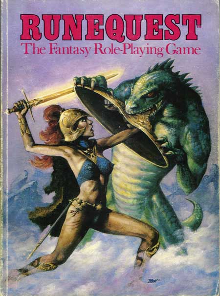
Never having owned the GW version, I don't know the name of the UK cover artist (please enlighten me in the comments). Whoever he is, there's no question he's more technically proficient than Luise Perrin. Compare the reptilian monster in each version and you'll quickly see what I mean. The warrior woman's pose from the GW cover likewise shows a greater command of human anatomy. Yet, somehow, even leaving aside the issue of the UK version's cheesecake, I find Perrin's version vastly more compelling to me. There's a mythic, dream-like quality to it that I think better suits the tone and content of RuneQuest.
Am I mistaken?

The Perrin cover captures the Bronze Age feel of RuneQuest better. Also from a Graphic Design viewpoint it is far better with the limited color pallet and traces of red in her armor echoed in the title and logo. Yet RuneQuest sold well in the UK so I guess sex sells.
ReplyDeleteFrom what I gather, RQ did very well in the UK and was at one point at least as popular as D&D, if not more so.
Delete@James Chaosium games seem to do better overseas than in the US. Call of Cthulhu has always outsold D&D by a fair margin in Japan, and continues to do so today. I'm going to guess the percentile skill based system is a big part of the appeal. Compared to the rather convoluted game engines of many RPGs the Chaosium house engine (by any name) has always been very easy to grasp - and more importantly, teach.
DeleteI don't think the cover is what sold it in the UK. I was there (and bought it) at the time. The reason it sold well is more likely to be that White Dwarf magazine heavily pushed RQ in every issue with articles, scenarios, reviews of supplements and heavy advertising. Even as a teenage boy I found the cover a bit "Meh" - trying too hard really, skinny near naked warrioress with some kind of Jim Henson expression on her face. All the cover did for me was make me uncomfortable being seen with the book around non-gamers.
DeleteIt was the UK fans, especially the Reaching Moon Megacorp, and their fanzine Tales of the Reaching Moon (which was eventually successful enough to be offset print on glossy paper with full colour covers) that effectively kept RQ alive during the darker days of it's existence at Avalon Hill.
DeleteIt may be familiarity bias, but I prefer the US version by quite a large margin.
ReplyDeleteThe GW one fails hard for me simply because it's cheesecake (battle bikinis are utterly absurd, especially in RQ with its locational armor and damage system), but I question the anatomy as well. Those pipe-cleaner arms don't look up to wielding her sword and shield and their proportions look off as well. The US version also has a much more eye-catching color scheme, even if the GW one shows better technical proficiency when it comes to shading.
Personally, I think the Perrin artwork has more of a RuneQuest feel to it, given the ancient armour and helmet.
ReplyDeleteAlthough the GW version carries the helmet over, it's much more generic.
The Perrin cover has much better character. The UK version looks afraid; the US version looks confident. Also, the armor just works better. The chainmail bikini has no depth; I honestly can't tell if she has nipple bosses or it's just that cold.
ReplyDeleteThe UK cover is by Ian McCaig (who illustrated some of the Fighting Fantasy books). Although the UK RQ was my first game (and the one I'm running now for my kids + friends), I *much* prefer the US cover. It's a much better illustration of the game, and it's far less silly.
ReplyDeleteBut I do have a soft spot for the McCaig one - not least because it was also the cover for all the marvellous RuneQuest miniature boxes that Citadel released at the time.
Fun fact: the Citadel RQ trolls (http://solegends.com/citrq/citrqb3v1trolls/index.htm) are very closely based on Luise Perrin's troll illustrations in Borderlands - before RQ trolls grew snouts!
Yes, the Citadel RuneQuest miniature boxes were my first encounter with the GW artwork as well.
DeleteThe knight with the swan helmet in, I think, Attack of the Broo was my character miniature in a WFRP campaign for years.
I'm going to have to disagree with you ladies and say that I *vastly* prefer the McCaig cover. The Perrin cover looks like a fainting woman holding a Salvador Dali shield being overwhelmed by a scaly green potato. The McCaig cover may not be perfect but it's a nice piece of fantasy art; the Perrin cover is a complete eyesore and very poorly executed.
ReplyDelete"I'm going to have to disagree with you ladies..."
DeleteWhat's that all about? You know full well that most (probably all) of your fellow commenters are male. What makes you think deliberately misgendering the lot of us is anything but childish trolling?
Although I like the McCaig cover well enough, I must agree with our host: the Perrin cover is more compelling and even more so in color than the black & white cover of 1st edition RQ.
ReplyDeleteThe McCaig cover looks more sword and sorcery to me, more reminiscent of the sword & sorcery pulp covers while RuneQuest is keyed to a more mythical genre.
ReplyDeleteBut certainly a lot of my preference is grounded in the cover I'm used to seeing.
If we're talking about homages to the Louis Perrin cover, I like the one Andrey Fetisov did for the RuneQuest Quickstart rules.
ReplyDeleteNope. Not mistaken at all.
ReplyDeleteThe UK cover is very generic fantasy, and despite greater realism is "cold" or "sterile", compared to Louise.
The red on white (which I owned along with the color cover shown) and green on white softcover versions of the original LP cover are also very cool.
The Runequest 6/Mythras cover pays homage to that cover.
ReplyDeleteThe Perrin cover looks like a Vingan Red Woman fighting a lizard-like beast. The McCaig cover looks like a generic fantasy warrior woman fighting a generic fantasy lizard person. I disagree that there is much difference in artistic skill between the two, though the McCaig one is certainly more suited for the commercial art fashions of the time.
ReplyDeleteOne of my favourite pieces of trivia - the model for the original warrior woman was fantasy novelist Kate Elliott (aka Alis Rasmussen) : http://imakeupworlds.com/index.php/2015/02/where-should-i-start-with-your-novels/
ReplyDeleteKate Elliot was a model for a RuneQuest cover, but it was for RuneQuest 3rd edition (the Avalon Hill edition), along with her husband. They were friends of the artist, Jody Lee. https://basicroleplaying.org/topic/8171-rq3-cover-painting-unearthed
DeleteIn Perrin's version, I see a warrior. In McCaig's version, I see a skinny porn star.
ReplyDeleteMcCaig went on to do some wonderful concept art later in his career for the movie industry and has a very nice teaching/retrospective book called Shadowline.
ReplyDeleteHowever, that cover is actually fairly bad IMO. It's encouraging to see where he end up after such a mediocre start. I wonder if he'd have come up with a better composition if unconstrained to match the original.
My only knock against the Perrin cover is where the sword ended up---far too close to the skull.
Both version might have benefited from have a darker underbelly on the beastie.
You are not wrong. Perrin's cover is far more evocative, no one cares about technical errors in visual art, look at Van Gogh ffs, the errors are part of the appeal!
ReplyDeleteIain McCaig is extremely skilled and occasionally has created striking work (https://i.imgur.com/81GM3Ji.jpg), but this one was a miss. I was always envious of the RQ2 American cover once I saw it. Luckily, most of the RQ2 boxed supplements made it through unscathed to the UK - Trollpak, Pavis, Borderlands, Cults of Terror, all had great covers which matched the US ones, afaik.
Perrin's Eco-warrior is the best because she is wearing the Extinction Rebellion logo, how Perrin predicted that we will never know.
To be honest, the attacking monster left me questioning my Glorantha lore ability. I learned about halfway into my Gloranta career of more than three decades that it might be meant to be a rock lizard, but its humanoid stance and foreleg grasp always invoked some kind of lizardman, more so on the GW re-imagining than in the original - admittedly wasting a bite attack on the large metal shield (an item not canonically available in the current incarnation of the rules).
ReplyDeleteThe spiked bikini in the GW edition reminds me of 80ies porn attire. The GW girl's legs almost look like they are covered in very thin suede leggins (or nylons?).
The Perrin girl's mini-skirt is on the very short side, too. With the abs and the chiseled belly-button, the armor looks almost flexible. But it is a lot less sexualized than the GW girl's attire.
Apart from her wielding a sword, the original image always conveyed a "Yelmalian" image to me. Seeing the Vingan Vasana in the re-imagining took a bit getting used to, too.
They seemed to wear their "skirts" short.
Deletehttps://www.hoplites.org/depictions-of-hoplites/
I vividly remember my llama riding Oltpec Freehand exploring the Big Rubble and fighting the Lunar Empire defending the cradle of some godling. I much prefer the original cover. My own D&D webcomic Tales from the Gnomish Tarot is heavily influenced by the almost amateur art of the old days.
ReplyDelete