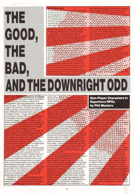
"The Good, the Bad, and the Downright Odd" by Phil Masters is a decent article about the creation and use of non-player characters in superhero RPGs. However, my enjoyment of it was seriously hampered not by anything in its content by its godawful layout, one of the worst in the long history of White Dwarf's godawful layouts. Let your eyes feast upon this:
More damning than the possibility that this layout could trigger epileptic seizures in the reader, it's almost completely illegible. The combination of colors, especially in the areas that combine a white background with black text and a red overlay, makes the thing almost impossible to read. This isn't just middle age speaking; this was true even in my teen years before I ever owned a pair of glasses. What were they thinking?
Fortunately, "Open Box" is as readable as ever. This issue, there are reviews for West End's Paranoia (7 out of 10), which used to be a favorite of mine. Reviewer Marcus L. Rowland quite correctly points out that, though fun, Paranoia is probably not suitable for a "prolonged campaign." Also reviewed are the first three Alien Modules for GDW's Traveller, focusing on the Aslan (9 out of 10), K'Kree (7 out of 10), and Vargr (9 out of 10). Concluding the column are reviews of three different supplements and adventures for use with FASA's Star Trek RPG: The Romulans (8 out of 10), The Orion Ruse (9 out of 10), and Margin of Profit (8 out of10). For a lover of science fiction like myself, this issue included a great collection of product reviews.
Dave Langford's "Critical Mass" is an unexpectedly good installment this months, perhaps because I'm much more familiar with the books he's reviewing. Langford starts off talking about the Dune series and, by and large, I agree with his initial assessments: Dune is excellent, Dune Messiah almost as good, Children of Dune a mess, and God-Emperor of Dune a slog. Unlike Langford, who – unexpectedly – enjoyed both Heretics of Dune and Chapter House: Dune, I was by turns annoyed and bored. Go figure, He also spends some time slagging Dragons of Autumn Twilight, which is a fine way to spend one's time: "inspired by an AD&D campaign full of chunks ripped bleeding from Tolkien." Langford says he couldn't even finish it; I sometimes wish I could say the same. Langford's byline reappears beneath "The Distressing Damsel," a humorous fantasy tale that I didn't love, but I also didn't hate, so that's something, I guess.
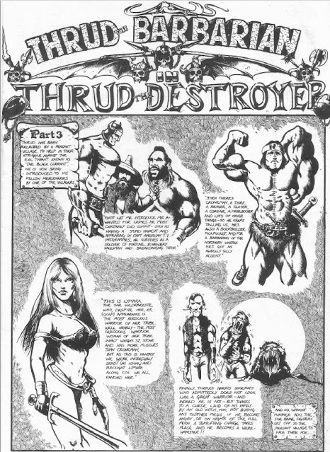
"Thrud the Barbarian" continues its fun "Thrud the Destroyer" storyline. Rather than waste time talking about it, here's a reproduction of the comic to give you a sense of its content.
Graham Miller's "Smile Please" is an adventure for Traveller that is better in concept than execution. The characters are contracted to transport a mysterious box aboard a merchant vessel filled with a motley assortment of fellow passengers. As the ship enters jump space, some of these passengers start dying, seemingly as the result of a murderer in their midst. In truth, the whole thing is part of an Imperial version of the TV show, Candid Camera, which is a bit of a letdown. Mind you, I never ran this scenario, so perhaps it works well in play, though I have my doubts.
"Balancing Act" by Mike Lewis is an interesting early example of discussing the possible tension between the logic of drama (or "storytelling") and the unexpected outcomes of rules. Lewis suggests downplaying the role of rules to ensure a greater degree of dramatic coherence in a campaign and provides lots of examples and suggestions on how to handle this. His ultimate point is that the flow of a game session ought not to be broken by an errant dice roll or even the dictates of a rule. A good referee understands the need for judgment calls when in-game events dictate it. I find it hard to disagree, though leaning into this approach too heavily leads to the railroad and similar pathologies.
"The Sahuagin Heel" by Graeme Drysdale is a nice little AD&D adventure for characters of levels 2–4. The scenario involves a string of islands menaced by the aforementioned sahuagin. It's a solid sea-based adventure, with numerous interesting encounters, including tricks and traps. If it has a flaw, it's the extensive backstory presented at the start of the adventure to set the stage. In general, I prefer less of this sort of thing, but that's just personal preference. "The Other Imperium" by Michael Scott presents several civilian organizations for use with Traveller, like Intercredit (an intersellar banking service) and the Mercenary Monitoring Corps. Much more interesting is the latest installment of "The Travellers" comic, which has a go at Star Trek in forms of the characters of Captain Quirk and his first officer, Speck. We're also treated to more "Gobbledigook," though I almost missed it this time, because its placement amidst a sea of advertisements at the end of the issue obscured it somewhat.
"Forecasting the Runes" by Dave Morris and Oliver Johnson is an article for RuneQuest that presents two small rules/world additions to the game. The first is the titular runes, which function as a type of augury, while the second pertains to a system of birth signs based around the four parts of the soul (as understood by Glorantha's Lunar Empire). Both are quite flavorful and, just as importantly, mechanically simple, which I think is very important. Well done! Meanwhile, "The Noegyth Nibin" by Steven Prizeman stats up the "pettty dwarfs" of Tolkien's Silmarillion in D&D terms.
"Armed to the Teeth" by MJ Bourne is (yet another) collection of unusual historical weapons for use with D&D – stuff like the misericorde and poinard, alongside the boomerang and blowpipe. I don't hate articles like this, but I do question their utility after so many others have been written – and are still being written – that cover the same material. Finally, there's "Horse Sense" by Joe Dever and Gary Chalk in which they discuss the intricacies of painting horse miniatures for use with RPGs and tabletop wargames. As always, I find this series weirdly fascinating, perhaps because I know so little about miniatures painting.
And there you have it: issue #65 of White Dwarf. It's a better than average issue in my opinion, though a little more staid than earlier issues in the magazine's run. Unfortunately, that's the nature of these sorts of things. As a publication becomes more polished and "professional," its content is both more consistent and more "safe." Much as I have commented negatively about the inconsistency of White Dwarf's content in its early days, I nevertheless recognize that that inconsistency was, in some respects, a necessary consequence of its newness – the very same newness that regularly inspired some truly phenomenal creativity and that I'd love to see again.


Whoever was responsible for that layout should have been fired, and the person that gave the go-ahead for the magazine to be sent out to the public like that fired along with said layout person.
ReplyDeleteThe only thing that comes close to this in my experience was Sorcerer's Apprentice #16, in their Rogues' Gallery feature (Flying Buffalo's house magazine that covered their games T&T and MS&PE). Rogues' Gallery was a collection of NPCs for the game MS&PE, and the article featured a dark royal-blue background that bled into a light royal-blue background with speckles of white and black text. At 16, my 20/20 eyes had a hard time with it, but this red dot stuff above, with black text...well, lets just say I would have done something completely irrational if I'd bought the magazine, like write a letter to the editor.
It really is awful, isn't it?
DeleteAwful indeed. If it was a month earlier I'd suspect it of being some kind of April Fool's joke with the punchline hidden in the least-legible parts of the fool thing.
DeleteIf it was just the red stripes it'd be bad but not awful (perfectly readable as long as it doesn't cross through a word, which unfortunately it does plenty), but the dots? Why?
ReplyDeleteAs I mentioned in another comment, I am fairly convinced it was a conscious attempt to make it EXTREMELY difficult to reproduce content by photocopying the pages of the magazine.
ReplyDeleteAt the time (in the 80s) color photocopies were difficult to come by and extremely expensive. At the same time, the photocopier, even big professional devices you could find in copy shops or large companies, really struggled with red.
White Dwarf was mostly printed in black/gray (at least before turning into a monthly catalog for Warhammer) with rare exceptions like the Irilian multi-issue scenario so introducing the red splashes must have been done to address a specific business issue.
Especially considering that if they really wanted to experiment with colour, using something like turquoise would have been better for HUMAN EYESIGHT too (but would also result in more readable photocopies).