The first AD&D book I ever owned was the Monster Manual. I bought it with money my grandmother had given me for Christmas 1979, ordering it through the Sears catalog. Once my copy arrived, sometime in early January 1980, I spent untold hours poring over its contents. Though I, of course, loved all the descriptive material contained in the book's 112 pages, it was the illustrations that truly seized my imagination – so much so that, to this day, it's difficult to conceive of many Dungeons & Dragons monsters in any way other than how Dave Sutherland, Dave Trampier, Tom Wham, and Jean Wells drew them.
One aspect of the Monster Manual's artwork that grabbed my youthful attention was how often it depicted fear and death. Consider, for example, the piece accompanying the book's title page:
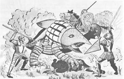
Here, we get three knights in
historical armor facing off against a bulette. Beneath the landshark's front right claw, you can see the corpse of a horse (perhaps belonging to one of the two unmounted knights in the foreground). It's a small detail, seemingly unimportant, but it's the first example of a recurring motif in the
Monster Manual's illustrations:
facing off against monsters is perilous.
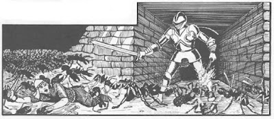
Again and again, you see this throughout the book: monsters frightening, harming, or killing those who dare to challenge them – often in unexpected places, like this one.
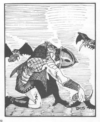
Those are giant ants and look how they use their large numbers to overwhelm their opponents, as do stirges in another memorable illustration.
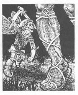
Of course, not all low-level monsters rely solely on numbers to get the better of their enemies. Take a look at this pixie.
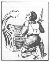
Being surprised by a lurking monster is another common element of Monster Manual illustrations, like the classic mimic preparing to punch the unfortunate thief attempting to open a "chest."
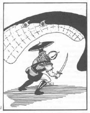
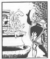
But there are many others in this style as well.
I could offer many more examples from the book and I'm sure readers will remember some of their own favorites. I adored these kinds of illustrations as a younger person, in large part because they emphasized the danger posed by monsters, even things as seemingly innocuous as giraffes.
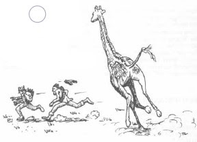
Everything in the
Monster Manual was a potential threat to life and limb and I can't tell how exciting that was to me as a budding Dungeon Master. While I was never a
killer DM, I nevertheless did revel in seeing the looks of horror on players' faces as they realized what their characters were up against. Descending into a dungeon or wandering off into the wilderness is supposed to be frightening to some degree. A big part of the appeal of games like
D&D, especially for young people, is being able to face those frights vicariously. That's part of why horror movies continue to be so popular, I imagine, particularly as the real world becomes ever safer and more sanitized. Something in our nature atavistically craves, maybe even
needs fear and danger. Monsters in fantasy roleplaying games should give us a chance to experience both.



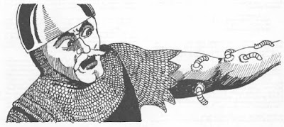

One of the joys of A/D&D is attacking the PCs with zoo animals.
ReplyDeleteAbsolutely. Zoo animals need to be buffed up a bit in newer editions!
DeleteI too was ensorcelled by all those images from the Monster Manual. They inspired me to play and defined my preferred style to this day. There’s something about the clumsiness of those black and white drawings that invites you to fill in the blanks with your own imagination in a way that “better” art fails to do. I found 2e art good as well, but disliked 3e art, and hated 4e imagery so much that I never bought a 4e book.
ReplyDelete"...even things as seemingly innocuous as giraffes."
ReplyDeleteReminded of a video of a giraffe kicking a lioness so hard she flew ten feet through the air, spinning helplessly the whole way. An adult female giraffe weighs about a ton, a male twice that. Those legs only look fragile and the muscles powering them can reach 35 mph at a sprint. They don't kick very often but they're very good at trampling anything as puny as a human - or lion.
"Seemingly innocuous" is an understatement.
I’ve actually blogged about this, reviewing the illustrations from 1E versus the illustrations I later editions (both MM and other core books).
ReplyDeleteMy belief is that these illustrations help shape our perception of what the game IS…after all, none of us have faced a goblin or dragon in real life and SOME image must be used to fire the imagination.
What I found was that there were far more images of peril (death, dying, terror, etc.) in the 1E books and far fewer (close to zero!) in most later edition core books.
What message does that send? That PCs are never to be imperiled? That D&D is a game of heroic adventurers triumphing in a fantasy world?
The illustrations reflect the differences of attitude between players of different editions, and it’s not by accident.
I must have missed these. Links?
DeleteSorry...here you go:
Deletehttp://bxblackrazor.blogspot.com/2021/07/imagination-art.html
http://bxblackrazor.blogspot.com/2021/07/the-art-of-peril.html
http://bxblackrazor.blogspot.com/2021/07/addendum-to-art-of-peril.html
http://bxblackrazor.blogspot.com/2021/07/modular-art.html
The first post discusses the importance of artwork to the imagination, The second does a comparison between artwork across 1st through 3rd editions. The third post is an addendum (probably to address the comments). The last post discusses 5E artwork AND artwork in adventure modules.
Cheers!
: )
One of my favorite monster illustrations is from the Basic D&D manuals, the spectre (from the Expert rule book), wholly unlike the spectre from the AD&D Monster Manual and vastly superior in my view. I quickly outgrew Basic in favor of AD&D, but there were a few things the Basic manuals got better, and the spectre drawing was one of them. Freaked me out just staring at it.
ReplyDeleteIn the summer of 1979 I was 12 and was away for two weeks to an overnight camp. By this age I already knew of The Hobbit and LoTR. I had seen the Rankin Bass movie and we had read The Hobbit that year in 6th grade. One rainy day we piled into a large cabin with other campers to play games. That cabin was used by older teens who were there for week long trips and thus was empty that day. Bored, I notice by one camper's stuff a book with a fantastic cover - The Monster Manual! I spent the whole day reading the entries wondering what all the information meant. That next year I bought my best friend the Basic D&D set for his birthday. I spent $12 whole dollars and hid it from my parents! We played D&D every day that summer and I'm still playing 40+ years later - all because of The Monster Manual.
ReplyDeleteGreat point about fear and danger in 1e. It goes for the DMG too:
ReplyDeletehttps://www.enworld.org/attachments/skeleton-water-1e-dmg-jpg.57806/
Nice post. I hadn’t thought about how the illustrations shaped attitudes towards the game play.
ReplyDeleteEven the humorous ones were gallows:
“Whaddya mean we gotta talk to this lynx?? The last monster we talked to ate half of the party!“
Makes me think of Lamentations of the Flame Princess. Every piece of art is adventurers in peril yet the game lacks a proper Bestiary.
ReplyDeleteThe HackMaster monster books always had the illustration be the monster in question (even the good ones) eviscerating some person.
ReplyDeleteThe Hacklopedia covers tell a very entertaining story of an adventuring party being whittled down one by one over the course of the books.
DeleteThanks, Shane.
DeleteI didn't know about those covers.
So good.
Those illos could launch a *line* of minis.
I like how they advance in levels (one per Volume?) as they get mangled.
And it sort of seems like the character that should most be able to handle the monster in question is the one that gets ruined; Cleric vs. Mummy, I'm looking in your direction.