
Here is the second part of the list I began earlier this week. As always, a reminder that this list is highly personal. The entries here were judged on a variety of criteria, resulting in entries that fall somewhere in that wide, nebulous space between my personal favorites and objectively best with the former likely playing a far larger role in my final determination. Nevertheless, I genuinely do think all the entries below are excellent illustrations of my own early experiences of Dungeons & Dragons, experiences that still influence my view of the game to this day.
5. Holmes Basic Frontispiece (1977)
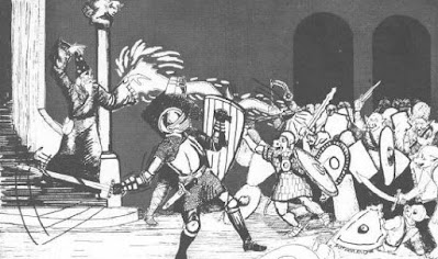
Like the cover to the J. Eric Holmes-edited Basic Set, my fondness for this particular piece is no doubt colored by its placement as the very first piece of art inside the Basic rulebook. Consequently, it's seared into my memory in much the same way as the cover itself. However, there's more to my fondness for the piece than primacy of memory. This is a terrific action scene, one depicting two doughty fighters in historical armor – a signature element of Sutherland's art – holding the line against a veritable horde of pig-faced orcs, while a magic-user casts a spell from the safe higher ground afforded by the nearby spiral staircase. I like it because it shows an adventuring party, albeit a small one, in action in a way that suggests the use of tactics. Likewise, I adore how many orcs there are. This is not a fair fight by any means; in fact, it looks downright desperate. This is what dungeon adventuring was like before the appearance of the notion of "balanced encounters." It can't get any more old school than this.
4. AD&D Dungeon Masters Screen (1979)
3. Room of Pools (1977)
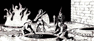
This illustration, from the module In Search of the Unknown, is one of my favorites – along with the dungeon chamber it depicts. I was so in love with the Room of Pools that I shamelessly included a version of it in many of my early dungeons. It's not hard to understand why. The Room of Pools is a near perfect example of old school dungeon design principles. There are lots of pools, some of which offer boons and others banes, and it's up to the players to figure out which ones are which, based on cleverness, observation, and trial and error. I'm a huge fan of rooms like this and enjoy sitting back and watching the players' minds work, as they try to puzzle out what's in front of them. Sutherland captures this dynamic perfectly here. He also depicts an adventuring party – a little larger this time – and that always tickles my fancy.
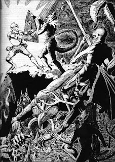
This Dave Sutherland illustration, from the AD&D Players Handbook, simply had to be on this list, as I long ago deemed it "my favorite D&D illustration of all time." More than a decade on from that original post, I largely stand by that assessment. It remains my favorite piece in the entirety of the PHB, as well as the best depiction of a paladin in all of Dungeons & Dragons artwork. What prevents my including it in the top slot is its specificity. This scene depicts a lone character fighting against foes in a very unusual situation. How often do D&D characters venture to Hell itself to take on the forces of the Enemy? Not very often, I'd wager. Likewise, D&D is about groups of characters working together to explore dungeons and relieve them of their treasures. There's plenty of space for individual heroism, of course, but, much as I love this illustration, I don't think the situation it depicts is in any way typical of those found in the average game session. But it's a solid number 2.
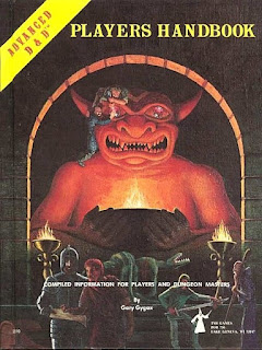
Was there really any doubt about the number 1 spot? I don't believe there's ever been a piece of artwork for Dungeons & Dragons that is more well recognized and iconic. It is unquestionably the best cover of any D&D rulebook ever and perhaps even the single best evocation of what D&D was about in its early days. It's got pretty much everything you'd want in such a cover: the aftermath of a battle against lizard men, looting, planning, the use of maps, and the great demon idol itself. The idol is what really sells the piece for me. It's simultaneously attractive and repellent, redolent with the kind of mystery I expect in good dungeon features. I'm not sure I can say anything about the piece that hasn't been said hundreds of times before and better. This is a case where the artwork really does speak for itself. Magnificent.

I've painted the Otherworld Minis sculpt of the PHB idol on commission several times over the years. I can attest that it's as much fun trying to emulate the lighting in 3D as it is to look at the original art.
ReplyDeleteAnd I remain annoyed that WizKids had the temerity to sculpt an "animated statue" version of the idol that completely ignores the scale of the original. Even the Otherworld sculpt was a little small, but WizKids wasn't even trying to make something big enough for a couple of ambitious looters to climb on.
Nice to know I'm not the only person who keeps cribbing the room of pools for homebrew dungeons. It really is something a Platonic ideal of a dungeon room, and never gets old. Keeps me (ahem) going back to the well, as it were. :)
Maybe the paladin in Hell got separated from the rest of his party, or they had already perished?
ReplyDeleteIt just now struck me how tiny the BRAND NAME (TM) is on the cover of the 1E PHB. Compare it to something like Gangbusters where the logo is half the cover even on adventure modules.
ReplyDeleteLots of surprises here. I thought that the mini adventuring scenes in the DMG would have made the top five.
ReplyDeleteI (well partially, at least) share a taste for the "ordinary extraordinary" esthetics.
The magic pools are the best thing in B1, I stole them too for my own games.
God willing someday I will own a sweet van with a rendition of number 4 on the side and number 1 on the back.
ReplyDeleteGood choices. The only one missing for me would be the tramp one from the PHB I think, the one with the enchanter riding thro the town?
ReplyDeleteAre you thinking of Emirikol The Chaotic from the DMG?
DeleteHa I believe I am, yes! Been a while...
DeleteNext: Top 10 non-TSR D&D adventures/supplements!!!
ReplyDeleteThat would be interesting. There'd certainly be some Roleaids stuff from Mayfair on my list, although I'd have to think hard about which pieces.
DeleteSome more good ones James. Thanks for sharing these.
ReplyDelete5, 3, and 1 are ICONIC!!! I would only add "Magic Mouth" from the AD&D PHB as a special mention.
ReplyDeleteMagic Mouth is one of my favorites
DeleteI've come to appreciate David C. Sutherland's art much more than I did when I was younger. He didn't have the technical, M.C. Escher-esque prowess of his contemporaries like Trampier, but he always had super strong narrative elements and interesting compositions. As others have said, his drawings looked like how D&D often played to me.
ReplyDeleteThe Holmes frontispiece is probably my favorite of his, just for the feeling of potential it gave me when I first looked through the book. I believe that the mid-ground character depicts a cleric, as he's brandishing a mace. (It's a bit visually confusing, but you can see the mace has action lines showing that it's making contact with an orc's shield. The orc in the foreground is holding a falchion that's making contact with the fighter's shield.) A great representation of the original D&D class trio, but it's those pig-faced orcs that got me!
I'd have your #9 a lot higher, but I cut my teeth on B/X. I'm a little surprised nothing from the modules made your list- the interior title page from Hommlet is pretty iconic IMO and the Tomb of Horrors artwork has some fun stuff. Still a great idea and a great list!
ReplyDeleteHe does have Room of Pools at #3, but I was surprised too that eight came from rulebooks.
DeleteI suspect it's because I looked at the rulebooks a lot more than the modules, so the art from them is burned into my brain.
DeleteI was tormented by the face of the warrior on the right side of the DM Screen when I was a kid. I always sat directly to the DM's left so that guy's face was right there, glaring at me. I made the DM paperclip a piece of paper over the guy's face so he would stop freaking me out. Good times!
ReplyDeleteI think part one was more interesting, just for diversity (though Willingham wouldn’t have come anywhere near a top 10 for me, maybe not even 100). I expected #1 and #5, but would have guessed the latter to place higher.
ReplyDeleteI would have omitted the Willingham and replaced it with Wham’s illustration on p.64 of the MM: a party of (now) four in a wilderness adventure arguing over whether to converse with a “monster”. How much of the old artwork portrays those aspects of the game?
I was rooting for Emirkol the Chaotic. A piece for which I have a truly mysterious fascination
ReplyDeleteEmirikol
DeleteHe's chaotic. Probably irregularly changes the spelling of his name just to live up to his reputation. :)
DeleteI just learned that the street down which he rides is based on a real one:
Deletehttps://batintheattic.blogspot.com/2010/09/imagining-d-for-myself.html
The blog writer followed up by tracing his route on Google Earth to see where he was going:
https://batintheattic.blogspot.com/2010/09/more-on-emirikol-chaotics-ride.html
Love every choice, with Sutherland's three pools being the big surprise for me. I'd forgotten about that piece. Of note is that so much B&W interior artwork from the Golden Age just rocks, and did perfect work capturing the game. That is almost completely missing from 2e thereafter. BECMI and the Gazetteers still have some great interiors though.
ReplyDeleteJames, where do place artists Jim Holloway and Jeff Easley on your Golden and Silver Age time frame? I'm guessing Silver Age. I see them as a bridge between the two, if there can accept one.