Showing posts with label trampier. Show all posts

Monday, July 7, 2025

Dungeons & Dreamscapes

I’ve often said I feel fortunate to have discovered Dungeons & Dragons when I did, before the dead hand of brandification settled over the game and drained it of the wild, untamed esthetic that once made it so visually compelling and culturally strange. In the years before D&D became a polished entertainment “property,” its visual identity was a chaotic collage of influences drawn from unexpected sources: psychedelic counterculture, turn-of-the-century Art Nouveau, underground comix, pulp magazines, and outsider art. Monsters leered with extra eyes and boneless limbs, while dungeons sprawled like fever dreams. There was a visual lawlessness to early D&D (and to roleplaying games more broadly) that mirrored the creative freedom of its rules. That freedom invited players to imagine fantasy worlds that were not simply adventurous, but also surreal, grotesque, and deeply personal.

These thoughts came back to me recently while flipping through some of the Dungeons & Dragons materials I encountered shortly after I took my first tentative steps into the hobby. Looking at them now, decades later, I’m struck not just by their content, but also by their form. Much of the art did not resemble anything I had seen before. It was crude at times, even amateurish by the standards of commercial illustration. Yet, it was also evocative in a way that transcended technique. These images did not so much depict a fantasy world as suggest one, obliquely, symbolically, even irrationally. Many felt like fragments from dreams or relics from some lost visionary tradition and, on some level, they were.

That tradition was a subterranean one, largely outside the orbit of mainstream fantasy art. Psychedelic poster designers, Symbolist painters, and zinesters working on the margins of the counterculture all contributed, consciously or not, to the strange visual DNA of early roleplaying games. Before branding demanded consistency and legibility, Dungeons & Dragons was porous enough to absorb all of it. The result was an esthetic that was both wildly eclectic and, paradoxically, cohesive in its weirdness. It didn’t feel like a mainstream product; it felt like artifacts from another world.

Today, it’s common to point to Tolkien as the primary visual and thematic influence on early D&D. His mark is real and unmistakable (despite what Gary Gygax wanted us to believe). However, when you examine the actual artwork that filled TSR’s products in the late 1970s and early ’80s – the era when I entered the hobby – you find yourself far from Middle-earth. Instead of noble elves and stoic rangers, you see grotesque creatures, warped anatomy, anatomical impossibilities, and alien geometries rendered in flat inks and, later, garish colors. This wasn’t the Shire. This was something older, more primal, and far stranger.

Where did this esthetic come from?

As I’ve already suggested, part of the answer lies in the psychedelic explosion of the 1960s. This was a cultural moment that sought to dissolve the boundaries between consciousness and art. Psychedelic artists like Rick Griffin and Victor Moscoso developed a visual language rooted in abstraction, distortion, and saturated color, a kind of sensory mysticism meant to evoke altered states. Concert posters and album covers became portals to other dimensions. Meanwhile, underground comix, like those of Robert Crumb or Vaughn Bodē, combined sex, satire, fantasy, and absurdism into worlds that gleefully rejected the conventions of good taste or coherent storytelling.

While Gygax and Arneson were not themselves products of this milieu, the audience they attracted often was – college students, sci-fi fans, and other oddballs shaped by the psychedelic visual environment of the late ’60s and early ’70s. I was younger than that cohort, a child in fact, not a teen or adult, but even I absorbed some of its esthetic currents. They filtered into my world through album covers, comics, cartoons, toys, and the hazy, low-fi look of the decade itself. I didn’t yet know what most of these things meant, but I nevertheless felt their strangeness. They stuck with me, shaping my imagination in ways I only later came to understand.

TSR, for its part, didn’t initially reflect these influences. Much of the earliest D&D art was traditional or utilitarian, inherited from the wargaming scene. As the game’s popularity exploded in 1979, TSR began to draw on a new crop of young illustrators, many of them influenced, directly or indirectly, by underground comix, countercultural poster art, and the lingering weirdness of the 1970s. Their work didn’t smooth out the chaos from which early D&D was born – it amplified it.

No one embodied this more than Erol Otus. His illustrations for the Basic and Expert boxed sets are among the most iconic in the history of the hobby, as well as some of the strangest. Otus’s monsters don’t just look dangerous; they look wrong, like something glimpsed in a fever or half-remembered from a dream. His color palettes are lurid, his anatomy grotesquely playful, his compositions uncanny and theatrical. His esthetic doesn’t belong to heroic fantasy. It belongs to a blacklight poster, hung next to a velvet mushroom print and a battered copy of The Teachings of Don Juan.

Otus, whether intentionally or not, brought the visual grammar of psychedelia into the core of D&D. In doing so, he captured something essential about the game: that it wasn’t just a fantastic medieval wargame; it was a tool for exploring the irrational, the liminal, the transformed. Other artists took up different parts of this same sensibility. Dave Trampier’s work, for example, especially his iconic AD&D Players Handbook cover, radiates a stillness and mystery more akin to myth or ritual than heroic adventure. Other similarly restrained pieces of early D&D likewise seem caught between worlds.

The same spirit is evident in third-party publications. Judges Guild modules are packed with crude, surreal illustrations that throb with symbolic weirdness. David Hargrave’s Arduin Grimoire goes even further. It's a deranged collage of cybernetic demons, magical diagrams, flying sharks, and bizarre maps that reads like D&D filtered through Zardoz. It’s no coincidence that Hargrave gave Otus his first professional credit. They were kindred spirits, working not within a genre, but along the outermost fringes of it.

Beyond psychedelia, another artistic thread ran through the background: the ornate, esoteric elegance of Art Nouveau. The flowing lines of Aubrey Beardsley, the sacred geometry of Alphonse Mucha, and the decadent mysticism of Gustav Klimt all haunt the margins of early RPG art. Beardsley’s illustrations for Salome or Le Morte d’Arthur look, at times, like direct ancestors to early D&D's depictions of witches, sorcerers, and demons. These fin de siècle influences were rediscovered during the 1960s counterculture and found their way, through posters, tarot decks, and zines, into the strange visual stew of early roleplaying games.

Even the dungeon itself is shaped by this visionary impulse. Early dungeons aren’t realistic structures. They’re mythic underworlds. They don’t obey architectural logic but symbolic logic, filled with teleporters, talking statues, secret doors, and fountains of infinite snakes. They’re not places so much as thresholds. To descend into a dungeon is to cross into a space where transformation of one kind or another is not only possible but expected.

That’s why so many early modules have such power decades later. Quasqueton, Castle Amber, White Plume Mountain, The Ghost Tower of Inverness – they’re not just combat arenas. They’re almost spiritual landscapes, mythic spaces presented as keyed maps. The artwork used to depict them conjures a mood, a worldview, a sense of mystery, inviting players to see fantasy not as genre convention, but almost as a moment of altered perception.

However, as D&D became a brand, this strangeness was steadily scrubbed away. Style guides were introduced. Idiosyncratic artists gave way to professionals. The game’s visuals became cleaner, more representational, more standardized. With that polish came a flattening of the imagination. D&D no longer looked like a vision; it looked like product.

This, I think, is what so many of us in the early days of the Old School Renaissance were reaching for, even if we couldn’t name it at the time. We were looking for the weirdness again, for the ecstatic, chaotic, sometimes unsettling energy that marked those early years. We remembered when fantasy didn’t have to be safe or heroic or respectable. We remembered when D&D looked like a door to Somewhere Else.

That's because fantasy, properly understood, is not an esthetic. It is a vision of the world tilted just enough to let the impossible shine through. Like the pioneers of science fiction and fantasy, the early artists of Dungeons & Dragons understood this. Otus understood it. Trampier understood it. So did Beardsley, Griffin, and countless anonymous illustrators working on mimeographed zines and early rulebooks in the 1970s. They weren’t just drawing monsters or dungeons. They weren’t just illustrating rules. They were revealing other worlds.

Tuesday, June 10, 2025

Smoke Rings and Sorcery: An Ode to Wormy

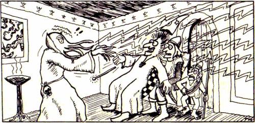
Among the many delights of flipping through issues of Dragon magazine from my youth is getting the chance to see Dave Trampier's Wormy comic strip once again. Long before I was conscious of the names of any of the artists who appeared in my favorite RPG products, I knew Wormy. Even among the clutter of rules variants, advertisements, fiction, and the occasionally bombastic editorials that defined Dragon during the years when I most avidly read it, Wormy stood out, in large part because it was so strange. It was a peculiar, beautiful little world unto itself, filled with pool-playing dragons, cigar-chomping ogres, and an imp who spoke with the laid-back confidence of a veteran hustler. It was, in short, utterly unlike anything else in the pages of Dragon and it fascinated me – in large part because I didn't fully understand it or its continuing storyline, having picked it up many issues after it first began.


Wormy's debut (in issue #9, September 1977) occurred when Dragon was still very much in its formative years. Indeed, the hobby of roleplaying itself was barely out of its own infancy and TSR’s flagship magazine was still trying to figure out what kind of publication it wanted to be. Early issues mixed game material with essays, fiction, and humor. Comics became a regular feature before long, with J.D. Webster's Finieous Fingers being one of the more well-known of the bunch, even though it ended its run about a year before I started reading Dragon. But Wormy stood out as something different. It was never simply an in-joke for gamers nor a gag strip loosely inspired by fantasy tropes. Instead, it presented a fully realized fantasy world rendered in lush color and with a distinct artistic sensibility.

What immediately set Wormy apart was, of course, Trampier’s art. Nowadays, we all celebrate Trampier from his iconic work on the AD&D Player’s Handbook and the Dungeon Master’s Screen. His style is clean, expressive and rich in texture and character. Wormy carried those same qualities into serialized comic form, but with an added flourish of visual wit and playfulness. The strip was never slapdash or haphazard. Trampier’s panels were packed with detail, his character designs expressive, his linework confident. Each page was a feast for the eyes and even when the plot meandered a bit (as it regularly did), the visuals carried the reader along to such an extent that he didn't care. I know I didn't, even though, as I said, it wasn't always clear to my younger self just what was happening in many installments.

The tone of the strip is one of its greatest charms. Wormy is unquestionably fantasy, but it’s fantasy as seen through a haze of cigar smoke and the low hum of a barroom pool table. Its characters speak in a colloquial American idiom that lends the strip a grounded, personable quality. One never gets the sense that Wormy or Ace or the ogres and trolls with whom he shares his world are interested in epic quests or noble deeds. They’re more likely to be plotting a scam, hustling a demon, or arguing about who’s buying the next round. This sense of the fantastical-as-everyday-life gives Wormy much of its charm and humor, not to mention its distinctiveness from the other comics that appeared alongside it in Dragon. 

In this, Wormy mirrors the culture of early roleplaying itself. The early hobby, as reflected in the pages of Dragon, was a strange admixture of wargamers, fantasy and science fiction fans, history buffs, and countercultural weirdos. This was a time before fantasy had hardened into genre orthodoxy, when anything could happen and often did. The world Trampier presented in Wormy feels like a campaign gone delightfully off the rails: a sandbox setting where the players long ago stopped caring about the dungeon and are now embroiled in a decades-long tavern brawl. For me, that was a big part of what I found so compelling about Wormy. It was so unlike my then-narrow conception of "fantasy" that I couldn't help but keep reading.

Over time, Trampier introduced a larger story into the strip. There were plots and schemes in motion and strange characters lurking just out of frame. Readers were teased with glimpses of the larger world beyond Wormy’s abode and the smoky dens of the trolls. Then, just as suddenly as it had begun, Wormy vanished. Trampier’s final installment appeared in Dragon #132 (April 1988), ending mid-story. He never offered a public explanation. Other than the following, which appeared in issue #136 (August 1988), TSR never provided an explanation for what had happened:

Wormy, along with its creator, David Trampier, vanished without a trace.

This abrupt disappearance only deepened the comic strip’s allure. In the years that followed, fans spun wild theories: Was Trampier dead? Had he severed all ties with the gaming world? Or was it something darker? For decades, the mystery endured, unanswered. Then, in 2002, word emerged that Trampier was alive, living a quiet life in southern Illinois as a taxi driver. He had steadfastly declined all invitations to return to art or gaming until 2014, when he agreed to showcase some of his original artwork at a local Illinois game convention. Tragically, just three weeks before the event, he died suddenly at age 59.
In hindsight, Wormy feels like a microcosm of an entire era in fantasy gaming, a time that was raw, personal, and unapologetically chaotic. The strip was a labor of love, brimming with anarchic energy, improvisational flair, and unfiltered creativity. Like the Dragon magazine of its heyday, Wormy was gloriously messy, fiercely idiosyncratic, and utterly brilliant in its refusal to conform or explain itself.

As the hobby grows ever more polished and commercialized, Wormy stands as a vibrant reminder of its roots, a time when oddballs and iconoclasts like Trampier defined its spirit. More than a relic, Wormy embodies the untamed passion and fearless imagination of those who dared to be unapologetically strange. It captures a moment when the heart of gaming pulsed with individuality, free from the gloss of corporate agendas.

Whenever I leaf through old issues of Dragon, I find myself missing Wormy – not just the comic, but what it stood for: the spirit of unfiltered creativity, the joy of irreverence, and the beautiful imperfections of a world made by and for dreamers. In remembering Wormy, we remember that the true magic of roleplaying lies not in polished production values or grand designs, but in the bold, eccentric, and often messy adventures we undertake with one another .

Monday, March 3, 2025

Fight On! Fights On

Editor extraordinaire, Ignatius Ümlaut, has informed me that issue #16 of the flagship fanzine of the Old School Renaissance, Fight On!, is now available in both print and digital forms. Dedicated to the late, great Dave Trampier, this 128-page issue includes excellent contributions by a wide variety of writers and artists – from Dave Hargrave and Tim Kask to Peter Mullen and Cameron Hawkey, not to mention Sean "Stonegiant" Stone, Oakes Spalding, Simon Bull, Gabor Lux, Kevin Mayle, Evlyn Moreau, Calithena, Paul Carrick, Sophie Pulkus, J. Blasso-Gieseke, bät, Attronarch, Philipp H., Settembrini, Robert S. Conley, Idle Doodler, DeWayne Rogers, Rick Base, Dyson Logos, Jon Salway, Becami Cusack, Tony A. Rowe, Prince of Nothing, Jasmine Collins, Anthony Stiller, Allan T. Grohe Jr., Will Mistretta, Steve Queen, Zhu Baijee, Thomas Denmark, and many, many more (including yours truly). 

It's this "ecumenical" approach to old school gaming that, in my opinion, distinguishes Fight On! Its contents are incredibly diverse, representing everything from the groggiest of grognard takes to more new-fangled, "old school-inspired" approaches. Not every article is going to appeal to everyone – and that's OK. Fight On! reminds me of what Dragon was like during my youth, when each issue was a grab-bag of the unexpected, some of which I could immediately use and some of which I only came to appreciate later. That's as it should be. Speaking only for myself, I know only too well how easy it is to get trapped inside my own head, limiting myself to my own comfortable ways of thinking. Fight On! shakes me out of my complacency, offering me ideas and imagery that I might otherwise not have considered. I have no doubt that it'll do the same for you.

Friday, August 23, 2024

Lament for a Lost Age

One of my most popular posts is "The Ages of D&D," which I wrote more than fifteen(!) years ago, on January 11, 2009. In it, I attempted to sort the history of Dungeons & Dragons into a series of "ages" – Golden, Silver, Bronze, etc. I was still fairly new to the blogging game when I wrote that post and, while I largely stand behind its conclusions, I now concede that I relied more on hazy memories and intuitions than on anything approaching "research." Perhaps one day I'll offer a more considered discussion of the Ages of D&D, complete with evidence to support my assertions, but, for the purposes of the present post, I'm going to go with the categories and timeframes I established back in 2009.

In the original post, I assert that the Golden Age of D&D lasted almost a decade, from 1974 until 1983. In retrospect, I'm not entirely sure why I chose 1983 as the end point of the Golden Age. My guess is that it I saw the arrival of Dragonlance in 1984 as marking a definitive break with the way the game had previously been marketed and played. Even so, if you read my original post, you'll see that I allow for the possibility that the Golden Age actually ended somewhere 1979 and 1981, with either the completion of AD&D or the publication of Moldvay's Basic Set being important milestones, albeit for different reasons. Even then, I think I recognized that the game had already changed by the time I first encountered it in late 1979 and indeed that I might never have encountered it at all had it not been for those changes.
I've previously discussed the foundational role played by David C. Sutherland III in giving birth to the esthetics of Dungeons & Dragons. Sutherland's grounded, vaguely historical illustrations were, for several years, the face of D&D. During the three-year period between 1975 and 1978, Sutherland and Dave Trampier were together responsible for nearly all the art that appeared in TSR products, not just Dungeons & Dragons but other games, too, like Gamma World and Boot Hill. Not bad for a couple of "talented amateurs." is it?

By now, you can probably guess where I'm going with this: the end of the Golden Age is marked by a shift in the game's esthetics away from the extraordinary ordinary artwork of Sutherland and Trampier and toward something else – just what is a different question. Nevertheless, consider that, in 1979, TSR began to expand its stable of artists, hiring Erol Otus (whose TSR artwork debuted in later printings of the AD&D Dungeon Masters Guide) and David "Diesel" LaForce (ditto). The next year, in 1980, TSR added Jeff Dee, Jim Roslof, and Bill Willingham as well. The cumulative effect of their artistic talents is unmistakable.
The change in the look of Dungeons & Dragons products in the aftermath of hiring these five artists cannot be denied. Pick up almost any D&D book or module published between 1979 and 1981 and compare it to its predecessors. Earlier products have a stiff, staid, "serious" look to them that, to my eyes at least, shows some continuity with the look and feel of the historical wargames out of which the hobby grew. By contrast, the D&D books and modules from the '79 to '81 period are bright, bold, and dynamic. They are clearly the work of different artists with very different esthetic sensibilities.

These sensibilities ranged from the comic book inflected art of Dee and Willingham to the more restrained heroic action of Roslof and the underground comix stylings of Otus. Whether this shift was "better" or "worse" than what preceded it is immaterial. What matters is that it happened and it denotes the beginning of a new phase in the history of Dungeons & Dragons – the mass marketing of the game to an audience beyond college age and older wargamers whose points of reference were the pulp fantasy authors and stories that I've attempted to draw attention to over the years.
I entered the hobby right smack in the middle of this period of D&D history. After my initial exposure to Dungeons & Dragons through the Holmes Basic Set and In Search of the Unknown, many of my earliest memories of the game are filtered through the artwork of Dee, Otus, Willingham, and the other newcomers to TSR. While only a few of my Top 10 Illustrations of the Golden Age – bear in mind I wrote those posts before I started to re-evaluate my thoughts on the matter – are the work of these artists, that does nothing to diminish the impact they had not just on me but on D&D's presentation to the wider world. For a large cohort of new players, the 1979–1980 hires defined Dungeons & Dragons in much the same way that Sutherland and Trampier did before them.

But, like all such periods of roiling creativity, it did not last long. By 1982, many of these artists no longer worked at TSR and those that remained, like LaForce, shifted over to cartography, doing illustrations only sporadically. New artists, like Larry Elmore and Jeff Easley, appeared on the scene around the same time, lending their considerable talents to depicting the fantastic realism of the dawning Silver Age. Lots of readers slightly younger than me no doubt have similar feelings of affection toward this next group of artists, as they should, but, for me, many of my fondest memories of Dungeons & Dragons will be forever intertwined with that first "new" generation of artists whose arrival on the scene coincided with my own.

Wednesday, August 7, 2024

A (Very) Partial Pictorial History of Lizard Men

Lizard men were introduced into Dungeons & Dragons in the pages of its first supplement, Greyhawk (1975). The first illustration of them appears on the inside cover of Supplement I, provided by Greg Bell. As we'll see, this image established the general outlines of what D&D's lizard men look like and nearly all of those that follow will use it as the foundation on which to build their own specific interpretations.

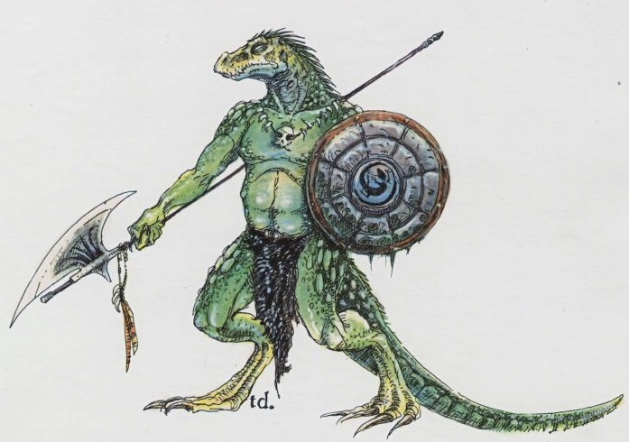
The next time we see a lizard man is the Monster Manual (1977), with artwork provided by Dave Trampier. There's a lot of similarity between Tramp's depiction and that of Bell above, like the tattered loincloth, spiny ridges on the head, and serpentine tongue. This is my default mental image of a lizard man, probably because it's the first one I ever saw. 


In the 1980 Rogues Gallery, Jeff Dee provided an illustration of a lizard man – or, rather, a human who was reincarnated as a lizard man by druidic magic. Aside from the additions of bracers and pirate boots, the latter of which are quite common in Dee's artwork, this looks pretty similar to the work of both Bell and Trampier. 
That same year, Grenadier Models acquired the AD&D miniatures license, producing numerous boxed sets of 25mm figures. One of these sets, Denizens of the Swamp, featured lizard men on its cover by Ray Rubin. The lead lizard man looks almost identical to Trampier's version from the Monster Manual. 
The Sinister Secret of Saltmarsh was published in 1981 and contains this piece by Harry Quinn. Once again, we can see the influence of both Bell and Trampier, though I'd say Trampier has the upper hand. Look, for example, at the skull necklaces the lizard men are wearing, as well as their shields.
The module's immediate sequel, Danger at Dunwater (1982), also features lizard man art, this time depicted by Timothy Truman. Truman's take on the monster is much more bestial and savage.
The same year, the AD&D Monster Cards appeared. Jim Roslof offereed us his take on the lizard man, which doesn't differ all that much from the one found in the Monster Manual. Note again the presence of the skull necklace.
The 1983 Dungeons & Dragons cartoon series featured lizard men several times during the course of its run. Here's a trio of them, one of which (again) wears a skull necklace.

Jim Holloway's depiction of lizardmen in the AD&D Second Edition Monstrous Compendium is notable for downsizing the head and back ridges while also extending them to the end of the tail. Holloway also shortened the snout and shrank the size of the mouth. 

Tony DiTerlizzi's interpretation of lizard men appeared in the 1993 Monstrous Manual. It's very distinctive in many ways, such as the legs. Interestingly, DiTerlizzi gave the lizard man a polearm that looks very similar to the one Greg Bell included in his original illustration. I wonder if this was intentional.
Lizard men are not monsters about which I think a great deal, so it was instructive to take a look at their depiction during the TSR era. While there are undoubtedly many I've not included here – feel free to post your favorites in the comments below – what strikes me most about the ones I have included is how similar they are. Greg Bell laid a foundation in 1975 that Dave Trampier then built upon; all subsequent artists have either directly copied or slightly altered their work. 

Monday, July 22, 2024

A (Very) Brief Pictorial History of Mind Flayers

The people have spoken, which means I shall continue this series for a while longer. In reviewing the suggestions offered by readers, one of the more popular ones was the mind flayer. Since this tentacled monstrosity is also my favorite Dungeons & Dragons monster, I thought it'd make sense to kick off the next round of these posts with a look at mind flayers (or illithids, as they were called in Descent into the Depths of the Earth). 

Though the mind flayer first appears in issue #1 of The Strategic Review (Spring 1975), the first illustration of it does not appear until a year later, in Supplement III, Eldritch Wizardry (1976), as drawn by Tracy Lesch. Despite how early it is, this is clearly recognizable as the monster of later depictions – a rare instance when someone other than Dave Sutherland laid the esthetic foundations upon which later artists would build.


Speaking of Dave Sutherland, here's his take on the mind flayer from the Monster Manual (1977). You can see that he was riffing off Lesch's original conception, right down to having four facial tentacles and a preference for high-collared robes of the sort favored by Ming the Merciless.

Like the kobold, the mind flayer gets two illustrations in the Monster Manual. However, this second illustration is not by Sutherland but rather by Tom Wham. Though humorous in tone, Wham's art shows a mind flayer that looks very close to its predecessors. He even includes the skull on the monster's belt. (Also of interest is that one of the illithid's victims is a halfling.)

The aforementioned Descent into the Depths of the Earth (1978) not only gives us the name illithid but also this terrific illustration (by an uncredited artist that I nevertheless think is Dave Trampier). Again, note the similarities to its predecessors.
1980 gave us several different illustrations of mind flayers, starting with this one from The Rogues Gallery by Erol Otus:
We get another, from Jeff Dee this time, in Expedition to the Barrier Peaks. It's one of my favorites of all time, probably because it's different. Rather than showing the illithid in a high-collared robe like every previous artist, Dee puts him in a sci-fi uniform, wielding technological devices – and it feel right. I can't be certain, but I suspect this illustration is the origin of the widely held notion that mind flayer are from another world (or even the future).
1980 also brought us the first mind flayer miniature from Grenadier Models. By most standards, it's pretty goofy looking, but you can see, if you look carefully, that it's heavily inspired by Sutherland's Monster Manual illustration. For example, the mini has similar sleeve decoration and he's wearing the same strange harness seen in the MM.
The next year, in 1981, AD&D modules D1 and D2 were combined together under a single cover, with the addition of some new art. One of those pieces of art appeared on the back cover of the module. Drawn by Bill Willingham, this is the first time we've seen a mind flayer in color.
In October 1983, in issue #78 of Dragon, Roger E. Moore's "The Ecology of the Mind Flayer" appeared, accompanied by a Roger Raupp illustration. What's notable about this illustration is that the illithid is not wearing a high-collared robe, but he is wearing that harness seen in previous illustration.
Citadel Miniatures briefly held the license for AD&D miniatures and produced several mind flayers in 1985, such as the one below. The high-collared robe returns once more.
By 1987, the license passed to Ral Partha. The company held the license for almost a decade and, during that time, they produced this mind flayer miniature:
I don't know precisely when this mini was produced, so, if anyone knows, please let me know in the comments. This is important for a reason that will become apparent shortly.

For the 1989 Second Edition Monstrous Compendium, we get an illustration from James Holloway. Though some of the details are different – notice the brain you can see inside the mind flayer's head – but it's still not far from what we've seen many times before, including the high-collared robe.
Finally, there's 1993's Monstrous Manual whose depiction was done by Tony DiTerlizzi.

The illustration looks just like the Ral Partha mini above – unless it's the other way around. That's why I'm curious about when the miniature was released. My suspicion is that the DiTerlizzi illustration came first, but I cannot prove it.

With that, we come to the end of my brief look at mind flayer artwork from the TSR era of Dungeons & Dragons. I know I've probably overlooked a lot of illithid illustrations from Second Edition, like the one on the cover of Spelljammer, but I've already presented enough, I think, to give a good sense of how these monsters were presented during the first two decades of D&D. However, if you can recall any illustrations of mind flayers you think are especially worthy of comment, let me know. 

Monday, July 8, 2024

A (Very) Partial Pictorial History of Trolls

It's well known that, in populating the bestiary of Dungeons & Dragons, Arneson and Gygax regularly looked beyond mythology and folklore for inspiration. Such is obviously the case with the troll, which borrows heavily from the monster's description in Poul Anderson's Three Hearts and Three Lions right down to its green color and ability to regenerate. Unlike many of the other monsters we've looked at in this series, the troll's appearance is remarkably consistent during the TSR era of D&D. Despite the large number of artists who've drawn this horrid creature, nearly all of them seem to be using its initial appearance in 1977's Monster Manual as a guide.

In point of fact, the troll appears twice in the MM, both times drawn by Dave Sutherland. The first is on the cover:

Perhaps because it's likely the first time I ever saw a D&D troll, I've always been quite fond of this particular illustration of it. The interior of the book gives us this second depiction:
This second piece is unusual in that it depicts the same monster from two angles, like a model sheet. I can't think of any other monsters drawn this way in the Monster Manual. 

During the same year, Minifigs produced a figure of a troll that looks almost identical to that of Sutherland's illustration (unless the inspiration goes in the other direction). In any case, the troll's primary physical characteristics seem to be its tall, lanky body; tooth-filled mouth, long nose, black, deep-set eyes, and bristly black hair atop its elongated head. 
The next year, 1978, sees quite a large number of troll illustrations, starting with this one by Dave Trampier, which appeared in module G3, Hall of the Fire Giant King:
Though Tramp's style is quite different from Sutherland's, his trolls nevertheless look identical. Speaking of Sutherland, here's another one by him, this time from module D1, Descent into the Depths of the Earth, about which I've posted before, because it's a favorite of mine.
What a terrific piece! Not only is it a great battle scene, featuring men in historical armor fighting a band of trolls, it also includes possibly the only depiction of the severed body parts of a troll fighting independently. It's such a signature element of the monster that I'm surprised there are no other such depictions (you'll tell me if I'm wrong in the comments).

Tramp returns for this fun illustration from the Players Handbook:
1980 brings us more trolls, starting with a Grenadier Models miniature that looks very much like the Sutherland original:
Then there's this one by Jeff Dee, appearing in the Arthurian Heroes section of Deities & Demigods
1981's Fiend Folio introduces us to several new troll variants. Though they are different sub-species, you can still see a "family resemblance," starting with this giant troll by Russ Nicholson:
Then there's the giant, two-headed troll, another illustration by Dee:
At the dawn of the Second Edition era, Jim Holloway provides this image of a troll for the Monstrous Compendium. Despite its small alterations to the template late down in 1977, this is still very recognizable as the same creature Sutherland originally drew.

Finally, there's Tony DiTerlizzi's take from the Monstrous Manual, which is – again – just a variation on Sutherland's. There's a reason why I continue to argue that Dave Sutherland is perhaps the single most important and influential artist in the game's history
So, what have I missed? Are there any notably different takes on trolls during the TSR era? Or do they all follow in Sutherland's footsteps as these do?