
On some level that's a shame, because I continue to think the evolution of fantasy art is a fascinating subject, especially for those of us who favor the esthetics of earlier times. Because of this – and because I've found myself unexpectedly busy over the last week and thus unable to devote myself properly to Pulp Fantasy Library – I've decided to pen a new entry in Pulp Fantasy Gallery today. Whether I'll continue to do so on a regular basis, I don't know.
For now, let's take a look at five different cover illustrations created for the various English editions of Fritz Leiber's Swords and Deviltry. The first of these was published by Ace in May 1970 and featured artwork by Jeff Jones. Ace continued to use variations on this cover for more than fifteen years on its US editions of the book.

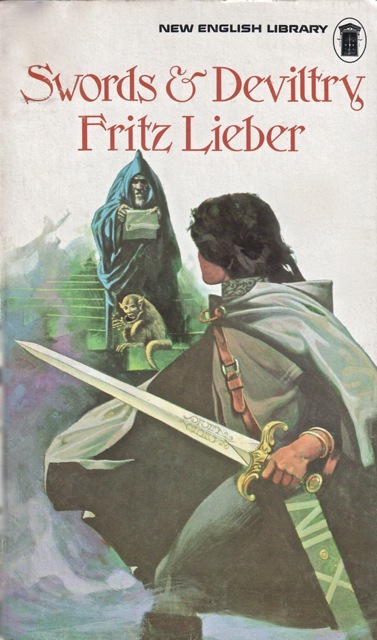
Not long thereafter, in December 1971, the New English Library released a UK edition of the book. The cover (by an unknown artist) bears a clear similarity to the Ace cover above.
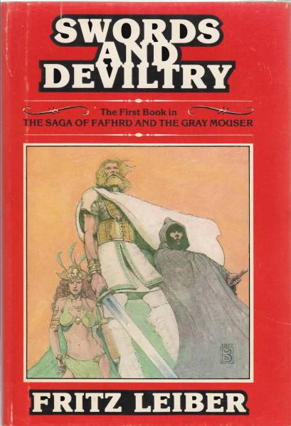
A second UK edition appeared in December 1977 from George Prior Publishers, with artwork by Wayne Barlowe.
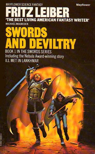
Just two years later, a third UK edition appeared from Mayflower, illustrated by Peter Elson.
Continuing a theme, we have a fourth UK edition, this time from Grafton in July 1986, with Geoff Taylor doing the cover.


The UK 1986 Grafton version is the one I have! :)
ReplyDeleteBasically Fafhrd & Mouser didn't noticeably change. Very unlike Conan's transformation between the 1930s Brundage and 1970s Buscema & Frazetta version, which I think is still iconic.
Thanks for these. I think that these pre-digital age covers are much more evocative than the modern "FRPG" style of art. The heroes still seem to be mortal men rather than superhuman, and for me there's more energy and dynamicism, possibly because my imagination is filling in more gaps than the technically better modern stuff.
ReplyDeleteBTW, as a left-hander I notice that Mouser is presented as a southpaw in the first two and final one. Perhaps he's ambidextrous?
PS: I think that the second and penultimate ones are very D&D!
ReplyDeleteJones' is by far and away the best artistically. The others fairly bland.
ReplyDeleteI'm so used to Wayne Barlowe's more "realistic" art from his Guide to Extraterrestrials and his books Expedition and Inferno, sot it's interesting to see more stylized coloring here. I'm sure I've seen more and just not known it was him.
ReplyDeleteJones's has a wonderfully evocative look and great colors. Most of the others aren't bad, just more grounded to varying degrees. My biggest irritation with modern cover art is when they go for simple, flat images, sometimes photos, of models standing still in their costumes.
ReplyDelete"A second UK edition appeared in December 1977 from George Prior Publishers, with artwork by Wayne Barlow." You have a misspelling here that sent me down a blind alley: Wayne Barlowe's family name ends in an "e." A volume with that same cover and general trade dress was published in hardback in America (Boston, specifically) under Gregg Press, also in 1977.
ReplyDeleteThanks for the correction. I'll amend the post.
DeleteProbably wild speculation on my part, but I wonder if the second one is by Angus McBride? The details in the sword hilt, leather belt buckle and shading in the cloak remind me of his style. He'd certainly be active in 1971 and he started doing the Osprey military history books in the late 70s.
ReplyDeleteWhen we moved here in 1983 our downtown library had a full set of the red cover hardbacks, which was my introduction to F&tGM- takes me way back.
ReplyDeleteOf the above, I prefer the second cover (the 1st UK edition); it's a little more evocative than the rest, resonates more for me than the others. Do continue this series, it's fascinating. I'm catching up on the older posts in the category.
ReplyDeleteI concur, the Jones cover is very powerful in its simplicity.
ReplyDelete