Showing posts with label willingham. Show all posts

Friday, August 23, 2024

Lament for a Lost Age

One of my most popular posts is "The Ages of D&D," which I wrote more than fifteen(!) years ago, on January 11, 2009. In it, I attempted to sort the history of Dungeons & Dragons into a series of "ages" – Golden, Silver, Bronze, etc. I was still fairly new to the blogging game when I wrote that post and, while I largely stand behind its conclusions, I now concede that I relied more on hazy memories and intuitions than on anything approaching "research." Perhaps one day I'll offer a more considered discussion of the Ages of D&D, complete with evidence to support my assertions, but, for the purposes of the present post, I'm going to go with the categories and timeframes I established back in 2009.

In the original post, I assert that the Golden Age of D&D lasted almost a decade, from 1974 until 1983. In retrospect, I'm not entirely sure why I chose 1983 as the end point of the Golden Age. My guess is that it I saw the arrival of Dragonlance in 1984 as marking a definitive break with the way the game had previously been marketed and played. Even so, if you read my original post, you'll see that I allow for the possibility that the Golden Age actually ended somewhere 1979 and 1981, with either the completion of AD&D or the publication of Moldvay's Basic Set being important milestones, albeit for different reasons. Even then, I think I recognized that the game had already changed by the time I first encountered it in late 1979 and indeed that I might never have encountered it at all had it not been for those changes.
I've previously discussed the foundational role played by David C. Sutherland III in giving birth to the esthetics of Dungeons & Dragons. Sutherland's grounded, vaguely historical illustrations were, for several years, the face of D&D. During the three-year period between 1975 and 1978, Sutherland and Dave Trampier were together responsible for nearly all the art that appeared in TSR products, not just Dungeons & Dragons but other games, too, like Gamma World and Boot Hill. Not bad for a couple of "talented amateurs." is it?

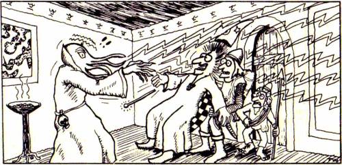
By now, you can probably guess where I'm going with this: the end of the Golden Age is marked by a shift in the game's esthetics away from the extraordinary ordinary artwork of Sutherland and Trampier and toward something else – just what is a different question. Nevertheless, consider that, in 1979, TSR began to expand its stable of artists, hiring Erol Otus (whose TSR artwork debuted in later printings of the AD&D Dungeon Masters Guide) and David "Diesel" LaForce (ditto). The next year, in 1980, TSR added Jeff Dee, Jim Roslof, and Bill Willingham as well. The cumulative effect of their artistic talents is unmistakable.
The change in the look of Dungeons & Dragons products in the aftermath of hiring these five artists cannot be denied. Pick up almost any D&D book or module published between 1979 and 1981 and compare it to its predecessors. Earlier products have a stiff, staid, "serious" look to them that, to my eyes at least, shows some continuity with the look and feel of the historical wargames out of which the hobby grew. By contrast, the D&D books and modules from the '79 to '81 period are bright, bold, and dynamic. They are clearly the work of different artists with very different esthetic sensibilities.

These sensibilities ranged from the comic book inflected art of Dee and Willingham to the more restrained heroic action of Roslof and the underground comix stylings of Otus. Whether this shift was "better" or "worse" than what preceded it is immaterial. What matters is that it happened and it denotes the beginning of a new phase in the history of Dungeons & Dragons – the mass marketing of the game to an audience beyond college age and older wargamers whose points of reference were the pulp fantasy authors and stories that I've attempted to draw attention to over the years.
I entered the hobby right smack in the middle of this period of D&D history. After my initial exposure to Dungeons & Dragons through the Holmes Basic Set and In Search of the Unknown, many of my earliest memories of the game are filtered through the artwork of Dee, Otus, Willingham, and the other newcomers to TSR. While only a few of my Top 10 Illustrations of the Golden Age – bear in mind I wrote those posts before I started to re-evaluate my thoughts on the matter – are the work of these artists, that does nothing to diminish the impact they had not just on me but on D&D's presentation to the wider world. For a large cohort of new players, the 1979–1980 hires defined Dungeons & Dragons in much the same way that Sutherland and Trampier did before them.

But, like all such periods of roiling creativity, it did not last long. By 1982, many of these artists no longer worked at TSR and those that remained, like LaForce, shifted over to cartography, doing illustrations only sporadically. New artists, like Larry Elmore and Jeff Easley, appeared on the scene around the same time, lending their considerable talents to depicting the fantastic realism of the dawning Silver Age. Lots of readers slightly younger than me no doubt have similar feelings of affection toward this next group of artists, as they should, but, for me, many of my fondest memories of Dungeons & Dragons will be forever intertwined with that first "new" generation of artists whose arrival on the scene coincided with my own.

Monday, August 12, 2024

A (Very) Partial Pictorial History of Troglodytes

Since last week we looked at lizard men, I thought it would make sense to examine troglodytes next, since they're both humanoid reptilian monsters. There are, of course, lots of differences between them, starting with their alignment – troglodytes are Chaotic Evil, while lizard men are Neutral – I can nevertheless easily imagine someone confusing the two. With that in mind, how did TSR era Dungeons & Dragons visually distinguish between them?

The earliest illustrations I can find of troglodytes come from the AD&D Monster Manual (1977), both by Dave Sutherland. Sutherland gives trogs a much shorter snout and a large crest on their heads. These are both features that can be found in most of the depictions that follow.

The second illustration from the Monster Manual gives us a better look at these monsters' legs, as well as their scaly skin. Both pieces of art hide the troglodyte's tail in shadow, but it is there, if you look carefully.
Sutherland provides two additional depictions of trogs on the front and back covers of the original 1978 release of the module Descent into the Depths of the Earth. Here's the front cover, which shows them as looking little different from those in the Monster Manual.
The back cover of the module is interesting, because it depicts not only a troglodyte, but also an exceptionally long-nosed troll and a bugbear.
A troglodyte next appears in the Tom Moldvay D&D Basic rulebook (1981), as drawn by Bill Willingham. Willingham's take on the monster is clearly inspired by Sutherland's, but with a few new elements. First, ridges or frills like the head crest also appear on both arms. Also, the monster's face looks a bit more fishy or amphibian, with large, blank eyes and a mouth that reminds me of a catfish's. 
In 1982, as part of the AD&D Monster Cards, we get Jeff Dee's nifty take on troglodytes. Once again, it's broadly consonant with Sutherland's original, but Dee's version has a slightly more dinosaur-like appearance. Coupled with the stone axe it's holding, Dee gives the trogs a kind of Lost World flavor that I really like.
The same year, we get Jeff Easley's version in the AD&D module The Lost Caverns of Tsojcanth. Though recognizable because of their head crests, these troglodytes look a bit fishy in appearance. Take note of their eyes and mouths, not to mention their scales, which strike me as more piscine than reptilian in appearance. 
1982 seems to have been a big year for troglodyte illustrations, because we get one by Jim Holloway in Against the Cult of the Reptile God. Though we don't get to see the entirety of the monster, what we do see suggests that it's closer to Sutherland than any of the other artists we've examined. It's also a return to a more clearly reptilian depiction, as you can see from its mouth and eyes.

In 1985, Citadel Miniatures released a troglodyte miniature that's also very reptilian in appearance. If you look carefully, you can see not only its crocodile-like scales but also its cranial ridges (which are smaller).

Two years later, in 1987, Ral Partha gained the AD&D miniatures license and released its own version of the troglodyte. Here's a trio of them, which, to my eyes anyway, don't look all that different than traditional depictions of lizard men. They do have the cranial ridges at least, though, like Citadel before them, they're much smaller than in previous depictions of them.
AD&D Second Edition's Monstrous Compendium (1989) saved the troglodyte for its second release (MC2), which suggests that TSR didn't see troglodytes as being as important as lizard men, who appeared earlier. True or not, we get this absolutely atrocious illustration of them (by Daniel Horne) that looks like an anthropomorphic horny toad with some serious dental problems. Yikes!
Then, in 1993, Tony DiTerlizzi provides this illustration for the Monstrous Manual. It's something of a break with previous versions. DiTerlizzi opts for a newt-like, amphibian appearance rather than a reptilian one.
Reviewing this sampling of troglodyte artwork from the TSR era of Dungeons & Dragons, I'm struck by two things. First, there is some degree of consistency in the depiction of these monsters, with most artists looking to Dave Sutherland's Monster Manual art as a foundation. Second, each post-Sutherland illustrator (with the possible exception of Holloway) put his own spin on the troglodytes by giving them some fish-like or amphibian characteristics. I can certainly understand why they might do this, since it's a good way to distinguish trogs from lizard men (and other reptile men) visually. At the same time, I think this variability contributes to rather than diminishes the conflation of troglodytes and lizard men, which likely explains why my vision of troglodytes is very close to that of Sutherland.

How about you? How do you view troglodytes?

Thursday, August 8, 2024

Retrospective: Revolt on Antares

While I've briefly touched on TSR's 1981 mini-game Revolt on Antares a couple of times before, I've never done a proper Retrospective post on it. I've decided to rectify that this week, both because it's an excellent, fun-to-play little hex-and-chit wargame and because, of all TSR's mini-games, it's the one with which I had the most experience playing. Consequently, I've got a lot more to say about Revolt on Antares compared to its seven sister games published over the course of 1981 and 1982.

Before getting to the game itself, I'd briefly like to draw attention to its place within the history of TSR. Revolt on Antares came out in '81, during a time when TSR was rapidly expanding both its release schedule and its ambitions. Though Dungeons & Dragons remained the company's bestselling line of products by far, there seems to have been genuine concern that its popularity was faddish and could not be sustained forever. TSR, therefore, began to experiment with other games (and approaches to games) as a hedge against the possible collapse in interest in D&D.

Mini-games, like Revolt on Antares, were part of that experiment. Coming on a clear plastic case, the game consisted of a short, 16-page rulebook, a sheet of cardboard counters, a colored map, and a pair of dice. Tom Moldvay designed the rules, while Kevin Hendryx served as its developer. Graphically, it makes full use of TSR's stable of young artists, like Jeff Dee, Dave LaForce, Erol Otus, Jim Roslof, and Bill Willingham, all of whom I'd consider representative of this experimental period in the history of the company. Dee's cover is especially memorable to me, probably because of how I often I played Revolt on Antares with my friends at the time.

As wargames go, this one is quite simple – but that was a big part of its appeal to me. Though I knew a lot of guys into wargames in my youth, I never really devoted much effort to playing them myself, with a couple of exceptions here and there. For the most part, this was simply a matter of not being sufficiently interested in wargames to devote the time necessary to learn and play them. I'd much rather have been playing roleplaying games than the Rise and Decline of the Third Reich

What immediately appealed to me about Revolt on Antares was its science fiction setting. I've been a huge fan of SF since I was a young child, growing up in the immediate aftermath of the Apollo program and watching reruns of Star Trek on a grainy black-and-white TV with my aunt. And, of course, like all little boys at the time, I was a fan of Star Wars. The combination of these facts with my TSR fanboyism made it perhaps inevitable that I'd purchase Revolt on Antares almost as soon as I saw it. 

The simplicity was, as I've already noted, a plus, especially when compared to other SF wargames I attempted to play around the same time. The rulebook quickly establishes the basic scenario:

Imirrhos, ninth planet of the star Antares, lies on the edges of Earth's Imperial Terran Empire. As the Empire grows weaker, Imirrhos boils with unrest and intrigue. The seven local ruling families (or "houses") fight for power. Some want the Terrans to leave, others need Imperial support. A few know of the Silakka, an alien race that is waiting to invade ...

The rulebook then offers up three different scenarios for play. The basic scenario is for two players and concerns the revolt against Terra. One player takes the role of a house leader leading the revolt, while the other is the Imperial Terran consul, who is attempting to crush the rebellion. The second scenario is also for two players and concerns the defense of Antares against the invading Silakkans. The third – and, in my opinion, most fun – scenario is for 2 to 4 players, with each player taking on the role of one or more houses as they jockey for control of Imirrhos. 

A big part of the appeal of Revolt on Antares are its characters. Each of the houses is led by a character with both a name and a unique ability. For example, House Orsini is led by Messalina Orsini, whose power of fascination enables her to subvert the loyalty of opposing units, while House Edistyn is led by Nureb Khan Edistyn, whose precognition ability allows him to roll two dice instead of one in combat, taking the best result. In addition, there are "Galactic Heroes" whom you can recruit, like the assassin Corvus Adromeda and Dr. Death, who can animate the bodies of fallen units as zombies. These heroes act much like house leaders in their use but may be recruited by any faction. There are also ancient alien artifacts, such as the Force Cannon and Energy Drainer, whose possession and use adds yet more mayhem into the mix.

Looking back on it now, it's clear that what made Revolt on Antares so appealing to me was its world building. Though the information Moldvay provides about Imirrhos and its inhabitants are as brief as its rules, they are surprisingly evocative. Names like Black Dougal Mackenzie or Ward Serpentine possess a certain mystery that made me want to know more – and, in the absence of such information, my friends and I imagined it for ourselves. That's precisely the stuff from which good games are made and, by that standard, Revolt on Antares is a very good game.

From a purely objective perspective, it's nothing special. As I keep saying, the rules for combat and movement are very, very simple. I'm sure long-time wargamers would justifiably scoff at their lack of depth. I can't really argue against such judgments, except to say that I had a blast playing Revolt on Antares again and again, each time coming up with new ideas about the implied setting of the game – not bad for a little game published four decades ago!

Monday, July 22, 2024

A (Very) Brief Pictorial History of Mind Flayers

The people have spoken, which means I shall continue this series for a while longer. In reviewing the suggestions offered by readers, one of the more popular ones was the mind flayer. Since this tentacled monstrosity is also my favorite Dungeons & Dragons monster, I thought it'd make sense to kick off the next round of these posts with a look at mind flayers (or illithids, as they were called in Descent into the Depths of the Earth). 

Though the mind flayer first appears in issue #1 of The Strategic Review (Spring 1975), the first illustration of it does not appear until a year later, in Supplement III, Eldritch Wizardry (1976), as drawn by Tracy Lesch. Despite how early it is, this is clearly recognizable as the monster of later depictions – a rare instance when someone other than Dave Sutherland laid the esthetic foundations upon which later artists would build.


Speaking of Dave Sutherland, here's his take on the mind flayer from the Monster Manual (1977). You can see that he was riffing off Lesch's original conception, right down to having four facial tentacles and a preference for high-collared robes of the sort favored by Ming the Merciless.

Like the kobold, the mind flayer gets two illustrations in the Monster Manual. However, this second illustration is not by Sutherland but rather by Tom Wham. Though humorous in tone, Wham's art shows a mind flayer that looks very close to its predecessors. He even includes the skull on the monster's belt. (Also of interest is that one of the illithid's victims is a halfling.)

The aforementioned Descent into the Depths of the Earth (1978) not only gives us the name illithid but also this terrific illustration (by an uncredited artist that I nevertheless think is Dave Trampier). Again, note the similarities to its predecessors.
1980 gave us several different illustrations of mind flayers, starting with this one from The Rogues Gallery by Erol Otus:
We get another, from Jeff Dee this time, in Expedition to the Barrier Peaks. It's one of my favorites of all time, probably because it's different. Rather than showing the illithid in a high-collared robe like every previous artist, Dee puts him in a sci-fi uniform, wielding technological devices – and it feel right. I can't be certain, but I suspect this illustration is the origin of the widely held notion that mind flayer are from another world (or even the future).
1980 also brought us the first mind flayer miniature from Grenadier Models. By most standards, it's pretty goofy looking, but you can see, if you look carefully, that it's heavily inspired by Sutherland's Monster Manual illustration. For example, the mini has similar sleeve decoration and he's wearing the same strange harness seen in the MM.
The next year, in 1981, AD&D modules D1 and D2 were combined together under a single cover, with the addition of some new art. One of those pieces of art appeared on the back cover of the module. Drawn by Bill Willingham, this is the first time we've seen a mind flayer in color.
In October 1983, in issue #78 of Dragon, Roger E. Moore's "The Ecology of the Mind Flayer" appeared, accompanied by a Roger Raupp illustration. What's notable about this illustration is that the illithid is not wearing a high-collared robe, but he is wearing that harness seen in previous illustration.
Citadel Miniatures briefly held the license for AD&D miniatures and produced several mind flayers in 1985, such as the one below. The high-collared robe returns once more.
By 1987, the license passed to Ral Partha. The company held the license for almost a decade and, during that time, they produced this mind flayer miniature:
I don't know precisely when this mini was produced, so, if anyone knows, please let me know in the comments. This is important for a reason that will become apparent shortly.

For the 1989 Second Edition Monstrous Compendium, we get an illustration from James Holloway. Though some of the details are different – notice the brain you can see inside the mind flayer's head – but it's still not far from what we've seen many times before, including the high-collared robe.
Finally, there's 1993's Monstrous Manual whose depiction was done by Tony DiTerlizzi.

The illustration looks just like the Ral Partha mini above – unless it's the other way around. That's why I'm curious about when the miniature was released. My suspicion is that the DiTerlizzi illustration came first, but I cannot prove it.

With that, we come to the end of my brief look at mind flayer artwork from the TSR era of Dungeons & Dragons. I know I've probably overlooked a lot of illithid illustrations from Second Edition, like the one on the cover of Spelljammer, but I've already presented enough, I think, to give a good sense of how these monsters were presented during the first two decades of D&D. However, if you can recall any illustrations of mind flayers you think are especially worthy of comment, let me know. 

Wednesday, July 17, 2024

Retrospective: Assault on the Aerie of the Slave Lords

Since I've already done Retrospective posts about the first, second, and fourth modules in the "Slave Lords" series, I thought it only proper that I should finally do one on the third, Assault on the Aerie of the Slave Lords. Written by Allen Hammack (best known for The Ghost Tower of Inverness) and released in 1981, module A3 is probably my least favorite of the four, perhaps because it reveals its origins as a tournament module even more obviously than do the others in the series. So much of its content and structure is contrived to test the skills of its players that it feels obviously artificial. That's a shame, because there are some genuinely good ideas here that, presented differently, might have been more successful. 

Having destroyed a caravan fort of the slavers in the previous module, the characters are now investigating a hidden mountain city reputed to serve as one of their main bases of operation. Reaching the city first requires a trek through cave tunnels to find its entrance. Once there, the characters must then descend into its sewers to locate the council chamber of the slave lords. Only at this point can they face off against them and hope to put an end to their depredations. 

If all that sounds convoluted, even improbable and tedious, you're right. There's a reason I called this module contrived. It's presented as a series of gauntlets – make it through the caves to find the city; through the city to find the sewers, etc. – the characters must run, each one filled not only with a lot of enemies but also with tricks and traps of all kinds. This probably works really well in a tournament, where each gauntlet is part of a different round of play, but, as a module to be used in campaign play, it leaves a lot to be desired.

The situation is made worse, I think, by the fact each section includes elements that strain credibility. For example, the mountain "caves" the characters must navigate to reach the city are actually a mazelike series of worked stone corridors. The slave lords clearly went to a lot of trouble to make them and then fill them with monsters and traps. The "city" of Suderham that serves as their base is really quite small (about 70 locations), a great many of which are taverns and "houses of ill repute." The referee is encouraged to flesh it out more fully, based on some limited details provided in the module. Perhaps that's enough, given its purpose here, but I find myself wishing for more. Almost nothing in this module feels naturalistic to me. Instead, it's all here to support a tournament experience and it shows.

Worst of all is the ending. Because this is the penultimate module in the series, the characters clearly cannot defeat the slave lords once and for all. Likewise, the next and final module in the series, begins with the characters defeated, stripped of their equipment, and thrown into a dungeon from which they must escape. Consequently, the module provides numerous ways to ensure that, no matter what else happens, the characters are captured so that they be thrown into said dungeon. I fully understand why this is the case, especially in a tournament situation, but it's deeply unsatisfying nonetheless. 

Despite all of my complaints, there's still a lot to like here. Suderham, while smaller and less detailed than I'd have wanted, has potential, given its location in a volcanic crater and nefarious character – a pity that it's unceremoniously destroyed in the next module. Likewise, the idea of exploring the sewers and encountering weird monsters, like a killer mimic and a crossbow-wielding minotaur, is great, even if its execution leaves something to be desired. Then there's the art by TSR's stable of Electrum Age artists like Jeff Dee, Bill Willingham, and Erol Otus, most of which is quite good and probably deserving a post of its own. Such a shame they weren't put to better use!
Speaking of halflings ...

Monday, July 15, 2024

A (Very) Brief Pictorial History of Halflings

For today's look at the art of TSR era Dungeons & Dragons, I've decided to step away from monsters and instead focus on something a little different: halflings. Halflings, as everyone knows, originate in the works of J.R.R. Tolkien and have little or no antecedents in real world myth or legend. Despite Gary Gygax's well-known dislike of The Lord of the Rings, he was, however, a fan of The Hobbit, which introduced halflings – or, rather, hobbits – to the world. Both books were very popular among fantasy aficionados during the early 1970s, when D&D was born, so it's not at all surprising that Tolkien's diminutive creations should find their way into the game (along with several of his monsters). Of course, this usage was completely unauthorized and legally dubious. Saul Zaentz's Middle-earth Enterprises threatened legal actions against TSR for its usage of "hobbit" (and "ent" and "Nazgûl," I believe) in OD&D. Subsequent printings of the game, such as the one I own, changed "hobbit" to "halfling" and that term then became the common one in Dungeons & Dragons. 

There are no clearly identified illustrations of halflings in OD&D. However, there is this piece of Greg Bell artwork that I think is supposed to be a halfling:

As you can see, the illustration is crude and looks more like the common depiction of a leprechaun – note the hat – than what we now expect of a hobbit or halfling. However, there are no leprechauns in OD&D, playable or otherwise. Further, if you look carefully, you can see the figure above is using a sling in his right hand, a signature weapon of halflings in both OD&D and the Fantasy Supplement to Chainmail. 

The earliest unambiguous illustration of a halfling comes in the AD&D Monster Manual by David Sutherland. Sutherland's depiction is broadly consonant with Tolkien's descriptions of hobbits, including their hairy feet.
The next year, in 1978, Sutherland illustrated module B1, In Search of the Unknown. One such illustration shows a short figure I assume is meant to be a halfling. Because he has no beard, I don't think he's supposed to be a dwarf, but there's no way of knowing for certain.
Next up is Bill Willingham's take on a halfling from the 1980 reprint of White Plume Mountain – even though it actually depicts a polymorphed efreeti masquerading as a halfling. Once again, furry feet à la Tolkien are visible.
1980 also saw the release of Slave Pits of the Undercity, whose cover features this towheaded halfling by Jeff Dee.
The Tom Moldvay D&D Basic Set (1981) includes this depiction of several different character classes by Dave LaForce. In the bottom right-hand corner, you can see a halfling, armed with a bow. 
The Cook-Marsh Expert Set (1981) includes one of my favorite depictions of a D&D halfling (by Jeff Dee). 
Frank Mentzer's 1983 revisions of the Basic and Expert Sets include many illustrations of halflings, probably the most of any TSR edition of Dungeons & Dragons. For the purposes of space, I'm including only a single example (by Larry Elmore), though there are many other excellent options to choose from.
The same year saw the release of The Shady Dragon Inn, a supplement filled with artistic renderings of every conceivable D&D character type, including halflings. It also features portraits of characters based on the LJN D&D toy line, such as Figgen the Halfling Thief (whose toy, ironically, was never actually produced as far as I know). This is Timothy Truman's version of Figgen:
In the third episode of the first season of the Dungeons & Dragons cartoon series (also 1983), we're introduced to a character called Hector the Halfling (who's actually bad guy Venger disguised by magic). He's the only halfling to appear in the series of looks quite different than all previous depictions of the race. He lacks hairy feet, but he wears peculiar pants that cover half of his oversized feet, leaving the toes visible. He also has pointed ears, an inconsistently portrayed aspect of D&D halflings.
The Forgotten Realms Campaign Set (1987) presents us with another slightly anomalous vision of halflings. Jeff Easley's halflings are skinny, goofy-looking little people with mildly larcenous demeanors. They still have big, slightly hairy feet, but otherwise strike me as quite unique.
Jim Holloway's version of halflings from 1989's Monstrous Compendium is, in my opinion, a little creepy, with his heavy eyebrows, half-lidded eyes, and languorous pose. He also boasts a veritable mane of hair that starts at his ankles and then drapes over the tops of his feet. To my eyes, the overall effect is suggestive of a satyr rather than a hobbit and I can't say I'm keen on it.
Tony DiTerlizzi's piece from the 1993 Monstrous Manual is better, exuding a kind of scrappy heroism that works well for halflings. 
As you can see from just this small sampling of illustrations, there's never been a fully consistent conception of halflings. I wouldn't be surprised if this was driven, at least in part, by a desire to legally distinguish D&D's diminutive race from Tolkien's hobbits. At the same time, there can be no question that, at base, halflings are hobbits in all but name. The presence of hairy feet – a characteristic derived from Tolkien – in nearly all of the above pieces of artwork demonstrates that. If the intention were to avoid comparisons to the denizens of Middle-earth, you'd think removing that feature would have been at the top of the art director's list. (Interestingly, the kender of Dragonlance pointedly wear shoes – take that, Saul Zaentz!).

There's a lot more to be said on this topic, I think, but I'll leave that to another day. For now, I'm interested in your thoughts about both the art and the place of halflings in your own D&D campaigns. Do you use them? Do you, like me, replace them with another race? Or you omit them entirely? 

Wednesday, January 4, 2023

Retrospective: Mad Mesa

Every now and then, as I consider the subject of the next entry in this series, I come across one whose primary interest is not its content so much as its form. That's the case with Mad Mesa, the very first module produced by TSR in 1981 for use with Boot Hill. This fact alone makes it notable. While the module format was originally created for use with Dungeons & Dragons, TSR would eventually publish modules for all of their roleplaying lines, though most were never as extensive (or successful) as those for D&D. Boot Hill would eventually have only five modules, the lowest number, I believe, of any TSR RPG. This small number gives each published entry added weight when looking at it.

Consider, too, the module's byline: "by Jerry Epperson and Tom Moldvay." Tom Moldvay is a name that needs no introduction to anyone reading this blog, but Jerry Epperson? Who is he? That's a good question and I wish I could provide a good answer. He seems to have been a freelance writer rather than an employee of TSR, like Moldvay. He'd later go on to contribute to a handful RPG products over the years (for GURPS, Marvel Super Heroes, and Shadowrun), but doesn't appear to have otherwise left a significant mark on the hobby. Epperson dedicates Mad Mesa to, among other people, Moldvay, "who took an idea and breathed into it the essence of life." This suggests to me that Moldvay had a much bigger hand in the final product than his secondary credit in the byline might imply.

Like most modules of the time, Mad Mesa is 32 pages long and is divided into two uneven sections, along with a map on its interior cover. Here's what part of the map looks like, because it's quite unusual:

As you can see, there are numbered buildings, as one might expect on map of this kind. However, there are also numbers located elsewhere, such as on the streets of the titular town of Mad Mesa. Some of these numbers are circled. The numbers are all used not merely as part of a traditional map key but as entries in a solitaire adventure scenario that makes up the bulk of the module. Whenever the solo player's character enters an area with a number, he consults the appropriate entry in the book to see what he encounters. Entries with circles around them indicate "chance encounters," which is to say, a random encounter, the results of which are determined by consulting tables also in the book.

I find it fascinating that the very first Boot Hill module contains a lengthy solitaire scenario, which takes up 24 of its 32 pages. It's doubly fascinating when you consider that the second part of the module contains a multi-player adventure that depends on the referee's having already played through the solo scenario "so that he or she can use the information to smoothly run the multi-player adventure." Indeed, the multi-player adventure is little more than a more freeform and elaborated version of the solo adventure, which involves the characters having come to the frontier settlement of Mad Mesa just as the long-simmering feud between the Russells and the Kanes – two ranching factions – boils over into violence. 

As presented, both versions of the module's scenario are fairly open-ended and I dare say "Braunstein-like." The characters are caught up in the machinations of larger factions with their own agendas and it's up to the player(s) to navigate this as best they are able, even to the point of playing one faction off against another, Clint Eastwood-style. Of all of TSR's published roleplaying games, Boot Hill seems to have stayed closest to its original miniature wargaming roots and that comes across very clearly in Mad Mesa. Younger gamers or those simply unfamiliar with the history of the hobby might well find this aspect of the module strange, even off-putting, but I find it a useful reminder of where it all began.

Finally, Mad Mesa is worthy of note for one other reason: its artwork. TSR in 1981 had a remarkable and varied bullpen of illustrators and this module makes use of almost all of them. There are thus pieces by Jeff Dee, David "Diesel" LaForce, Jim Roslof, Bill Willingham, and even Erol Otus. It's an incredible lineup, all the more so because they're illustrating a western adventure rather than a fantasy or science fiction one. It's a pity that most of them wouldn't be employed by TSR much beyond the publication date of Mad Mesa, but, during the time they were there, they certainly left an impression.

Wednesday, June 22, 2022

Retrospective: Operation: Rapidstrike!

I have many fond memories of TSR's espionage roleplaying game, Top Secret. My friends and I regularly played it as part of our rotation of RPGs that weren't Dungeons & Dragons. Though Top Secret is not without its problems, we had a lot of fun with it. I typically acted as the Administrator, which meant that it fell to me to come up with the missions for the player character agents. This rarely bothered me; I'd seen enough espionage-related movies and TV shows to have ready sources of ideas. 

Like many referees, though, I sometimes appreciated having someone else do the heavy lifting for me, which is where pre-made adventures like Operation: Rapidstrike! came in. Written by Mike Carr (of In Search of the Unknown fame) and Corey Koebernick (husband of the Jean Wells) and published in 1980, Rapidstrike! is the first adventure module sold separately from the Top Secret boxed set. Consequently, I was quite keen to pick it up after its release, hoping that it would make a nice change of pace from my own "original" scenarios.

The character agents are assigned to infiltrate a pharmaceutical research facility located on an island off the coast of Africa. The facility is owned by a wealthy Frenchwoman, Geneviève Larreau, with a history of anti-Western agitation. Also located on the island is Felix Fendelmann, a Nobel Prize-winning Swiss scientist who disappeared from his laboratory several months previously. Reliable sources suggest that Fendelmann is developing Zucor, "a mind-expanding drug of incredible power," which Larreau hopes to use to undermine the nations of Europe and North America. All in all, it's a fairly typical plot for the pulpy spy thrillers of the era, not too different, for example, from 1969's Bond outing, On Her Majesty's Secret Service.

As an adventure, Operation: Rapidstrike! is, in effect, a dungeon crawl, with the characters sneaking from room to room of Larreau's facility, fighting her guards and evading the traps placed therein. As I would later discover, this is more or less the template of most Top Secret adventures published by TSR. There's not a lot of espionage to be had here; it's mostly an infiltration and elimination module, with the requisite amount of gunplay and associated mayhem. I don't think any of us much minded at the time, since Top Secret's various combat-related sub-systems were among its attractions for us. Likewise, the module was originally intended, as Carr explains in his foreword, for use at a GenCon tournament, which necessitated a fairly straightforward – and deadly – scenario. (I continue to wonder how the history of the hobby might have changed had fewer of TSR's published modules not originated in the tournament scene.)

Nowadays, I'd judge Operation: Rapidstrike! a fair bit more harshly than would my younger self. As I said, it's a rather limited, smash-and-grab situation, more like a special operations mission than something calling for the world's greatest spies. Mind you, that's the eternal problem with espionage roleplaying games: how do you incorporate more than a couple of player characters into a campaign without its becoming a mess? Parties of dungeon explorers make sense, but spies? Not so much, hence the inevitable morphing of the game's ostensible genre into something more closely resembling SEAL Team Six (or, more likely, the A-Team) than anything from James Bond or The Man from U.N.C.L.E.

Despite these criticisms, I nevertheless retain an affection for Rapidstrike! My friends and I enjoyed ourselves while using it, which is the ultimate seal of approval when it comes to entertainment of this sort. Nowadays, I think the module's main value might be in some of its artwork, created by the likes of such legends as Jeff Dee, David LaForce, Bill Willingham, Jim Roslof, and Erol Otus. Otus, in particular, offers up some truly memorable illustrations, such as this one depicting the effects of the drug Zucor on any agent foolish enough to ingest it. Good times!