Showing posts with label otus. Show all posts

Saturday, August 23, 2025

Interview: Geoffrey McKinney

The release of Geoffrey McKinney's Carcosa, an imaginary fifth supplement to OD&D, in 2008 caused quite a stir at the time – so much that I devoted four posts to reviewing it on this blog. What set Carcosa apart was its singular vision of old school fantasy roleplaying seen through the lens of an idiosyncratic interpretation of H.P. Lovecraft. Since I was already devoting the entirety of this month to HPL and his legacy, I thought it might be interesting to ask McKinney a few questions about Lovecraft, Carcosa, and roleplaying games. 

1. What first drew you to the works of H. P. Lovecraft, and how did they shape your vision for Carcosa?

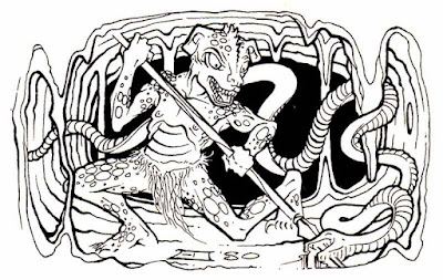
In the spring of 1980, I bought the D&D Basic Set (with the rule book edited by Dr. Holmes and with module B2) and the Monster Manual, and I started playing D&D with some friends who had already been playing for a few months. In the second half of August 1980, I had enough money to buy the Players Handbook, but when I got to the toy store, I decided to instead buy the brand-new Deities & Demigods Cyclopedia (DDG). The Cthulhu Mythos section melted my 10-year-old brain. The gloppy Erol Otus illustrations are still my favorite Mythos illustrations of all, and his Shub-Niggurath is one of the best D&D illustrations of any sort.

The dark, mysterious text accompanying Otus’s art deepened my fascination. In fact, the sixth word of the first sentence left me unsure whether the Mythos was a 20th-century creation or whether some unhealthy ancient men actually believed in and worshiped these beings: “The Cthulhu Mythos was first revealed in a group of related stories by the American writer H. P. Lovecraft.”

The six pages of the Cthulhu Mythos immediately seeped into our D&D games, adding a generous helping of Cthulhoid gods and monsters; dark magics to conjure, dominate, and banish them; and human sacrifice.

Carcosa is basically D&D seen through the lens of “DDG’s Cthulhu Mythos, all the time”.

2. In what ways do you see Carcosa as diverging from Lovecraft’s cosmic horror, and in what ways do you think it reinforces it?

Carcosa is definitely the version of the Cthulhu Mythos presented in Deities & Demigods, and as such does not strive to be “true” to Lovecraft’s stories. Carcosa is pulpy, sword & sorcery D&D fun. Sure, the setting is dark and bleak, but you can (for example) blow Cthulhu away with technetium pulse cannons rather than cower and hide.

3. You incorporate many of the Great Old Ones and other Mythos entities. Did you approach these beings differently from how Chaosium might?

All the monsters in Carcosa were taken from the 1974 D&D game, inspired by the Cthulhu Mythos section of Deities & Demigods, or they crawled out of the dark corners of my own imagination. I have never played Chaosium’s Call of Cthulhu, so I am not familiar enough with it to compare it with Carcosa.

4. The setting of Carcosa feels like a fusion of Lovecraft, planetary romance, and pulp science fiction. Do you think Lovecraft’s legacy fits naturally into that blend, or did you have to reshape it?

I like to refer to Carcosa as “weird science-fantasy”. Virtually everything in it grew from the seeds in the Cthulhu Mythos section of Deities & Demigods. Carcosa’s psionics sprang from DDG’s description of the Great Race. Carcosa’s high-tech grew from DDG’s descriptions of the Primordial Ones and of the Great Race. Of course, Lovecraft’s “The Shadow out of Time” and At the Mountains of Madness include these elements. I would not say I reshaped Lovecraft’s legacy but rather fleshed it out.

5. Do you think there is room for wonder in Lovecraft’s cosmos or is everything inevitably tainted by dread? Does Carcosa reflect that?

There is definitely room for wonder in Lovecraft’s cosmos, particularly when looked at through Dunsany’s Pegana and some of his other early tales. My own favorite of my books is the Carcosa module, The Mountains of Dream. I tried to infuse it with that Dunsanian/Lovecraftian sense of wonder and awe.

6. In traditional D&D, magic is a tool. In Carcosa, it is a moral and metaphysical hazard. How much of that came from Lovecraft, and how much from your own take on sorcery?

At risk of sounding like a broken record, it came from the Cthulhu Mythos section of Deities & Demigods. Of DDG’s seventeen pantheons, only the gods of the Cthulhu pantheon are unanimous in demanding human sacrifice (DDG, pp. 136-137). Couple that with DDG’s description on page 48 of the spells contained in the Necronomicon. For example, “It would appear that spells are given for summoning all of the Old Ones and their minions, and some spells for their control and dismissal, although these latter are not always effective. The spells are very long and complicated, and not entirely comprehensible without long study and research.” Carcosa’s sorcery attempts to flesh out these four paragraphs from DDG.

7. How did you approach the balance between evoking Lovecraftian horror and making a setting that is actually playable and engaging at the table?

The gods, monsters, sorcery, and setting itself of Carcosa evoke Lovecraftian horror just by existing. The player characters can arm themselves with advanced technology and/or with sorcery and psionics to lay waste to the blasphemous abominations that are practically everywhere on Carcosa. It is not about being afraid of Cthulhu and his ilk. Instead, the player characters can strive to amass enough might and firepower that Cthulhu and everything else becomes afraid of them.

8. Would you ever consider returning to Carcosa or Lovecraftian themes in a future project or is that ground you feel you have already covered?

Generally speaking, every time a DM puts something such as purple worms, black puddings, mind flayers, Juiblex, Kuo-Toans, gibbering mouthers, slaadi, etc. into his campaign, he is injecting some good old Lovecraftian horror into his game. As for me writing additional Carcosa books, that is out of my hands. If the Muses sing to me again the dark songs of Carcosa, then yes. We must wait and see what implacable Fate decrees for the future.

9. Have your thoughts on Lovecraft’s work or worldview changed over the years?

I have read and re-read Lovecraft since the early 1990s. While I enjoy his works as much as ever, I have come to agree with Lovecraft that his four favorite authors (Lord Dunsany, Algernon Blackwood, Arthur Machen, and M. R. James) are even better. I highly recommend the following:

by Lord Dunsany:

by Arthur Machen:

  • “The Great God Pan”
  • “The Inmost Light”
  • “The Shining Pyramid”
  • The Three Impostors
  • “The Red Hand”
  • The Hill of Dreams
  • “Ornaments in Jade”
  • “The Great Return”

by M. R. James:

  • Ghost Stories of an Antiquary
  • More Ghost Stories of an Antiquary
  • A Thin Ghost and Others
  • A Warning to the Curious and Other Ghost Stories

by Algernon Blackwood:

A great many of his weird stories, preeminent of which are:

  • “The Willows”
  • “The Wendigo”
  • Incredible Adventures

Monday, July 7, 2025

Dungeons & Dreamscapes

I’ve often said I feel fortunate to have discovered Dungeons & Dragons when I did, before the dead hand of brandification settled over the game and drained it of the wild, untamed esthetic that once made it so visually compelling and culturally strange. In the years before D&D became a polished entertainment “property,” its visual identity was a chaotic collage of influences drawn from unexpected sources: psychedelic counterculture, turn-of-the-century Art Nouveau, underground comix, pulp magazines, and outsider art. Monsters leered with extra eyes and boneless limbs, while dungeons sprawled like fever dreams. There was a visual lawlessness to early D&D (and to roleplaying games more broadly) that mirrored the creative freedom of its rules. That freedom invited players to imagine fantasy worlds that were not simply adventurous, but also surreal, grotesque, and deeply personal.

These thoughts came back to me recently while flipping through some of the Dungeons & Dragons materials I encountered shortly after I took my first tentative steps into the hobby. Looking at them now, decades later, I’m struck not just by their content, but also by their form. Much of the art did not resemble anything I had seen before. It was crude at times, even amateurish by the standards of commercial illustration. Yet, it was also evocative in a way that transcended technique. These images did not so much depict a fantasy world as suggest one, obliquely, symbolically, even irrationally. Many felt like fragments from dreams or relics from some lost visionary tradition and, on some level, they were.

That tradition was a subterranean one, largely outside the orbit of mainstream fantasy art. Psychedelic poster designers, Symbolist painters, and zinesters working on the margins of the counterculture all contributed, consciously or not, to the strange visual DNA of early roleplaying games. Before branding demanded consistency and legibility, Dungeons & Dragons was porous enough to absorb all of it. The result was an esthetic that was both wildly eclectic and, paradoxically, cohesive in its weirdness. It didn’t feel like a mainstream product; it felt like artifacts from another world.

Today, it’s common to point to Tolkien as the primary visual and thematic influence on early D&D. His mark is real and unmistakable (despite what Gary Gygax wanted us to believe). However, when you examine the actual artwork that filled TSR’s products in the late 1970s and early ’80s – the era when I entered the hobby – you find yourself far from Middle-earth. Instead of noble elves and stoic rangers, you see grotesque creatures, warped anatomy, anatomical impossibilities, and alien geometries rendered in flat inks and, later, garish colors. This wasn’t the Shire. This was something older, more primal, and far stranger.

Where did this esthetic come from?

As I’ve already suggested, part of the answer lies in the psychedelic explosion of the 1960s. This was a cultural moment that sought to dissolve the boundaries between consciousness and art. Psychedelic artists like Rick Griffin and Victor Moscoso developed a visual language rooted in abstraction, distortion, and saturated color, a kind of sensory mysticism meant to evoke altered states. Concert posters and album covers became portals to other dimensions. Meanwhile, underground comix, like those of Robert Crumb or Vaughn Bodē, combined sex, satire, fantasy, and absurdism into worlds that gleefully rejected the conventions of good taste or coherent storytelling.

While Gygax and Arneson were not themselves products of this milieu, the audience they attracted often was – college students, sci-fi fans, and other oddballs shaped by the psychedelic visual environment of the late ’60s and early ’70s. I was younger than that cohort, a child in fact, not a teen or adult, but even I absorbed some of its esthetic currents. They filtered into my world through album covers, comics, cartoons, toys, and the hazy, low-fi look of the decade itself. I didn’t yet know what most of these things meant, but I nevertheless felt their strangeness. They stuck with me, shaping my imagination in ways I only later came to understand.

TSR, for its part, didn’t initially reflect these influences. Much of the earliest D&D art was traditional or utilitarian, inherited from the wargaming scene. As the game’s popularity exploded in 1979, TSR began to draw on a new crop of young illustrators, many of them influenced, directly or indirectly, by underground comix, countercultural poster art, and the lingering weirdness of the 1970s. Their work didn’t smooth out the chaos from which early D&D was born – it amplified it.

No one embodied this more than Erol Otus. His illustrations for the Basic and Expert boxed sets are among the most iconic in the history of the hobby, as well as some of the strangest. Otus’s monsters don’t just look dangerous; they look wrong, like something glimpsed in a fever or half-remembered from a dream. His color palettes are lurid, his anatomy grotesquely playful, his compositions uncanny and theatrical. His esthetic doesn’t belong to heroic fantasy. It belongs to a blacklight poster, hung next to a velvet mushroom print and a battered copy of The Teachings of Don Juan.

Otus, whether intentionally or not, brought the visual grammar of psychedelia into the core of D&D. In doing so, he captured something essential about the game: that it wasn’t just a fantastic medieval wargame; it was a tool for exploring the irrational, the liminal, the transformed. Other artists took up different parts of this same sensibility. Dave Trampier’s work, for example, especially his iconic AD&D Players Handbook cover, radiates a stillness and mystery more akin to myth or ritual than heroic adventure. Other similarly restrained pieces of early D&D likewise seem caught between worlds.

The same spirit is evident in third-party publications. Judges Guild modules are packed with crude, surreal illustrations that throb with symbolic weirdness. David Hargrave’s Arduin Grimoire goes even further. It's a deranged collage of cybernetic demons, magical diagrams, flying sharks, and bizarre maps that reads like D&D filtered through Zardoz. It’s no coincidence that Hargrave gave Otus his first professional credit. They were kindred spirits, working not within a genre, but along the outermost fringes of it.

Beyond psychedelia, another artistic thread ran through the background: the ornate, esoteric elegance of Art Nouveau. The flowing lines of Aubrey Beardsley, the sacred geometry of Alphonse Mucha, and the decadent mysticism of Gustav Klimt all haunt the margins of early RPG art. Beardsley’s illustrations for Salome or Le Morte d’Arthur look, at times, like direct ancestors to early D&D's depictions of witches, sorcerers, and demons. These fin de siècle influences were rediscovered during the 1960s counterculture and found their way, through posters, tarot decks, and zines, into the strange visual stew of early roleplaying games.

Even the dungeon itself is shaped by this visionary impulse. Early dungeons aren’t realistic structures. They’re mythic underworlds. They don’t obey architectural logic but symbolic logic, filled with teleporters, talking statues, secret doors, and fountains of infinite snakes. They’re not places so much as thresholds. To descend into a dungeon is to cross into a space where transformation of one kind or another is not only possible but expected.

That’s why so many early modules have such power decades later. Quasqueton, Castle Amber, White Plume Mountain, The Ghost Tower of Inverness – they’re not just combat arenas. They’re almost spiritual landscapes, mythic spaces presented as keyed maps. The artwork used to depict them conjures a mood, a worldview, a sense of mystery, inviting players to see fantasy not as genre convention, but almost as a moment of altered perception.

However, as D&D became a brand, this strangeness was steadily scrubbed away. Style guides were introduced. Idiosyncratic artists gave way to professionals. The game’s visuals became cleaner, more representational, more standardized. With that polish came a flattening of the imagination. D&D no longer looked like a vision; it looked like product.

This, I think, is what so many of us in the early days of the Old School Renaissance were reaching for, even if we couldn’t name it at the time. We were looking for the weirdness again, for the ecstatic, chaotic, sometimes unsettling energy that marked those early years. We remembered when fantasy didn’t have to be safe or heroic or respectable. We remembered when D&D looked like a door to Somewhere Else.

That's because fantasy, properly understood, is not an esthetic. It is a vision of the world tilted just enough to let the impossible shine through. Like the pioneers of science fiction and fantasy, the early artists of Dungeons & Dragons understood this. Otus understood it. Trampier understood it. So did Beardsley, Griffin, and countless anonymous illustrators working on mimeographed zines and early rulebooks in the 1970s. They weren’t just drawing monsters or dungeons. They weren’t just illustrating rules. They were revealing other worlds.

Friday, August 23, 2024

Lament for a Lost Age

One of my most popular posts is "The Ages of D&D," which I wrote more than fifteen(!) years ago, on January 11, 2009. In it, I attempted to sort the history of Dungeons & Dragons into a series of "ages" – Golden, Silver, Bronze, etc. I was still fairly new to the blogging game when I wrote that post and, while I largely stand behind its conclusions, I now concede that I relied more on hazy memories and intuitions than on anything approaching "research." Perhaps one day I'll offer a more considered discussion of the Ages of D&D, complete with evidence to support my assertions, but, for the purposes of the present post, I'm going to go with the categories and timeframes I established back in 2009.

In the original post, I assert that the Golden Age of D&D lasted almost a decade, from 1974 until 1983. In retrospect, I'm not entirely sure why I chose 1983 as the end point of the Golden Age. My guess is that it I saw the arrival of Dragonlance in 1984 as marking a definitive break with the way the game had previously been marketed and played. Even so, if you read my original post, you'll see that I allow for the possibility that the Golden Age actually ended somewhere 1979 and 1981, with either the completion of AD&D or the publication of Moldvay's Basic Set being important milestones, albeit for different reasons. Even then, I think I recognized that the game had already changed by the time I first encountered it in late 1979 and indeed that I might never have encountered it at all had it not been for those changes.
I've previously discussed the foundational role played by David C. Sutherland III in giving birth to the esthetics of Dungeons & Dragons. Sutherland's grounded, vaguely historical illustrations were, for several years, the face of D&D. During the three-year period between 1975 and 1978, Sutherland and Dave Trampier were together responsible for nearly all the art that appeared in TSR products, not just Dungeons & Dragons but other games, too, like Gamma World and Boot Hill. Not bad for a couple of "talented amateurs." is it?

By now, you can probably guess where I'm going with this: the end of the Golden Age is marked by a shift in the game's esthetics away from the extraordinary ordinary artwork of Sutherland and Trampier and toward something else – just what is a different question. Nevertheless, consider that, in 1979, TSR began to expand its stable of artists, hiring Erol Otus (whose TSR artwork debuted in later printings of the AD&D Dungeon Masters Guide) and David "Diesel" LaForce (ditto). The next year, in 1980, TSR added Jeff Dee, Jim Roslof, and Bill Willingham as well. The cumulative effect of their artistic talents is unmistakable.
The change in the look of Dungeons & Dragons products in the aftermath of hiring these five artists cannot be denied. Pick up almost any D&D book or module published between 1979 and 1981 and compare it to its predecessors. Earlier products have a stiff, staid, "serious" look to them that, to my eyes at least, shows some continuity with the look and feel of the historical wargames out of which the hobby grew. By contrast, the D&D books and modules from the '79 to '81 period are bright, bold, and dynamic. They are clearly the work of different artists with very different esthetic sensibilities.

These sensibilities ranged from the comic book inflected art of Dee and Willingham to the more restrained heroic action of Roslof and the underground comix stylings of Otus. Whether this shift was "better" or "worse" than what preceded it is immaterial. What matters is that it happened and it denotes the beginning of a new phase in the history of Dungeons & Dragons – the mass marketing of the game to an audience beyond college age and older wargamers whose points of reference were the pulp fantasy authors and stories that I've attempted to draw attention to over the years.
I entered the hobby right smack in the middle of this period of D&D history. After my initial exposure to Dungeons & Dragons through the Holmes Basic Set and In Search of the Unknown, many of my earliest memories of the game are filtered through the artwork of Dee, Otus, Willingham, and the other newcomers to TSR. While only a few of my Top 10 Illustrations of the Golden Age – bear in mind I wrote those posts before I started to re-evaluate my thoughts on the matter – are the work of these artists, that does nothing to diminish the impact they had not just on me but on D&D's presentation to the wider world. For a large cohort of new players, the 1979–1980 hires defined Dungeons & Dragons in much the same way that Sutherland and Trampier did before them.

But, like all such periods of roiling creativity, it did not last long. By 1982, many of these artists no longer worked at TSR and those that remained, like LaForce, shifted over to cartography, doing illustrations only sporadically. New artists, like Larry Elmore and Jeff Easley, appeared on the scene around the same time, lending their considerable talents to depicting the fantastic realism of the dawning Silver Age. Lots of readers slightly younger than me no doubt have similar feelings of affection toward this next group of artists, as they should, but, for me, many of my fondest memories of Dungeons & Dragons will be forever intertwined with that first "new" generation of artists whose arrival on the scene coincided with my own.

Thursday, August 8, 2024

Retrospective: Revolt on Antares

While I've briefly touched on TSR's 1981 mini-game Revolt on Antares a couple of times before, I've never done a proper Retrospective post on it. I've decided to rectify that this week, both because it's an excellent, fun-to-play little hex-and-chit wargame and because, of all TSR's mini-games, it's the one with which I had the most experience playing. Consequently, I've got a lot more to say about Revolt on Antares compared to its seven sister games published over the course of 1981 and 1982.

Before getting to the game itself, I'd briefly like to draw attention to its place within the history of TSR. Revolt on Antares came out in '81, during a time when TSR was rapidly expanding both its release schedule and its ambitions. Though Dungeons & Dragons remained the company's bestselling line of products by far, there seems to have been genuine concern that its popularity was faddish and could not be sustained forever. TSR, therefore, began to experiment with other games (and approaches to games) as a hedge against the possible collapse in interest in D&D.

Mini-games, like Revolt on Antares, were part of that experiment. Coming on a clear plastic case, the game consisted of a short, 16-page rulebook, a sheet of cardboard counters, a colored map, and a pair of dice. Tom Moldvay designed the rules, while Kevin Hendryx served as its developer. Graphically, it makes full use of TSR's stable of young artists, like Jeff Dee, Dave LaForce, Erol Otus, Jim Roslof, and Bill Willingham, all of whom I'd consider representative of this experimental period in the history of the company. Dee's cover is especially memorable to me, probably because of how I often I played Revolt on Antares with my friends at the time.

As wargames go, this one is quite simple – but that was a big part of its appeal to me. Though I knew a lot of guys into wargames in my youth, I never really devoted much effort to playing them myself, with a couple of exceptions here and there. For the most part, this was simply a matter of not being sufficiently interested in wargames to devote the time necessary to learn and play them. I'd much rather have been playing roleplaying games than the Rise and Decline of the Third Reich

What immediately appealed to me about Revolt on Antares was its science fiction setting. I've been a huge fan of SF since I was a young child, growing up in the immediate aftermath of the Apollo program and watching reruns of Star Trek on a grainy black-and-white TV with my aunt. And, of course, like all little boys at the time, I was a fan of Star Wars. The combination of these facts with my TSR fanboyism made it perhaps inevitable that I'd purchase Revolt on Antares almost as soon as I saw it. 

The simplicity was, as I've already noted, a plus, especially when compared to other SF wargames I attempted to play around the same time. The rulebook quickly establishes the basic scenario:

Imirrhos, ninth planet of the star Antares, lies on the edges of Earth's Imperial Terran Empire. As the Empire grows weaker, Imirrhos boils with unrest and intrigue. The seven local ruling families (or "houses") fight for power. Some want the Terrans to leave, others need Imperial support. A few know of the Silakka, an alien race that is waiting to invade ...

The rulebook then offers up three different scenarios for play. The basic scenario is for two players and concerns the revolt against Terra. One player takes the role of a house leader leading the revolt, while the other is the Imperial Terran consul, who is attempting to crush the rebellion. The second scenario is also for two players and concerns the defense of Antares against the invading Silakkans. The third – and, in my opinion, most fun – scenario is for 2 to 4 players, with each player taking on the role of one or more houses as they jockey for control of Imirrhos. 

A big part of the appeal of Revolt on Antares are its characters. Each of the houses is led by a character with both a name and a unique ability. For example, House Orsini is led by Messalina Orsini, whose power of fascination enables her to subvert the loyalty of opposing units, while House Edistyn is led by Nureb Khan Edistyn, whose precognition ability allows him to roll two dice instead of one in combat, taking the best result. In addition, there are "Galactic Heroes" whom you can recruit, like the assassin Corvus Adromeda and Dr. Death, who can animate the bodies of fallen units as zombies. These heroes act much like house leaders in their use but may be recruited by any faction. There are also ancient alien artifacts, such as the Force Cannon and Energy Drainer, whose possession and use adds yet more mayhem into the mix.

Looking back on it now, it's clear that what made Revolt on Antares so appealing to me was its world building. Though the information Moldvay provides about Imirrhos and its inhabitants are as brief as its rules, they are surprisingly evocative. Names like Black Dougal Mackenzie or Ward Serpentine possess a certain mystery that made me want to know more – and, in the absence of such information, my friends and I imagined it for ourselves. That's precisely the stuff from which good games are made and, by that standard, Revolt on Antares is a very good game.

From a purely objective perspective, it's nothing special. As I keep saying, the rules for combat and movement are very, very simple. I'm sure long-time wargamers would justifiably scoff at their lack of depth. I can't really argue against such judgments, except to say that I had a blast playing Revolt on Antares again and again, each time coming up with new ideas about the implied setting of the game – not bad for a little game published four decades ago!

Wednesday, July 17, 2024

Retrospective: Assault on the Aerie of the Slave Lords

Since I've already done Retrospective posts about the first, second, and fourth modules in the "Slave Lords" series, I thought it only proper that I should finally do one on the third, Assault on the Aerie of the Slave Lords. Written by Allen Hammack (best known for The Ghost Tower of Inverness) and released in 1981, module A3 is probably my least favorite of the four, perhaps because it reveals its origins as a tournament module even more obviously than do the others in the series. So much of its content and structure is contrived to test the skills of its players that it feels obviously artificial. That's a shame, because there are some genuinely good ideas here that, presented differently, might have been more successful. 

Having destroyed a caravan fort of the slavers in the previous module, the characters are now investigating a hidden mountain city reputed to serve as one of their main bases of operation. Reaching the city first requires a trek through cave tunnels to find its entrance. Once there, the characters must then descend into its sewers to locate the council chamber of the slave lords. Only at this point can they face off against them and hope to put an end to their depredations. 

If all that sounds convoluted, even improbable and tedious, you're right. There's a reason I called this module contrived. It's presented as a series of gauntlets – make it through the caves to find the city; through the city to find the sewers, etc. – the characters must run, each one filled not only with a lot of enemies but also with tricks and traps of all kinds. This probably works really well in a tournament, where each gauntlet is part of a different round of play, but, as a module to be used in campaign play, it leaves a lot to be desired.

The situation is made worse, I think, by the fact each section includes elements that strain credibility. For example, the mountain "caves" the characters must navigate to reach the city are actually a mazelike series of worked stone corridors. The slave lords clearly went to a lot of trouble to make them and then fill them with monsters and traps. The "city" of Suderham that serves as their base is really quite small (about 70 locations), a great many of which are taverns and "houses of ill repute." The referee is encouraged to flesh it out more fully, based on some limited details provided in the module. Perhaps that's enough, given its purpose here, but I find myself wishing for more. Almost nothing in this module feels naturalistic to me. Instead, it's all here to support a tournament experience and it shows.

Worst of all is the ending. Because this is the penultimate module in the series, the characters clearly cannot defeat the slave lords once and for all. Likewise, the next and final module in the series, begins with the characters defeated, stripped of their equipment, and thrown into a dungeon from which they must escape. Consequently, the module provides numerous ways to ensure that, no matter what else happens, the characters are captured so that they be thrown into said dungeon. I fully understand why this is the case, especially in a tournament situation, but it's deeply unsatisfying nonetheless. 

Despite all of my complaints, there's still a lot to like here. Suderham, while smaller and less detailed than I'd have wanted, has potential, given its location in a volcanic crater and nefarious character – a pity that it's unceremoniously destroyed in the next module. Likewise, the idea of exploring the sewers and encountering weird monsters, like a killer mimic and a crossbow-wielding minotaur, is great, even if its execution leaves something to be desired. Then there's the art by TSR's stable of Electrum Age artists like Jeff Dee, Bill Willingham, and Erol Otus, most of which is quite good and probably deserving a post of its own. Such a shame they weren't put to better use!
Speaking of halflings ...

Tuesday, July 2, 2024

Kobold Variants

Investigating the art of TSR era Dungeons & Dragons is a deep rabbit hole and I expect I'll be delving into it a great deal over the next few weeks. Apologies in advance to those of you who don't find this sort of thing nearly as interesting as I do. That's why I'm briefly going to return to the subject of kobolds.

Lore Suto reminded me that Jim Roslof did some illustrations of kobolds for AD&D module A4, In the Dungeons of the Slave Lords. Here they are:

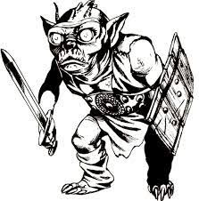
These kobolds look very similar to those he drew for the AD&D Monster Cards in that they're, for lack of a better word, more impish in appearance than the small, scaly dog-men of the Monster Manual. Also in the same module is a second depiction of a kobold, this time by Erol Otus, who had previously drawn a kobold for the Tom Moldvay Basic D&D rulebook.
The kobold above is actually dead, reanimated via myconid spores. Even so, its appearance differs from that of Roslof's kobolds earlier in the same module. Otus's depiction is closer to those in the MM, in spite of the fact that he had previously drawn a kobold for Basic D&D with different characteristics. It's fascinating and makes me wonder about the nature of art direction during the days of TSR. Were all these variants the result of a conscious policy or was there not much direction, leaving artists largely to their own devices? 

Monday, July 1, 2024

One More

Reader Lore Suto pointed out that I'd overlooked an important early illustration of the gnoll – by Erol Otus, no less! The image appears on the cover of the AD&D Dungeon Masters Adventure Log. Appearing in 1980, I have a great fondness for this particular product, which I used a lot in my youth. That's why I can't believe I'd forgotten that the cover featured a party of adventurers squaring off against a gnoll.

It's a terrific illustration that recalls Sutherland's original from the Monster Manual, right down to the gnoll's arms and armor. To my eyes, Otus's gnoll looks a bit more wolfish than does Sutherland's, but I like it nonetheless. I like it, too, because it's a good reminder that, despite his reputation for "trippy" visuals, Erol Otus was quite capable of something more akin to "traditional" D&D art, of which this piece is a solid example.

Monday, June 10, 2024

A (Very) Partial Pictorial History of Kobolds

One of the things I've long appreciated about early Dungeons & Dragons is the way that it took vaguely defined folkloric, mythological, and literary monsters and made them distinctive to the game. The pig-faced orcs of the Monster Manual are a good example of what I'm talking about, though there are many others, like kobolds. In folklore, kobolds don't have a clear and universally accepted description. From what I recall, they're short and vaguely dwarfish. That's probably why Holmes, in his Basic Set, calls them "evil dwarf-like beings" (and why I opted for something similar in my Dwimmermount and Urheim setting).

Within the history of D&D, however, the image immediately below is (I think) the very first time we're shown a kobold. It's from the AD&D Monster Manual (1977) and is drawn by Dave Sutherland, based on an exceptionally vague description that speaks only of their coloration, small horns, lack of hair, and red eyes. 

The MM also includes a second Sutherland kobold illustration, this one a full-page piece.
I like this second illustration a lot, because it gives a sense of how, despite having only 1–4 hit points each, kobolds could nevertheless be dangerous foes, because of their numbers. The illustration is also useful in showing the little monsters from several different angles. I suspect, more than any other, this piece is responsible for my early conception of kobolds and their physical characteristics – short, scaly dog-men with horns. Precisely why Sutherland settled on this appearance, I have no idea, since there's nothing in either folklore or the Monster Manual's own description to suggest it.

That same year (1977), Minifigs in the UK picked up the license to produce official Dungeons & Dragons miniatures. Though the company didn't produce as many figures as did Grenadier later (more on that below), it produced enough that they're often worth examining for insight into the beginnings of D&D as a product line. Take, for example, this figure of a kobold, which looks rather similar to the creatures depicted in Sutherland's illustrations, particularly the second, full-page one, right down to the harness he's wearing.
1980's Rogues Gallery features a very memorable depiction of kobolds by Jeff Dee. As you can see, Dee's kobolds look very similar to Sutherland's – almost identical, in fact. In this rendering, they're still short, scaly dog-men.

Deities & Demigods was published the same year as the Rogues Gallery, but offers up a somewhat different depiction of kobolds. The entry for Kurtulmak, the supreme deity of the kobolds, is accompanied by an illustration drawn by Erol Otus. He's described as looking like a "giant kobold (5½' tall) with scales of steel and a tail with a poisonous stinger). This suggests that what we see below is, more or less, what a kobold looks like. Though there's a very broad similarity with the Sutherland/Dee illustrations, we can see that his face has been flattened into more humanoid proportions, thereby lessening its canine associations.
Just below the Otus illustration in the DDG is another one featuring Kurtulmak, this time by Dave LaForce. As you can see, the four kobolds depicted in it look like smaller versions of their god, albeit without horns or scales. To me, LaForce's kobolds look almost simian in apperance. 
Interestingly, 1980 is also the year that Grenadier Models first started producing official Advanced Dungeons & Dragons miniatures under license from TSR. If you look carefully at this photo, what you see are three kobold miniatures whose appearance is not too dissimilar to what we see in the art of Otus and LaForce above. Pay close attention to their flat, humanoid faces and lack of horns.
The next year (1981), Otus provides a different illustration for a kobold, this time appearing in Tom Moldvay's D&D Basic Set. This illustration accompanies an entry that describes kobolds as "small, evil dog-like men ... [that] have scaly rust-brown skin and no hair."
This version has neither horns nor a tail, but its canine head is unmistakable. I find it notable that the module Keep on the Borderlands, included with the '81 Basic Set, has a rumor table that makes mention not just of "hordes of tiny dog-men" (i.e. kobolds), but also "big dog-men" or gnolls, suggesting a connection between these two monsters that I don't believe I've ever seen developed in the entire history of D&D. 
Above, we can see Jim Roslof's illustration of a kobold from 1982's AD&D Monster Cards. This illustration looks to me to be a further development of the Otus/LaForce version of kobolds – flat faces, no horns, no visible tail. In fact, they look rather like the goblins depicted in that same product, which makes for an interesting call-back to OD&D (and Chainmail before it), which seems to treat kobolds as if they were simply a species of goblin, or at least a closely related type of monster.

The first appearance of kobolds in AD&D Second Edition is in the Monstrous Compendium (1989), with this illustration by Jim Holloway:
Holloway's kobold is a kind of two-steps-forward-one-step-back version – broadly consonant with Otus/LaForce/Roslof one but regaining the horns of Sutherland/Dee. Though there's no visible tail, the description in the Monstrous Compendium suggests that they do indeed possess "non-prehensile rat-like tails." It also notes that they "sound like small dogs yapping" and smell like "a cross between damp dogs and stagnant water." This perhaps suggests that the writer (David Cook, Steve Winter, or Jon Pickens) was attempting to restore a bit of the canine connection of early 1e while retaining the overall look established by its later artists.
Lastly, there's this illustration from the 2e Monstrous Manual (1993), provided by Tony DiTerlizzi, who's probably best known for his distinctive contributions to the Planescape setting. This version restores the elongated, muzzle-like face of early AD&D, though, to my eyes, it looks more rat-like than canine. The accompanying description is the same as in the earlier Monstrous Compendium, so it's not as if any of DiTerlizzi's alterations were required by a revised text.

Despite my recent musings about Third Edition, the post-TSR editions of Dungeons & Dragons are beyond the scope of this blog, so I won't be discussing the subsequent development of kobolds. That's probably just as well, since I'm not a fan of their metamorphosis into small lizard/dragon-men. Nevertheless, looking over the pictorial history of this low-level monster has opened my eyes to just how ill-defined the kobold actually is. My own preferred version is heavily indebted to that of the first version I ever saw and I suspect that's probably true of most other D&D players. 

Do you have a default vision of kobolds? If so, what does it look like?

Tuesday, August 1, 2023

Original Polyhedron Art

As I noted in my post about issue #3 of Polyhedron, the newsletter contains a lot of original art by TSR's stable of artists. According to its credits page, here are the artists who contributed one or more pieces to the issue:

Most of those names should be familiar to aficionados of early '80s TSR Hobbies. The other two that might not be familiar are Bell and J.F. Mentzer. Bell is Greg Bell, who did a lot of the illustrations in the little brown books of OD&D. J.F. Mentzer is not, as I initially thought, Frank Mentzer, whose full name is Jacob Franklin Mentzer III, but rather his father, Jacob Franklin Mentzer II, as we'll see shortly.

The first piece of artwork I'd like to share from the issue is a depiction of an ice devil by an unknown artist.
Who's the illustrator? To me, it looks like it could be Dave LaForce, but I am uncertain of that attribution.

Next up is this excellent Lich by Darlene:

Darlene also contributed this portrait of a wizard that I rather like.
This party of adventurers is definitely the work of Dave LaForce. His signature is clearly visible on the righthand side of the piece, along the magic-user's staff.
Here's the piece attributed to JFM II, as you can see in the bottom lefthand side of the illustration. I'm not entirely sure what it's meant to depict, though it calls to mind the fairytale of the Frog Prince. In any case, I rather like it, if only because its style is so clearly different from that of the other artwork found in the issue.
And finally there's another Gamma World piece by Erol Otus:
These are less than half the original illustrations appearing in the issue, but they're the ones that stood out as being especially worth of comment. Should there be interest, I may post more examples of this artwork in the weeks to come. For now, I thought it sufficed to draw your attention to these, all of which caught my eye as I was reading.

Polyhedron: Issue #3

Issue #3 of the technically-still-unnamed Polyhedron newsletter (Winter 1981–82) is notable for numerous reasons, starting with the absolutely gorgeous piece of Erol Otus Gamma World art that graces its cover. It's yet another glimpse of an alternate reality where TSR better supported its post-apocalyptic science fantasy game. Of course, the issue is filled with remarkable – and original – illustrations by TSR's stable of artists, so many, in fact, that I'll probably make another post highlighting some of them. 

The issue is double the size of the previous two issues (32 pages), though editor Frank Mentzer mentions that it will return to 16 pages with issue #4. The reason for that is, starting with that issue, the newsletter will appear bimonthly rather than quarterly. Mentzer also announces the establishment of a $1000 RPGA Scholarship Fund to the college-bound RPGA member "with the highest College Entrance Examination Board scores or equivalent thereof." Though I didn't subscribe to Polyhedron until a few issues later, I do remember the announcement of the winner of the scholarship each year.

Issue #3 sees the inauguration of Mentzer's "Where I'm Coming From" column, which he calls "my podium." This first installment isn't all that insightful. It's mostly a paean to the RPGA Network and thanks to readers for the warm response to the newsletter. "Dispel Confusion" continues, though it's no longer credited to a single TSR but simply to "The Game Wizards." As ever, it's an interesting look into the minds of the more rules-obsessed gamers of the early '80s. There's a question about surprise, for example, that brought to light the fact that, in by-the-book AD&D, each segment a character is surprised, he is subject to a full round's worth of attacks – up to five. I can honestly say I have never played the game this way nor have I ever seen anyone else do so, but then it's been long established on this blog that I frequently do it wrong. Oh well!

There is a massive – 7-page – interview with James Ward that is well worth discussing in its own right. Naturally, Ward has a lot to say about Gamma World, among other topics, which is what most interests me, given my lifelong fondness for the game. Dawn Patrol gets two articles devoted to it, the first of which is a report about the results of a tournament at the most recent GenCon. The article includes a turn-by-turn recap of a dogfight between five German and three American planes that ended in a German victory. The second article is another Dawn Patrol by Mike Carr, this time focusing on medals and commendations. Like Gamma World, Dawn Patrol is another game for which I have great fondness, but, unlike GW, I have not played it in decades. One of these years, I may have to fix that.

Don Turnbull's "Turnbull Talking" returns. He devotes himself to the question of just what hit points actually represent, a perennial topic of debate in the old days (and perhaps even nowadays, come to think of it). Michael W. Brunton's "Figure Painting" is just that, a three-page article about the ins and outs of painting figures for use with roleplaying games. Sadly, unlike similar articles in the pages of White Dwarf, no photographs accompany it, which makes the piece a lot less appealing to a painting-impaired reader like myself. Then we get three more pages of "Convention Wrapup," in which the events of GenCon XIV and GenCon East are reported. The focus is naturally on the results of the RPGA AD&D tournaments, as one might expect.

Merle Rasmussen announces a "Top Secret™ Gadget Contest." I'll be curious to see the results of the contest when they're revealed in a later issue. More immediately interesting is the piece of Erol Otus artwork that accompanies the article.

The uncredited "Codebook" is a brief meditation on the use of codes and cyphers in RPGs, followed by four coded messages that are presented as part of a contest for readers to decipher. Later, there's also a Gamma World art contest – there sure are a lot of contests in this issue – in which readers are called upon to illustrate the monsters presented in issue #2 and in this issue. "Mutants: A Continued Sampling of the Weak Ones" by James Ward gives us four more opponents for use with the game. I was (and am) a sucker for stuff like this, so I was happy to see more of it here.

There are more reader-created tricks and traps in "Notes for the Dungeon Master," alongside "Notes from Overseas" by Don Turnbull. Also present is an uncredited full-page article "Spelling Bee" that looks at the use and abuse of the invisibility spell. "Saga of Marnie" by Marnie Bosch is a firsthand account of someone's experiences at GenCon East in July 1981. "Incomplete Convention Schedule '82" is simply a listing of gaming cons for the coming year. I was interested to see that Origins 82 was held in my old hometown of Baltimore that year. I never actually attended Origins until 1991, even though it was often held in and around Baltimore. What can I say? Cons were not a big part of my formative experiences in the hobby (and still aren't, though I should make a stronger effort to change that).

As I said at the beginning, issue #3 of Polyhedron is a significant one, demonstrating that it's already growing and changing in response to its increased readership. Having no direct experience with the RPGA itself, I can't help but wonder how successful it was during the first part of the 1980s. Certainly TSR seems to have placed great stock in it, if Polyhedron is any indication. 

Tuesday, July 18, 2023

Polyhedron: Issue #1

Polyhedron was the newsletter of the Role Playing Game Association (RPGA), TSR's official "club" for players of its various RPG offerings. When the first issue appeared during the summer of 1981, it wasn't called Polyhedron yet but rather the much more banal "RPGA News." A contest to give it a proper name is mentioned, but it will be several more issues before the winner is announced. Darlene provided an original illustration for the cover, one of several provided in issue #1 by her and other early TSR artists, like Greg Bell, Jeff Dee, Dave LaForce, and Erol Otus. 

Polyhedron is notable for, among other things, providing Frank Mentzer with a regular soapbox from which to preach, since he was Polyhedron's inaugural editor. Mentzer was later responsible for the revision of the Dungeons & Dragons line, starting in 1983. That version of the game, consisting of the Basic, Expert, Companion, Master, and Immortals boxed sets, was reputedly the best-selling one of its first quarter-century, and remains much beloved by generations of players. However, it was through his association with the RPGA and Polyhedron that Mentzer first made a name for himself.

The newsletter's first issue opens with a "letters page," an odd choice since, as Mentzer admits, "there were no letters to the editor" yet. Instead, he presents "a few incomplete comments plus one letter from the DRAGON™ files." Most of these "incomplete comments" are mere ephemera, but one of them is longer and worth discussing. Its unnamed author (known only as "DB" from Montgomery, Alabama) offers up a house rule from his home AD&D campaign. Mentzer reply is as follows:
Concern about AD&D rules variants started to become commonplace in official TSR circles around this time, with "international tournament stability" (or similar things) being offered as an explanation of the company's skepticism toward them. This stance would harden as the years wore on, with Gary Gygax taking up the cause through his own soapbox in the pages of Dragon.

"Dispel Confusion" was Polyhedron's version of "Sage Advice," offering official answers to rules queries about TSR's RPGs. Initially, this column differed from "Sage Advice" in that there was no single author. Instead, Polyhedron tapped multiple TSR designers for answers. In this issue, the designers are Lawrence Schick, David Cook, and Harold Johnson, but I suspect future issues will see different ones included in the roster.

The issue devotes four pages to a lengthy and genuinely interesting interview with Gary Gygax. The interview is wide ranging, so it'd be impossible to do it justice with a short summary. Previously, I've covered a couple of portions of it on this blog, so I'd recommend talking a look at those posts for a glimpse into the kinds of things Gygax says. I'll probably return to the interview again in the future to highlight other sections of note. Suffice it to say that, as with all Gygax interviews, it's a mix of truths, half-truths, and dissimulations – absolutely fascinating stuff but it must be approached with some degree of suspicion.

"The Fastest Guns That Never Lived" by Brian Blume, with Allen Hammack, Gary Gygax, and Tim Kask is an article for Boot Hill. Its title riffs off a section in the game's rulebook, "Fastest Guns That Ever Lived Chart," which provides statistics for historical gunfighters from the Old West. By contrast, the article provides stats for fictional characters from Western media, like the Lone Ranger, Bret Maverick, and Ben Cartwright, as well as composite stats for actors who portrayed a number of different characters. It's a fun little article and the kind of thing that aficionados of Westerns can argue about. In case anyone cares, Clint Eastwood's characters have the highest Gun Accuracy rating (+22), closely followed by those of Lee Van Cleef (+21). 

"Notes for the Dungeon Master" is a collection of eleven short descriptions of "really good, relatively unknown trick[s] or trap[s]" for use with Dungeons & Dragons. As with all such articles, how much one enjoys it depends heavily on one's tastes and experience. For me, the descriptions are all fine but not phenomenal. "The Fight in the Skies Game" by Mike Carr is a brief overview of the World War I aerial combat game that would soon be revised as Dawn Patrol. "An Open Letter to Frank Mentzer" by Merle Rasmussen is similar, if much shorter, in that it's mostly a plug for Top Secret and its continuing support by TSR.

"Gen Con® South Report" is, as its title suggests, a report of events at TSR's convention in Jacksonville, Florida earlier in 1981. I sometimes forget that, once upon a time, there are a number of reginal Gen Cons, though none of them survived past the '80s so far as I know. The article focuses primarily on the results of tournaments at the con. However, it does include a photo of the top winner, Matthew Rupp and his fellow gamers, which I found very charming.
The last article is "Gamma World Science Fantasy – A Role Playing Game with a Difference" by James A. [sic] Ward. Like the previous articles on Dawn Patrol and Top Secret, this one is simply a plug for Gamma World and its upcoming support by TSR. It's fine, but then I have an inordinate fondness for Gamma World (and the decades-long, unfulfilled promises of a revision of Metamorphosis Alpha compatible with it). Closing out the issue is a full-page comic by Tom Wham called "Rocksnoz in the Land of Nidd." If you're a fan of Mr Wham's work, you'll likely enjoy this one too. I'd never seen it before, so it was definitely a treat for me.

There you have it: issue #1 of Polyhedron and the start of a new series of retrospectives on a gaming periodical of yore. I suspect this series will not run as long as my previous one on White Dwarf, because I have access to fewer issues and because (due to its not being monthly until very late in its run) there are simply fewer issues to review. Nevertheless, I'm looking forward to this one, if only as a dose of nostalgia for my days as a TSR fanboy