
Ever since I started doing these Top 10 lists earlier this month, I've received a lot of positive feedback, including email suggestions of other lists I could present. One of the most requested of these other lists concerns the art of Dungeons & Dragons, namely my favorite pieces. There's no question that this is a good topic for a list and will generate a lot of discussion, but I must admit to some hesitation nonetheless. Judging art is often subjective, especially gaming art, appreciation of whose qualities can depend on numerous factors beyond the specific piece of art under discussion. It's also been my experience that there's something of a difference in tastes between age cohorts of D&D players, with those encountering the game in the mid to late 1980s having a different notion of what makes good D&D art than those, like myself, coming from just a slightly earlier era.
Nevertheless, I do think there's something to be gained by proposing a list of my Top 10 D&D illustrations. As before, I am limiting myself to the Golden Age of the game, since it's the era when I first encountered it. The imagery of that era made a strong impression on me and, as a result, most of what I think of as the best illustrations for the game were created during its first decade of publication. Also as before, I make no claims to objectivity or universal appeal. The ten illustrations that will appear here and in its follow-up post later in the week are those that I like, for reasons I will explain. Naturally, some will disagree, perhaps vehemently with my choices and that's fine. My only hope is that, in offering my list, I might encourage conversation rather than mere argument.
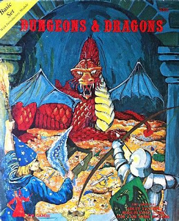
This painting, by David C. Sutherland, is perhaps the very first piece of D&D art I ever saw and is, therefore, forever linked with the game in my imagination. There was simply no way I could justify excluding it, despite its clear technical deficiencies. Of course, if I were to exclude illustrations on such a basis, I'd have to rule out almost all of those on this list. Even so, there's a lot to like in this particular piece, starting with the fact that it clearly shows a knight in historical armor standing beside a traditional-looking wizard as they face off against a dragon resting atop a vast treasure hoard. For a game called Dungeons & Dragons, this is nearly ideal in conveying what the game is about. I can't tell you how many hours I probably spent staring at this image in late 1979 and early 1980. The illustration reached out and seized me in a way I still cannot adequately explain. In my mind's eye, this is what D&D looks like.
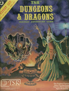
This is a slight cheat, in that the cover for the Expert Set by Erol Otus also incorporates a portion of his Basic Set cover as well. That said, I actually like the Expert Set illustration a bit more, since it highlights one of Otus's funky wizards, whom I found equally fascinating and unsettling as a youth. More to the point, since I already owned the Holmes-edited Basic Set (see above), I didn't see any immediate need to buy the 1981 Moldvay set, opting for the Expert Set alone (a situation I would later rectify). In fact, I often stuffed the Expert rulebook inside my Holmes box when I took it with me to friends' homes to play. Together, they formed the basis of my foundational D&D experiences and I find it hard to separate the two. However, I rate this illustration slightly higher solely on the basis of the greater skills of Erol Otus. His illustrations were always weird and evocative and did a lot to broaden my conception of what fantasy was and could be.
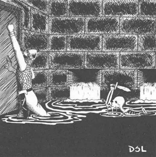
This illustration, by David S. LaForce, appears in the AD&D Dungeon Masters Guide. In terms of its composition, it's nothing special, but it's a piece that's fascinated me for decades nonetheless. What I think elevates it above so many other "better" illustrations is the sense of inexorable doom it conveys – a key feature of many early D&D sessions. The room is filling with water; the only means of obvious escape is barred. And there's also an animated skeleton in the room, emerging from beneath the water. Does the hapless fighter on the left know he's about to be attacked from behind? Is he simply more concerned about the rising water level in the room? I pondered these questions a lot when I was younger. Consequently, t's an illustration that's stuck with me over the years.
7. "Dragon Attack" (1981)
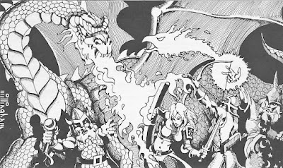
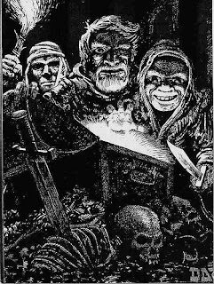
This Dave Trampier illustration, from the AD&D Monster Manual is favorite of mine for a number of reasons. For one, I think it's among Tramp's best pieces of work. The use of light and shadow is quite effective. For another, I love the faces of the three adventurers. They palpably evince greed, with the one on the far right unable to prevent his hand from reaching into the chest and grabbing what's within. Also, these aren't Hollywood handsome protagonists posing heroically for the cameras. They're rough and tumble rogues of the sort Robert E. Howard, Clark Ashton Smith, or Fritz Leiber might have created. They're perfect exemplars of the pulp fantasy literary inspirations of D&D that was largely discarded by later editions of the game. We need to see more dubious characters like this in D&D artwork, if you ask me.

James, I love all of your choices. I have enjoyed looking at that skeleton trap artwork, and "building the story", much as you have done as well. The basic and expert set artwork (exterior and interior) are one of the major reasons that I was brought into the hobby - for me, they tell a story of adventure, as opposed to a railroad storyline with few options.
ReplyDeleteGoing forward a bit a few years, the illustration on the player character sheets that were released with updates for the Unearthed Arcana also bring that sense of adventure and mystery to me.
Artwork can be so immersive in bringing a player or DM into a setting. I think that is one of the reasons I enjoy modules S1 and S3 so much, and was fascinated when I encountered them as a new player.
My first encounter with D&D was module A1 Slavepits of the Undercity. The front and back scene told me a story, and it resonates with me to this day. I think this is one of the main reasons I was disappointed when module formats changed, and only the front cover had artwork.
Thanks for continuing to do these kinds of posts.
Fun topic. #8 & #6 resonate with me the most. Would be fascinating to see a Top 10 list from all the readers on here.
ReplyDeleteAgree with you about 8 and 6, but only 7 doesn’t do anything for me.
DeleteOn the other hand, I may be the only one here who appreciates Tom Wham’s contributions. Their visual resemblance to newspaper comics may be what helps them communicate the humorous side of gameplay. I always have to laugh at his illustration accompanying the giant lynx in the Monster Manual.
Always enjoyed Wham's style, particularly on the many small boardgames he produced (mostly bound in to Dragon, of course). His cartoony style works really well for counter artwork and makes for attractive maps. Elefant Hunt is probably his cutest effort, and the ship designs in Planet Busters have a kind of "Schlock Mercenary feel to them. Tossup for me what his magnum opus is, either Awful Green Things From Outer Space or Mertwig's Maze.
DeleteEven though I started gaming in what you term the Silver Age (the tail end of 1984), with Elmore, Easley, Holloway, etc. art, I still feel these pictures' evocative power. Except for the Holmes cover, which has never really gripped me, the rest here all have become images I also think really "get" the D&D experience.
ReplyDeleteAnd it's probably no mistake that the "skeleton trap" has been re-done in subsequent editions by other artists.
Really nice !! Thanks
ReplyDeleteIf the Players Handbook isn't #1 I may demand a recount!
ReplyDeleteI'm fond of all of these and, as you say, it's a matter of personal taste and, even more importantly, the resonance with one's gaming memories. Memories aside, over the years I've only grown more astonished at the talent of Trampier, to the point that he now means more to me than all the other golden age D&D illustrators combined, including their most iconic images. I'm sure I'm affected by the odd circumstances of his anonymity and neglect, and by work that falls outside of the categories you're careful to stick with. Wormy seems to me a constantly missing reference in histories of comics and graphic novels, and the Divine Right map still makes me shiver. So my list might be all Trampier, with some betrayal of memory and of myself as a young gamer who valued other illustrations as much or more at the time.
ReplyDeleteFor sheer artistic pleasure, Russ Nicholson's D&D work is my only rival in this category. In my mind, Nicholson and Trampier make a deliciously baroque trio with a non-D&D and just-this-side-of-silver-age illustrator: the John Blanche drawings in Steve Jackson's Sorcery!
Maybe some part of my attraction to those three illustrators is that they more than other make me feel a connection to Victorian and Edwardian fantasy illustration that I also like, Syme, Rackham, Tenniel, Beardsley, etc. Though I guess one could say this of Otus too, and his work for some reason never stuck with me.
Looking forward to part 2. As always, thanks for your stellar blog. I learn so much.
Trampier does tend to be tragically and unjustly unappreciated in these sorts of discussions, but I'd be surprised if at least more one of his pieces doesn't get on to the next half of this list. And certainly more than that if this was about TSR art in general - Wormy by itself could fill a list with individual panels and pages, but it was really a D&D product as such.
DeleteNice to know I'm not the only one deeply affected by Divine Right's stunning map. You know he also did the artwork (and co-designed) the board game Titan, right? There's more than a hint of Wormy's aesthetics in that game, and thecounter art for the monsters is phenomenal for the amount a variety in it - most of the many types of monsters hav multiple unique and subtly different silhouettes, little things like holding different weapons or altered poses. Practically unheard of level of detail, especially for its day.
That is really interesting to hear about the Titan artwork. I also marvel at the variety given to the tokens.
DeleteThanks for sending me to look at images of the Titan tokens on the interwebs. Great stuff. I never saw the game but recall the ad that used to run in Dragon mag.
DeleteThis is great, James! Love your top 10 lists so far and especially this one. My brother just returned my Art & Arcana and I'm looking forward to paging back through it, so this topic is on my mind.
ReplyDeleteArt is interesting, as it conveys so much.
ReplyDeleteI had not really considered Bill Willingham's style as "comic booky", but I at once understood what you mean, and think it capture his style perfectly!
Just like you I love images where there's a tension, and something is about to drop, like that skeleton attack. Very moody.
I also love that image of the three greedy faces above the treasure chest. I am not as enamoured by the Basic box cover (maybe because I only ever saw it when the blogging crazy started in the 2000), but for me those three thieves are how D&D looks like.
For me, though, the image that forever is etched into my mind as the image of D&D is the cover of the orange spine DMG. Those big doors and that mischievous individual showing us a glimpse of all the wonders and terrors that reside within is D&D to me. Maybe not how it looks like, but the sense of wonder of D&D is that image.
Willingham is primarily a comic artist (and writer), his stint working for TSR is the exception, not the rule. His most notable work other in the gaming field was on Villains & Vigilantes, alongside Jeff Dee. Bill is by far best know for his large body of work for DC Comics though, most notably the very popular Fables series and various Vertigo titles. He also worked for Comico back in the early 80s doing Elementals, a supers book that's still well appreciated by older comics fans.
DeleteOn a more NSFW note he did the second-funniest porn comic I've ever seen, Fantagraphics' Yronwood. The funniest one is XXXenophile by the Foglios, which might say something about alumni of Dragon's comics page. Anyone who likes a good laugh with their smut is my kind of people. :)
What I found interesting was how well that described his style. I have been aware of his comics work since a panel at the WorldCon in 2009, but even before that his RPG illustrations always had a particular style to me.
DeleteAnd Elementals reused characters from two V&V modules he wrote.
DeleteYep. The Destroyers were too good to be relegated to just a single module. :)
DeleteNumbers 9 and 10 are both "my" D&D, although in practice I mostly played AD&D. Even had some minis (Heritage, I think) of dragons that were clearly based on the Sutherland art.
ReplyDelete"...Otus's funky wizards, whom I found equally fascinating and unsettling as a youth."
Fascinating and unsettling is a good descriptor for all of Otus' art to me, and I haven't outgrown the feeling in forty-plus years. :) My overall favorite piece from him isn't D&D though. That "two page spread" in Revolt on Antares still captivates me for reasons I can't define.
All great choices and I'm wondering where you are heading with the top 5.
ReplyDeleteI think that you are right about "The Treasure Hunters" - of the five revealed so far, this is the only one that draws you into the scene. For me it has a real "Treasure of Sierra Madre" vibe to it - gold fever and greed are obvious, and I can imagine what happens to the party after they bag up the treasure.
My two favorites are no contest: Trampier’s pseudo-dragon and his wyvern. They both pack a lot of emotion in a very small space.
ReplyDeleteCover of N1.
ReplyDeleteExcellent choices and I have to agree about #10... it had an immediate hook when I first saw it. I'll wait and see if my personal favourite makes it into the top 5.
ReplyDeleteDSL was not one of the more talented of the lot of TSR artists working at that time, but for me, that “skeleton trap” image is the quintessential depiction of dungeon exploration and its dangers !
ReplyDeleteI agree with everything EXCEPT Willingham. I've never liked his "comic book" style for D&D. I'm solidly in the Sullivan, Trampier, LaForce, and Otis camp.
ReplyDeleteIronic, considering that's he's probably the most commercially successful of the lot, and that's almost entirely due to his work in comics, mostly DC (eg Fables). He's maybe better known as a writer than an artist these days, though.
DeleteDid you ever notice the magic-user on the Expert Set cover has six fingers? That’s how you know he’s a magic-user.
ReplyDeleteCongratulations, you got me to look, but I count five fingers per hand.
DeleteI never noticed it before, but the left hand does appear to have six fingers, kinda, maybe? Right hand clearly has five.
Delete@Dead_Parrot I thought that myself for a minute but it's probably just the way the shadows are falling on the parts of the fingers closest to the palm. There's only room for five fingers when you look at the tips.
DeleteIsn’t #6 on page 104 of the Monster Manual?
ReplyDeleteYou're right, it is. I'll correct the post accordingly. Thanks for spotting that.
DeleteSince I am a total B/X fanboi I have deep love for 7 but more importantly I wholeheartedly agree with 6 and all you're saying about it. A lot of D&D has become world-shaking superhero epics when personally I care a lot more about the (relatively) small-scale stuff like pulling your dirt-poor family out of the muck by doing on some rather ill-advised grave robbing.
ReplyDeleteIf I were to make such a list, #9 would make the cut for sure, probably in my top 5. Very iconic image for me, and yes, even more than the Basic Rules box cover.
ReplyDeleteI'm glad you came back to your art of the Gold Age after so many years. The first image I ever saw of D&D was Sutherland's Holmes Basic cover, and I was hooked. I love that you included 8 and 6. The mood in these two evocative pieces remains lost in current D&D, to the point that I can't play the 5e game with newer players; the superhero PC's out on their heroic quests. That it takes 3+ pages of rules to describe a character class and outline all their special abilities, and at least an hour just to generate a PC...it's just a different set of priorities I can't run with in a D&D game anymore. Another RGP yes, but not D&D. For my own top 10 of the Golden Age I'd include some Jeff Dee, most likely the fire giant scene on the back cover of Ghost Tower of Inverness.
ReplyDeleteI was just thinking I would love to get prints of old school D&D art. Any ideas?
ReplyDelete