Wednesday, July 31, 2024

Retrospective: The Official Advanced Dungeons & Dragons Coloring Album

Over the years, I've made occasional posts in which I've shared an image from The Official Advanced Dungeons & Dragons Coloring Album, but I've never written a full Retrospective post about this curious – and amazing – product. Today, I intend to correct that oversight.

Released in 1979 just a few months prior to the disappearance of James Dallas Egbert III, the Coloring Album is a remarkable relic of the time just before Dungeons & Dragons ascended to the heights of name recognition that it's continued to enjoy ever since. Consequently, this 32-page, oversized book is something of a rarity nowadays. I knew nothing of its existence until I started writing this blog, despite the fact that it appeared shortly before I began playing D&D. I've likewise never seen a physical copy of thing, though one can easily find electronic versions online with only a little effort.

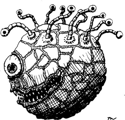
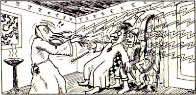
One might well imagine that, aside from the simple oddity of an AD&D coloring book, there's not much to say about this product, but that would be mistaken. Let's start with the obvious – the illustrations. In addition to the beholder battle I included earlier this week, there's this one, featuring a bulette:

And this one in which the adventurers discover a vault filled with treasure:
These only scratch the surface of the universally intricate and evocative art found throughout the Coloring Album. I may share some additional pages from the book in subsequent posts, because they're very much worthy of further comment. 

Equally of note is the artist responsible for all these illustrations: Greg Irons. Irons, who died in 1984 at the age of only 37, was well known in the underground comics scene of the 1970s. Prior to that, he worked as a painter of animation cels for the 1968 Beatles movie, Yellow Submarine. He'd also work in the burgeoning field of original poster art and tattooing. In short, Irons was deeply connected to the artistic counterculture of the period – a counterculture that was at the forefront of promoting fantasy images and themes from The Lord of the Rings to metal and prog rock albums to airbrushed "wizard vans."

The involvement of Irons shouldn't really be a surprise, given that the Coloring Album was published by Troubador Press of San Francisco. Though most of Troubador's titles were activity or coloring books, their audience wasn't just children. They frequently highlighted weird and offbeat interests, especially science fiction, fantasy, and the occult, which attracted many adults to them as well. Troubador treated these subjects seriously. Just as importantly, the company hired some of the best outsider artists to illustrate them with strange, compelling, and often psychedelic artwork that stood out from other similar books of the same time. The Official Advanced Dungeons & Dragons Coloring Album was, therefore, very much a product of the same counterculture that made the 1970s such a chaotic cauldron of creativity. 

The Album is also notable for being more than just a coloring book: it's also a game, albeit a very primitive one. The book presents itself as illustrating the various rooms and encounters found within "the depths of the vile dungeon" that holds a mystic talisman to be used "against the hordes of Evil threatening to overwhelm the Kingdom of Good." Included within is a map of the dungeon with simple rules using two six-sided dice to adjudicate battles, as the reader tries to guide his party of adventurers through the dungeon. The scenario and its accompanying text were apparently designed by Gary Gygax himself (who held copyright over the text). 

Though not one of Gygax's better adventure scenarios, the text accompanying the illustrations is surprisingly good, filled with lots of details and allusions to elements of D&D, as well as some from his World of Greyhawk setting. References are made to the Lake of Unknown Depths, the Green Dragon Inn, and St. Cuthbert, among a couple of others. It's quite fascinating to look at it now with an eye toward finding things you might have overlooked when you first saw it.

The Official Advanced Dungeons & Dragons Coloring Album is one of those early gaming products that might well qualify as a genuine "treasure." It's certainly one I wish were still readily available, because I think it's not only a fun book in its own right, but also an amazing reminder that D&D and, by extension, all roleplaying games grew up with and were influenced by the underground art scene of the '60s and '70s. It's a reminder of what D&D was like – and perhaps could have become – had it not eventually been seized by a corporatized desire to become a safe consumer product for the masses. 

Tuesday, July 30, 2024

REPOST: The Articles of Dragon: Modern Monsters

When I was a kid, the idea of mixing magic and technology was (largely) blasphemous. For some reason, it offended my youthful sensibilities, which insisted that fantasy and science fiction were two separate genres of literature, the division between which was impermeable. It took my purchase of Expedition to the Barrier Peaks (and, later, Blackmoor) to soften my stance on this question, but, even then, I was still instinctively opposed to the notion, despite ample evidence that the older generation of gamers, to whom I looked up, had no such qualms about it.

Consequently, I was equally baffled by both the sections of the Dungeon Masters Guide that included guidelines for converting Gamma World and Boot Hill characters to AD&D (and vice versa) and by articles like "Modern Monsters" in issue #57 (January 1982) of Dragon. I can't be certain, but I think this was the first article I ever read written by Ed Greenwood and I didn't think much of it at the time. Stats for cars and bazookas? Advice and guidelines regarding the functioning of magic in modern, technological worlds? Why? What was the point?

Now, there was no question that Greenwood's article was well presented and made ready use of ideas and suggestions from earlier articles (like James Ward's "Monty and the German High Command," for example). Heck, the article even had footnotes, citing not just previous Dragon material but a host of classic fantasy and SF literature where magic and technology contended. But none of that moved me and I found myself unable -- or unwilling -- to shake off the staid notion that six-guns and sorcery should never appear side by side. It's only been in recent years that I've abandoned my adolescent scruples regarding genre mixing and happily included robots and laser pistols in my fantasy without regret. Live and learn!

(The original version of this post and its comments can be found here.)

Monday, July 29, 2024

A (Very) Brief Pictorial History of Beholders

The creation of Terry Kuntz, brother of Rob Kuntz, the beholder first appeared in Supplement I to OD&D, Greyhawk in 1975. Since then, the eye tyrant (as it is sometimes known) has become a very strong contender for title of Most Iconic Monster of Dungeons & Dragons. It's also one of my favorite monsters in the game. The first illustration of a beholder appeared on the cover to Greyhawk and was drawn by Greg Bell. As you'll see from the artwork that follows, Bell's version of the beholder is quite distinctive, having a smooth body, a sleepy-looking central eye, and a comparatively small mouth.

Tom Wham, in the AD&D Monster Manual (1977), takes a slightly different tack. His beholder looks to be armor plated. Its central eye is large and bulbous, while its mouth is huge. This is the first version of the monster I ever saw, so it's my default image of it.
A couple of years later, in 1979, The Official Advanced Dungeons & Dragons Coloring Album was published by Troubador Press. The book contained this image of the beholder by Greg Irons. In general, I'd say it looks closer to Wham's illustration than Bell's.  

The next year, 1980, was when the first official AD&D miniatures appeared. Here's a beholder as painted by Ray Rubin, from the box art of the "Dwellers Below" set. Its appearance is quite close to that of Wham's illustration.
The actual beholder miniature from the set looks like this:
Issue #76 of Dragon (August 1983) includes the article, "The Ecology of the Beholder" by Ed Greenwood and Roger E. Moore. Accompanying it is this illustration of a beholder by Roger Raupp. Take note of its eye stalks, which looks a bit like the legs of a crab or spider.
A month later, in September 1983, the second episode of the Dungeons & Dragons cartoon series featured a beholder. Its eye stalks are snaky or wormy in appearance, while its mouth has the largest teeth of any version yet.
Citadel acquired the AD&D miniatures license in 1985 and produced a beholder figure. I don't know the precise year in which it was released. Though it's somewhat hard to tell from this image, the miniature looks pretty close to the Monster Manual depiction, right down to the plated body.
Also released in 1985 were the Dungeons & Dragons Master Rules, which included this picture of a beholder, as imagined by Jeff Easley. This illustration is interesting for its half-lidded appearance, something that's not really present in previous versions.

Toward the end of the 1e period, TSR released Waterdeep and the North (1987) for use with the Forgotten Realms setting. Its cover includes a beholder by Keith Parkinson. His version not only includes segmented eyestalks like Roger Raupp's but also upper and lower eye lids.
The cover to the Monstrous Compendium (1989) features a beholder by Jeff Easley. The armor plates are not present. Instead, the beholder appears to be very fleshy in appearance.
Meanwhile, the MC's interior gives us this illustration by Jim Holloway. The armor plates are back, as are the broad proportions of Wham's Monster Manual illustration (though the eye stalks look unique).
The Monstrous Manual (1993) gives us this very odd illustration by Tony DiTerlizzi, which may have the largest central eye-to-body proportions of any version of the beholder. 
I have intentionally excluded all the artwork of beholders found in the Spelljammer boxed sets and modules, both because there's so much of it and because it's intentionally varied in keeping with its idiosyncratic interpretation of beholders. Consequently, I'm not certain the extent to which they're at all representative of depictions of these monsters during the TSR era of D&D. On the other hand, it's quite possible these depictions were influential on those that followed in the '90s and into the 21st century. If anyone has any thoughts on this particular point, I'd be interested in hearing them.

As usual, I've no doubt left out a lot of illustrations, focusing primarily on those I either remembered clearly from my youth or those appearing in products to which I have ready access. If you feel like there are notable ones I've forgotten, I'd be interested in learning about those, too. 

Friday, July 26, 2024

Adventure Games from TSR (Part II)

Following yesterday's post, here are some more pages from the 1983 TSR UK catalog, courtesy of reader Martin Williams, starting with this one. There are several noteworthy details here. For example, the modules Blizzard Pass and Maze of the Riddling Minotaur are included in the list of AD&D adventure modules, possibly because of their code being "M" rather than "B" or "X." Meanwhile, The Temple of Elemental Evil is assigned the code T2A/B rather than the T1–4 it received upon its actual release in 1985. Further, Dungeonland and The Land Beyond the Magic Mirror are listed as modules GC 1 and GC2 respectively rather than EX 1 and EX2 (see also this post for another discussion of their changing module codes).

This next page is interesting because it includes the AD&D Fighting Wheel among the play aids available for sale, despite the fact that, so far as I know, it was never sold except to RPGA members.
Good to see some of TSR's other games given a page to themselves.
One can sometimes forget that TSR also published a wide range of boardgames intended for a wider audience, as this page demonstrates. At the bottom left, there's a note of "exciting news" regarding TSR's then-recent acquisition of the wargames publisher, SPI – an acquisition that ultimately proved to be an unhappy one for almost everyone concerned. There's also a striking bit of art by Rodney Matthews, depicting either a man in a very strange spacesuit or a robot of some kind.
Finally, we get not just more Matthews art, but a page devoted to books and magazines, with a passing mention of TSR's minigames
As someone much more familiar with the brown TSR "Gateway to Adventure" catalogs, I found the UK catalogs fascinating – especially for the original art included with it. Thanks again to Martin Williams for sharing this piece of history with me.

Thursday, July 25, 2024

Adventure Games from TSR (Part I)

Speaking of TSR UK: reader Martin Williams recently informed me of a catalog from the company's British division released in 1983, whose pages he kindly scanned. The catalog is notable both for its original art by Rodney Matthews, as well as its actual content. Matthews also worked with TSR UK through Imagine magazine, for which he provided the covers to issues 9, 12, and 22

The center spread of the catalog showcases both the Dungeons & Dragons (in its B/X variety – apparently this was prior to the release of the 1983 Frank Mentzer-edited version) and the Advanced Dungeons & Dragons games.

Of note is the use of the term "adventure games," which seems to have been particularly popular in the United Kingdom. Also noteworthy is that the section on AD&D, which it pronounces "an entirely different game ... for more experienced players."
Here's a better view of the Matthews illustration in all its glory.
I'll post more scans from the catalog tomorrow. Thanks again to Martin Williams for sharing these with me, as I'd never seen them before.

Wednesday, July 24, 2024

Retrospective: Dark Side of the Moon

In my musings on Traveller's birthday earlier this week, I reflected briefly on my introduction to what is not only my favorite science fiction RPG but also my favorite RPG period. However, in doing so, I mentioned that Traveller was not my sole SF RPG. For some time, it vied with several other science fiction games for my affection, including Star Frontiers, which I, as a TSR fanboy, snapped up eagerly when it was published in 1982. 

Aside from surface similarities, Star Frontiers and Traveller aren't all that similar. Traveller has always had a somewhat serious, almost literary tone, whereas Star Frontiers seemed to have more in common with SF movies and television shows. I don't mean that as a criticism, since there's no one-size-fits-all RPG for any genre or subject matter – especially science fiction, which encompasses a huge swath of possible ideas, concepts, and situations. 

That said, Star Frontiers could be more "serious," or touch on more serious subject matter. That's very much in evidence with 1985's Dark Side of the Moon by Jim Bambra. Like its immediate predecessor, Bugs in the System, this adventure was a product of TSR UK, whose approach to nearly everything, from subject matter to tone to artwork, cartography, and even layout was noticeably different than their Stateside counterparts, which had a pulpier, Saturday morning matinee vibe to them that was probably deemed more suitable for its "ages 10 and up" target demographic. 

The adventure takes place on the world of Kraatar, a world in the Tristkar star system, whose primary colonists are the insectoid Vrusk – at least according to the Star Frontiers expanded rules book. Bambra, however, postulates that Kraatar was originally colonized by humans some 200 years before the present, where they established a self-reliant, agrarian society. A little more than a century later, the Vrusk arrived, bringing with them their high technology and megacorporations. As a consequence, the original human colonists experienced culture shock that displaced many of them from their rural settlements and left others disaffected and angry, as Vrusk corporations came to dominate the planet.

The adventure proper kicks off when Jack Lagrange, a human scientist and businessman who heads up Trojan Enterprises, is assassinated while receiving a prestigious award for his work in advanced organ and tissue regeneration. His assassins are two former members of the Vrusk corporate security forces and this revelation alone threatens to throw Kraatar into political and social turmoil. Riots then break out between humans and Vrusk after a Vrusk terrorist organization claims responsibility for Legrange's death. The characters, whom the module assumes are working with Pan-Galactic Holo-News, soon find themselves enmeshed not just in inter-species hostility but also a grand conspiracy in which little is what it first seems.

Dark Side of the Moon's reach exceeds its grasp. Bambra's ideas are mostly quite good, but the execution leaves a bit to be desired, starting with the somewhat ham-fisted way the characters become involved. As presented, the situation on Kraatar is somewhat nuanced, with plenty of blame to go around. Despite this, there's still a supervillain worthy of James Bond behind it all, plotting something cartoonishly horrific. That's not necessarily a terrible thing; it's very much in keeping with the general tenor of Star Frontiers. At the same time, I couldn't help but feel a little disappointed, because there's a lot of good stuff here about social alienation and non-human psychology that I wish had been further developed. Perhaps it was inevitable that such topics could never be properly explored in a RPG module, but I had high expectations nonetheless.

Dark Side of the Moon is still a solid adventure, one of the better ones produced for use with Star Frontiers. Unfortunately, it doesn't treat its chosen subject with the same degree of sophistication or polish as did Bugs in the System. All the same, it's yet another example of TSR UK's willingness to innovate and push boundaries within the products they produced. The division's closure was a real loss for TSR, which would have really benefited from the industry and talents of its British writers and designers in the latter half of the 1980s. That's an alternate universe I'd like to have seen ...

Tuesday, July 23, 2024

The Mystery of Todd Oleck

I've gotten a couple of emails and comments asking about the artists responsible for the artwork accompanying the "From the Sorcerer's Scroll" column in Dragon. In most cases, I unfortunately have no idea who produced those pieces. However, in the case of the second to last illustration, the one showing a wizard seated at his desk, I know the artist is named Todd Oleck. Here's a bigger, full color version of the illustration:

The interesting thing is that the version above didn't appear until issue #47 (March 1981) of Dragon, about a year and a half after it was first used in conjunction with "From the Sorcerer's Scroll" in issue #30 (October 1979). 

As for Oleck himself, I know next to nothing about him. He is credited as an artist in several issues of Dragon and also produced a single piece of artwork that appeared in early printings of the AD&D Dungeon Masters Guide before being replaced. Here it is:
My version of the DMG is the so-called "revised" version from December 1979, so it doesn't include this piece. In its place is the Erol Otus illustration found at the top of this post. Beyond this, Oleck is a mystery to me. I can only assume that, like a lot of people involved in the hobby, he eventually drifted away from it and pursued other things. Still, I'm curious about him. Does anyone else know anything they can share?

Gamma World Figures

One of my biggest complaints about first edition Gamma World was that its rulebook included very few illustrations of its mutant creatures. Sure, there were verbal descriptions of most of them, but many of those descriptions were vague or equivocal, which made it difficult to describe them in the course of play. That's why I was so keen to see Grenadier's line of GW miniatures: I hoped they'd give me a better sense of what all these weird mutants looked like.
Unfortunately for me, I never saw most of the "over 150 figures plus accessories" promised in the advertisement above. I did find the large "Denizens" boxed set, which I happily purchased, partly because it had such evocative box art, featuring a trio of tribesmen facing off against a Yexil.
I don't know for certain, but I suspect the artist is Ray Rubin, who was one of the cofounders of Grenadier Models. He did a lot of box art for the company's miniatures, including those produced for its official AD&D line. This one looks similar, so it's probably his work.

As I said, I never saw most of the Grenadier Gamma World miniatures in the wild, so to speak. There is, however, a terrific website that includes photographs of most of them. When I first came across the site, I goggled at what I saw, because many of them are exactly the kind of thing I so wanted back in the day. Instead, I had to wait until the release of Gamma World's second edition in 1983 to see at last what all the game's mutant monsters actually looked like (lovingly drawn by Larry Elmore at, in my opinion, his best).

The Articles of Dragon: "Protection Circles and the Like ..."

One of the ways that this new version of The Articles of Dragon differs from its predecessor is that I'll linger on a single issue of the magazine if there's more than one article I consider worthy of comment. Perhaps because issue #56 (December 1981) is the first one I remember reading, I can also recall multiple articles from its pages. In addition to "Singing a New Tune," which I discussed last week, another that left a lasting impression on me was Gary Gygax's "From the Sorcerer's Scroll" column, entitled "Protection Circles and the Like, plus News of the North Central Flanaess" – quite a mouthful!

The article begins, as its title suggests, by briefly touching on the six types of protective circles available to AD&D spellcasters. These circles consist of the pentacle, magic (protection) circle, magic circle, thaumaturgic triangle, thaumaturgic circle, and the pentagram. Each one is accompanied by an illustration and a very brief description of its purpose (e.g. "This inscription is effective against lesser devils and lesser hostile sendings."). There are, however, no game mechanics associated with any of these circles. Gygax indicates such information will appear in the forthcoming The Lost Caverns of Tsojcanth module (which would appear sometime the following year, 1982).

Though this section of the column was very small and devoid of much in the way of specifics, it nevertheless left a strong impression on me, probably because of the accompanying artwork, which expanded upon what can be found on page 42 on the Dungeon Masters Guide.

Over the years, Gygax was inconsistent on the matter of just how much (A)D&D drew on real world occultism for inspiration (depending, no doubt, on who was inquiring about it). My friends and I, however, had no doubt that the game frequently took pages from such things – that was part of its appeal! So, even though there's not much meat to this part of "From the Sorcerer's Scroll," it's stuck with me even after all these years.

That said, the next part, which is quite substantial, stuck with me even more. In it, Gygax presents news and updated information about The World of Greyhawk, specifically about events following the return of the half-demon demigod Iuz to the domain that bears his name in the aftermath of his long imprisonment within Castle Greyhawk. Now, at the time I read this, I didn't yet own a copy of The World of Greyhawk, though I was vaguely familiar with some of the names and places associated with it through other AD&D products, like the DMG and The Village of Hommlet. Despite this, I found this section strangely compelling.

A big part of it, I think, was that it implied that Greyhawk was a dynamic setting in which Things Happened and had an impact on the setting. In addition, Gygax rattled off the names of important NPCs within the setting, along with their races, classes, and levels. He tallied up military units and their strengths and locations. He mentioned battles and geographic features. In short, he made Greyhawk come alive, as if it had a real (and deep) history. I loved it and wanted to learn more.

Of course, that's not what's included in The World of Greyhawk at all. The original folio – and even the later boxed set – were short on these kinds of nitty-gritty details, focusing instead on Big Picture stuff. I learned to appreciate that as one of Greyhawk's greatest virtues as a setting, but what initially drew me to it was this article and all the stuff Gygax implied was happening in his own campaign. In retrospect, I suspect that's exactly what Gygax was doing: recounting how his campaign was unfolding, but I had no real understanding of such a distinction in 1981 and wouldn't for many more years. Regardless, I loved this article.

Monday, July 22, 2024

Can You Spot the Hidden Deathtrap in this Room?

While looking for the illustration of the mind flayer that appears in issue #78 (October 1983), I came across this classic bit from Phil Foglio's What's New comic. I've hidden the answer below a break.

Happy 47th Birthday, Traveller!

Today is the real Traveller Day: 47 years ago, on July 22, 1977, at the third Origins Game Fair, held on Staten Island, New York, Game Designers Workshop released its science fiction roleplaying game, Traveller and the rest is history. 

Though, like most people, Dungeons & Dragons was my introduction to the hobby, Traveller became (and remains) my favorite RPG and the Third Imperium my favorite imaginary setting. I didn't discover the game until around the time The Traveller Book was released in 1982 – the same year TSR released Star Frontiers and just a year before FASA released Star Trek. I played and enjoyed them all, but it was ultimately Traveller that won my heart for its simple, flexible rules and serious tone reminiscent of so many of the sci-fi books I loved. 

My first professional writing credits were for Traveller when I was still in college. Through Traveller fandom, I met some of my oldest and dearest friends. And of course some of my best gaming memories relate to playing Traveller. Consequently, I'm inordinately fond of this roleplaying game and think the day of its release is every bit as worthy of celebrating as that of D&D

Happy Birthday, Traveller! Just three more years till your golden anniversary ...

A (Very) Brief Pictorial History of Mind Flayers

The people have spoken, which means I shall continue this series for a while longer. In reviewing the suggestions offered by readers, one of the more popular ones was the mind flayer. Since this tentacled monstrosity is also my favorite Dungeons & Dragons monster, I thought it'd make sense to kick off the next round of these posts with a look at mind flayers (or illithids, as they were called in Descent into the Depths of the Earth). 

Though the mind flayer first appears in issue #1 of The Strategic Review (Spring 1975), the first illustration of it does not appear until a year later, in Supplement III, Eldritch Wizardry (1976), as drawn by Tracy Lesch. Despite how early it is, this is clearly recognizable as the monster of later depictions – a rare instance when someone other than Dave Sutherland laid the esthetic foundations upon which later artists would build.


Speaking of Dave Sutherland, here's his take on the mind flayer from the Monster Manual (1977). You can see that he was riffing off Lesch's original conception, right down to having four facial tentacles and a preference for high-collared robes of the sort favored by Ming the Merciless.

Like the kobold, the mind flayer gets two illustrations in the Monster Manual. However, this second illustration is not by Sutherland but rather by Tom Wham. Though humorous in tone, Wham's art shows a mind flayer that looks very close to its predecessors. He even includes the skull on the monster's belt. (Also of interest is that one of the illithid's victims is a halfling.)

The aforementioned Descent into the Depths of the Earth (1978) not only gives us the name illithid but also this terrific illustration (by an uncredited artist that I nevertheless think is Dave Trampier). Again, note the similarities to its predecessors.
1980 gave us several different illustrations of mind flayers, starting with this one from The Rogues Gallery by Erol Otus:
We get another, from Jeff Dee this time, in Expedition to the Barrier Peaks. It's one of my favorites of all time, probably because it's different. Rather than showing the illithid in a high-collared robe like every previous artist, Dee puts him in a sci-fi uniform, wielding technological devices – and it feel right. I can't be certain, but I suspect this illustration is the origin of the widely held notion that mind flayer are from another world (or even the future).
1980 also brought us the first mind flayer miniature from Grenadier Models. By most standards, it's pretty goofy looking, but you can see, if you look carefully, that it's heavily inspired by Sutherland's Monster Manual illustration. For example, the mini has similar sleeve decoration and he's wearing the same strange harness seen in the MM.
The next year, in 1981, AD&D modules D1 and D2 were combined together under a single cover, with the addition of some new art. One of those pieces of art appeared on the back cover of the module. Drawn by Bill Willingham, this is the first time we've seen a mind flayer in color.
In October 1983, in issue #78 of Dragon, Roger E. Moore's "The Ecology of the Mind Flayer" appeared, accompanied by a Roger Raupp illustration. What's notable about this illustration is that the illithid is not wearing a high-collared robe, but he is wearing that harness seen in previous illustration.
Citadel Miniatures briefly held the license for AD&D miniatures and produced several mind flayers in 1985, such as the one below. The high-collared robe returns once more.
By 1987, the license passed to Ral Partha. The company held the license for almost a decade and, during that time, they produced this mind flayer miniature:
I don't know precisely when this mini was produced, so, if anyone knows, please let me know in the comments. This is important for a reason that will become apparent shortly.

For the 1989 Second Edition Monstrous Compendium, we get an illustration from James Holloway. Though some of the details are different – notice the brain you can see inside the mind flayer's head – but it's still not far from what we've seen many times before, including the high-collared robe.
Finally, there's 1993's Monstrous Manual whose depiction was done by Tony DiTerlizzi.

The illustration looks just like the Ral Partha mini above – unless it's the other way around. That's why I'm curious about when the miniature was released. My suspicion is that the DiTerlizzi illustration came first, but I cannot prove it.

With that, we come to the end of my brief look at mind flayer artwork from the TSR era of Dungeons & Dragons. I know I've probably overlooked a lot of illithid illustrations from Second Edition, like the one on the cover of Spelljammer, but I've already presented enough, I think, to give a good sense of how these monsters were presented during the first two decades of D&D. However, if you can recall any illustrations of mind flayers you think are especially worthy of comment, let me know. 

Saturday, July 20, 2024

REVIEW: The Lair of the Brain Eaters

The first few years of the Old School Renaissance were marked by a renewed appreciation not just of early roleplaying games but also of the pulp fantasy stories that inspired them. This was the time when Appendix N of Gary Gygax's AD&D Dungeon Masters Guide became a frequent topic of discussion on blogs and forums, much to the satisfaction of those of us who felt a strong injection of sword-and-sorcery was the perfect antidote to what we felt was an increasingly video-gamified hobby (remember: this coincided with the release of D&D Fourth Edition) that had lost sight of its literary roots.

This is the backdrop against which many of the earliest D&D retro-clones – emulations of earlier editions – appeared, including Lamentations of the Flame Princess. Calling itself a "weird fantasy role-playing game," LotFP took seriously the goal of bringing more pulp fantasy-inspired content into fantasy gaming, especially in its adventures, which quickly gained a reputation for being, by turns, imaginative, grotesque, challenging, deadly, and prurient – among many other extravagant adjectives. 

However, as LotFP's creator, James Raggi, found his strange Muse, its adventures moved away from generic pulp fantasy scenarios of the sort one might have found in Weird Tales during the Golden Age of the pulps and toward a weirder, even more brutal version of Earth's 17th century. This new focus on historical fantasy helped LotFP distinguish itself from its fellow retro-clones, but it also, I think, narrowed its appeal somewhat, since most fantasy gamers, old school or otherwise, are looking for adventures they can easily drop into campaign settings other than Earth during the 1600s.

While I am a big fan of LotFP's pivot to historical fantasy, I miss the ahistorical strangeness of stuff like Death Frost Doom, Hammers of the God, or The Monolith from Beyond Space and Time. Consequently, when I learned about D.M. Ritzlin's The Lair of the Brain Eaters, I was intrigued. Unlike most recent LotFP releases, this adventure didn't seem to be set in the 17th century. Rather, it seemed more like something from Robert E. Howard's Hyborian Age or perhaps Clark Ashton Smith's Hyperborea – a lurid, necromantic pulp fantasy scenario of the kind we haven't seen for LotFP in a while.

That should come as no surprise. Ritzlin is the proprietor of DMR Books, a small press dedicated "fantasy, horror, and adventure fiction in the traditions Robert E. Howard, H.P. Lovecraft, and other classic writers of the pulp era." Indeed, The Lair of the Brain Eaters shares its title with a short story Ritzlin wrote for the collection, Necromancy in Nilztiria. According to the author, some of the story's details have been changed (and "a great many more have been added"), so this adventure is less directly adapted and more inspired by its source. Even so, it's quite unusual by the standards of contemporary Lamentations of the Flame Princess.

The adventure concerns a cult dedicated to the consumption of human brains. Called the Yoinog – supposedly an ancient term meaning "knowledge seekers" – the cult serves the necromancer Obb Nyreb, furnishing him with a fresh supply of corpses as he attempts to unravel the mysteries of Veshakul-a, the goddess of death. Nyreb and the Yoinog have established themselves in a network of caves beneath a graveyard of the city of Desazu. Unfortunately, in their zeal for graverobbing, the cult has drawn attention to their master's activities, thereby providing an opening for the player characters to involve themselves in the adventure.

The Lair of the Brain Eaters is short and to the point. The cult's cave network consists of only twenty keyed areas, with Nyreb's chambers occupying an additional nine. Most of them are described briefly, with little in the way of extraneous detail. Do not, however, mistake its comparatively spartan descriptions for a sparseness of ideas – quite the contrary. The florid prose of many adventures is often chalked up to the designer's desire to be a writer of fiction. Here, the opposite is the case: the text's concision signals that its designer is already a skilled fictioneer and understands well that less can be more.

For example, this is part of the description of a "bottomless pit": "This pit is not really bottomless, but it amused Obb Nyreb to tell the Yoinog it was, and they never doubt him." Elsewhere, a kitchen is described thusly: "Grimy pots, pans, and plates litter the floor. A cauldron large enough to contain a man sits in the center of the room, while smaller ones dangle from the ceiling." Speaking as someone whose personal style tends toward the aureate, I admire Ritzlin's ability to convey description, vital information, and mood through so few words. This approach also makes the descriptions easy to use at a glance, which is very helpful in play.

Designed for character levels 1–3, The Lair of the Brain Eaters is challenging. There are a lot of Yoinog within the caves, as well as other creatures, such as the apelike Skullfaces and mutant rats (some of which breathe fire – yes, it's a bit silly, but so what?). Fortunately, the caves contain lots of opportunities for the characters to act stealthily or otherwise use the environment to their advantage. In addition, there's a captive within who, if freed, can aid the characters in navigating the place. These factors, combined with some clever tricks and obstacles, creates a memorable locale for both exploration and combat. 

The Lair of the Brain Eaters is an inventive, evocative, and unpretentious "meat and potatoes" adventure that I'd like to see more of – from Lamentations of the Flame Princess or any other publisher. I think it'd be an especially great fit for anyone playing North Wind's Hyperborea RPG, but it'd work just as well with any other fantasy game that draws inspiration from the pulps. I really enjoyed this one.

Friday, July 19, 2024

Arduin Map Collection

Dave Hargrave's The Arduin Grimoire (1977) and its two immediate sequels, Welcome to Skull Tower and The Runes of Doom (1978), are important artifacts from the first few years of the hobby of roleplaying and thus of great interest to all fans of old school gaming. These three books, often known collectively as The Arduin Trilogy, were not just mere flights of fancy by their creator, but outgrowths of Hargrave's home-brewed fantasy roleplaying game campaign, among whose hundreds of players was none other than Greg Stafford of RuneQuest fame. The Trilogy not only delighted many roleplayers during the '70s, but also included some of the earliest published artwork of Erol Otus.

Emperor's Choice Games, the current publisher and rights holder of Arduin, has big plans for Dave Hargrave's legacy, starting with the release of a large collection of maps based on those he made for his RPG campaign almost a half-century ago. These maps include not only the titular County of Arduin (an earlier version of which I positively reviewed fifteen years ago), but also maps of the continent of Khaora in which it is situated and the country of Chorynth as well. The new County of Arduin map is gorgeous and filled with lots of interesting and useful details.

If you're a fan of Arduin or just a lover of fantasy maps, please take a look.