Showing posts with label sutherland. Show all posts

Monday, December 8, 2025

Fight On! Issue #17 (Fall 2025)

The latest issue of the legendary OSR 'zine, Fight On!, has been released in both print and electronic formats. Dedicated to the memory of David C. Sutherland III, it's filled with a terrific selection of articles and art from a wide variety of old school creators. I myself wrote a longish piece for this issue, a hexcrawl set in the Eshkom Distict of the Secrets of sha-Arthan setting, which serves as a little preview of some of what I've been working on (though you can check out my Substack for lots more of that, too).

It's good to see Fight On! continuing to release new issues. I consider it a foundational product of the Old School Renaissance, one that quite literally helped to bring this weird little part of our hobby to wider attention. Check it out!

Friday, August 23, 2024

Lament for a Lost Age

One of my most popular posts is "The Ages of D&D," which I wrote more than fifteen(!) years ago, on January 11, 2009. In it, I attempted to sort the history of Dungeons & Dragons into a series of "ages" – Golden, Silver, Bronze, etc. I was still fairly new to the blogging game when I wrote that post and, while I largely stand behind its conclusions, I now concede that I relied more on hazy memories and intuitions than on anything approaching "research." Perhaps one day I'll offer a more considered discussion of the Ages of D&D, complete with evidence to support my assertions, but, for the purposes of the present post, I'm going to go with the categories and timeframes I established back in 2009.

In the original post, I assert that the Golden Age of D&D lasted almost a decade, from 1974 until 1983. In retrospect, I'm not entirely sure why I chose 1983 as the end point of the Golden Age. My guess is that it I saw the arrival of Dragonlance in 1984 as marking a definitive break with the way the game had previously been marketed and played. Even so, if you read my original post, you'll see that I allow for the possibility that the Golden Age actually ended somewhere 1979 and 1981, with either the completion of AD&D or the publication of Moldvay's Basic Set being important milestones, albeit for different reasons. Even then, I think I recognized that the game had already changed by the time I first encountered it in late 1979 and indeed that I might never have encountered it at all had it not been for those changes.
I've previously discussed the foundational role played by David C. Sutherland III in giving birth to the esthetics of Dungeons & Dragons. Sutherland's grounded, vaguely historical illustrations were, for several years, the face of D&D. During the three-year period between 1975 and 1978, Sutherland and Dave Trampier were together responsible for nearly all the art that appeared in TSR products, not just Dungeons & Dragons but other games, too, like Gamma World and Boot Hill. Not bad for a couple of "talented amateurs." is it?

By now, you can probably guess where I'm going with this: the end of the Golden Age is marked by a shift in the game's esthetics away from the extraordinary ordinary artwork of Sutherland and Trampier and toward something else – just what is a different question. Nevertheless, consider that, in 1979, TSR began to expand its stable of artists, hiring Erol Otus (whose TSR artwork debuted in later printings of the AD&D Dungeon Masters Guide) and David "Diesel" LaForce (ditto). The next year, in 1980, TSR added Jeff Dee, Jim Roslof, and Bill Willingham as well. The cumulative effect of their artistic talents is unmistakable.
The change in the look of Dungeons & Dragons products in the aftermath of hiring these five artists cannot be denied. Pick up almost any D&D book or module published between 1979 and 1981 and compare it to its predecessors. Earlier products have a stiff, staid, "serious" look to them that, to my eyes at least, shows some continuity with the look and feel of the historical wargames out of which the hobby grew. By contrast, the D&D books and modules from the '79 to '81 period are bright, bold, and dynamic. They are clearly the work of different artists with very different esthetic sensibilities.

These sensibilities ranged from the comic book inflected art of Dee and Willingham to the more restrained heroic action of Roslof and the underground comix stylings of Otus. Whether this shift was "better" or "worse" than what preceded it is immaterial. What matters is that it happened and it denotes the beginning of a new phase in the history of Dungeons & Dragons – the mass marketing of the game to an audience beyond college age and older wargamers whose points of reference were the pulp fantasy authors and stories that I've attempted to draw attention to over the years.
I entered the hobby right smack in the middle of this period of D&D history. After my initial exposure to Dungeons & Dragons through the Holmes Basic Set and In Search of the Unknown, many of my earliest memories of the game are filtered through the artwork of Dee, Otus, Willingham, and the other newcomers to TSR. While only a few of my Top 10 Illustrations of the Golden Age – bear in mind I wrote those posts before I started to re-evaluate my thoughts on the matter – are the work of these artists, that does nothing to diminish the impact they had not just on me but on D&D's presentation to the wider world. For a large cohort of new players, the 1979–1980 hires defined Dungeons & Dragons in much the same way that Sutherland and Trampier did before them.

But, like all such periods of roiling creativity, it did not last long. By 1982, many of these artists no longer worked at TSR and those that remained, like LaForce, shifted over to cartography, doing illustrations only sporadically. New artists, like Larry Elmore and Jeff Easley, appeared on the scene around the same time, lending their considerable talents to depicting the fantastic realism of the dawning Silver Age. Lots of readers slightly younger than me no doubt have similar feelings of affection toward this next group of artists, as they should, but, for me, many of my fondest memories of Dungeons & Dragons will be forever intertwined with that first "new" generation of artists whose arrival on the scene coincided with my own.

Monday, August 12, 2024

A (Very) Partial Pictorial History of Troglodytes

Since last week we looked at lizard men, I thought it would make sense to examine troglodytes next, since they're both humanoid reptilian monsters. There are, of course, lots of differences between them, starting with their alignment – troglodytes are Chaotic Evil, while lizard men are Neutral – I can nevertheless easily imagine someone confusing the two. With that in mind, how did TSR era Dungeons & Dragons visually distinguish between them?

The earliest illustrations I can find of troglodytes come from the AD&D Monster Manual (1977), both by Dave Sutherland. Sutherland gives trogs a much shorter snout and a large crest on their heads. These are both features that can be found in most of the depictions that follow.

The second illustration from the Monster Manual gives us a better look at these monsters' legs, as well as their scaly skin. Both pieces of art hide the troglodyte's tail in shadow, but it is there, if you look carefully.
Sutherland provides two additional depictions of trogs on the front and back covers of the original 1978 release of the module Descent into the Depths of the Earth. Here's the front cover, which shows them as looking little different from those in the Monster Manual.
The back cover of the module is interesting, because it depicts not only a troglodyte, but also an exceptionally long-nosed troll and a bugbear.
A troglodyte next appears in the Tom Moldvay D&D Basic rulebook (1981), as drawn by Bill Willingham. Willingham's take on the monster is clearly inspired by Sutherland's, but with a few new elements. First, ridges or frills like the head crest also appear on both arms. Also, the monster's face looks a bit more fishy or amphibian, with large, blank eyes and a mouth that reminds me of a catfish's. 
In 1982, as part of the AD&D Monster Cards, we get Jeff Dee's nifty take on troglodytes. Once again, it's broadly consonant with Sutherland's original, but Dee's version has a slightly more dinosaur-like appearance. Coupled with the stone axe it's holding, Dee gives the trogs a kind of Lost World flavor that I really like.
The same year, we get Jeff Easley's version in the AD&D module The Lost Caverns of Tsojcanth. Though recognizable because of their head crests, these troglodytes look a bit fishy in appearance. Take note of their eyes and mouths, not to mention their scales, which strike me as more piscine than reptilian in appearance. 
1982 seems to have been a big year for troglodyte illustrations, because we get one by Jim Holloway in Against the Cult of the Reptile God. Though we don't get to see the entirety of the monster, what we do see suggests that it's closer to Sutherland than any of the other artists we've examined. It's also a return to a more clearly reptilian depiction, as you can see from its mouth and eyes.

In 1985, Citadel Miniatures released a troglodyte miniature that's also very reptilian in appearance. If you look carefully, you can see not only its crocodile-like scales but also its cranial ridges (which are smaller).

Two years later, in 1987, Ral Partha gained the AD&D miniatures license and released its own version of the troglodyte. Here's a trio of them, which, to my eyes anyway, don't look all that different than traditional depictions of lizard men. They do have the cranial ridges at least, though, like Citadel before them, they're much smaller than in previous depictions of them.
AD&D Second Edition's Monstrous Compendium (1989) saved the troglodyte for its second release (MC2), which suggests that TSR didn't see troglodytes as being as important as lizard men, who appeared earlier. True or not, we get this absolutely atrocious illustration of them (by Daniel Horne) that looks like an anthropomorphic horny toad with some serious dental problems. Yikes!
Then, in 1993, Tony DiTerlizzi provides this illustration for the Monstrous Manual. It's something of a break with previous versions. DiTerlizzi opts for a newt-like, amphibian appearance rather than a reptilian one.
Reviewing this sampling of troglodyte artwork from the TSR era of Dungeons & Dragons, I'm struck by two things. First, there is some degree of consistency in the depiction of these monsters, with most artists looking to Dave Sutherland's Monster Manual art as a foundation. Second, each post-Sutherland illustrator (with the possible exception of Holloway) put his own spin on the troglodytes by giving them some fish-like or amphibian characteristics. I can certainly understand why they might do this, since it's a good way to distinguish trogs from lizard men (and other reptile men) visually. At the same time, I think this variability contributes to rather than diminishes the conflation of troglodytes and lizard men, which likely explains why my vision of troglodytes is very close to that of Sutherland.

How about you? How do you view troglodytes?

Monday, July 22, 2024

A (Very) Brief Pictorial History of Mind Flayers

The people have spoken, which means I shall continue this series for a while longer. In reviewing the suggestions offered by readers, one of the more popular ones was the mind flayer. Since this tentacled monstrosity is also my favorite Dungeons & Dragons monster, I thought it'd make sense to kick off the next round of these posts with a look at mind flayers (or illithids, as they were called in Descent into the Depths of the Earth). 

Though the mind flayer first appears in issue #1 of The Strategic Review (Spring 1975), the first illustration of it does not appear until a year later, in Supplement III, Eldritch Wizardry (1976), as drawn by Tracy Lesch. Despite how early it is, this is clearly recognizable as the monster of later depictions – a rare instance when someone other than Dave Sutherland laid the esthetic foundations upon which later artists would build.


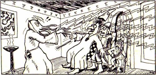
Speaking of Dave Sutherland, here's his take on the mind flayer from the Monster Manual (1977). You can see that he was riffing off Lesch's original conception, right down to having four facial tentacles and a preference for high-collared robes of the sort favored by Ming the Merciless.

Like the kobold, the mind flayer gets two illustrations in the Monster Manual. However, this second illustration is not by Sutherland but rather by Tom Wham. Though humorous in tone, Wham's art shows a mind flayer that looks very close to its predecessors. He even includes the skull on the monster's belt. (Also of interest is that one of the illithid's victims is a halfling.)

The aforementioned Descent into the Depths of the Earth (1978) not only gives us the name illithid but also this terrific illustration (by an uncredited artist that I nevertheless think is Dave Trampier). Again, note the similarities to its predecessors.
1980 gave us several different illustrations of mind flayers, starting with this one from The Rogues Gallery by Erol Otus:
We get another, from Jeff Dee this time, in Expedition to the Barrier Peaks. It's one of my favorites of all time, probably because it's different. Rather than showing the illithid in a high-collared robe like every previous artist, Dee puts him in a sci-fi uniform, wielding technological devices – and it feel right. I can't be certain, but I suspect this illustration is the origin of the widely held notion that mind flayer are from another world (or even the future).
1980 also brought us the first mind flayer miniature from Grenadier Models. By most standards, it's pretty goofy looking, but you can see, if you look carefully, that it's heavily inspired by Sutherland's Monster Manual illustration. For example, the mini has similar sleeve decoration and he's wearing the same strange harness seen in the MM.
The next year, in 1981, AD&D modules D1 and D2 were combined together under a single cover, with the addition of some new art. One of those pieces of art appeared on the back cover of the module. Drawn by Bill Willingham, this is the first time we've seen a mind flayer in color.
In October 1983, in issue #78 of Dragon, Roger E. Moore's "The Ecology of the Mind Flayer" appeared, accompanied by a Roger Raupp illustration. What's notable about this illustration is that the illithid is not wearing a high-collared robe, but he is wearing that harness seen in previous illustration.
Citadel Miniatures briefly held the license for AD&D miniatures and produced several mind flayers in 1985, such as the one below. The high-collared robe returns once more.
By 1987, the license passed to Ral Partha. The company held the license for almost a decade and, during that time, they produced this mind flayer miniature:
I don't know precisely when this mini was produced, so, if anyone knows, please let me know in the comments. This is important for a reason that will become apparent shortly.

For the 1989 Second Edition Monstrous Compendium, we get an illustration from James Holloway. Though some of the details are different – notice the brain you can see inside the mind flayer's head – but it's still not far from what we've seen many times before, including the high-collared robe.
Finally, there's 1993's Monstrous Manual whose depiction was done by Tony DiTerlizzi.

The illustration looks just like the Ral Partha mini above – unless it's the other way around. That's why I'm curious about when the miniature was released. My suspicion is that the DiTerlizzi illustration came first, but I cannot prove it.

With that, we come to the end of my brief look at mind flayer artwork from the TSR era of Dungeons & Dragons. I know I've probably overlooked a lot of illithid illustrations from Second Edition, like the one on the cover of Spelljammer, but I've already presented enough, I think, to give a good sense of how these monsters were presented during the first two decades of D&D. However, if you can recall any illustrations of mind flayers you think are especially worthy of comment, let me know. 

Monday, July 15, 2024

A (Very) Brief Pictorial History of Halflings

For today's look at the art of TSR era Dungeons & Dragons, I've decided to step away from monsters and instead focus on something a little different: halflings. Halflings, as everyone knows, originate in the works of J.R.R. Tolkien and have little or no antecedents in real world myth or legend. Despite Gary Gygax's well-known dislike of The Lord of the Rings, he was, however, a fan of The Hobbit, which introduced halflings – or, rather, hobbits – to the world. Both books were very popular among fantasy aficionados during the early 1970s, when D&D was born, so it's not at all surprising that Tolkien's diminutive creations should find their way into the game (along with several of his monsters). Of course, this usage was completely unauthorized and legally dubious. Saul Zaentz's Middle-earth Enterprises threatened legal actions against TSR for its usage of "hobbit" (and "ent" and "Nazgûl," I believe) in OD&D. Subsequent printings of the game, such as the one I own, changed "hobbit" to "halfling" and that term then became the common one in Dungeons & Dragons. 

There are no clearly identified illustrations of halflings in OD&D. However, there is this piece of Greg Bell artwork that I think is supposed to be a halfling:

As you can see, the illustration is crude and looks more like the common depiction of a leprechaun – note the hat – than what we now expect of a hobbit or halfling. However, there are no leprechauns in OD&D, playable or otherwise. Further, if you look carefully, you can see the figure above is using a sling in his right hand, a signature weapon of halflings in both OD&D and the Fantasy Supplement to Chainmail. 

The earliest unambiguous illustration of a halfling comes in the AD&D Monster Manual by David Sutherland. Sutherland's depiction is broadly consonant with Tolkien's descriptions of hobbits, including their hairy feet.
The next year, in 1978, Sutherland illustrated module B1, In Search of the Unknown. One such illustration shows a short figure I assume is meant to be a halfling. Because he has no beard, I don't think he's supposed to be a dwarf, but there's no way of knowing for certain.
Next up is Bill Willingham's take on a halfling from the 1980 reprint of White Plume Mountain – even though it actually depicts a polymorphed efreeti masquerading as a halfling. Once again, furry feet à la Tolkien are visible.
1980 also saw the release of Slave Pits of the Undercity, whose cover features this towheaded halfling by Jeff Dee.
The Tom Moldvay D&D Basic Set (1981) includes this depiction of several different character classes by Dave LaForce. In the bottom right-hand corner, you can see a halfling, armed with a bow. 
The Cook-Marsh Expert Set (1981) includes one of my favorite depictions of a D&D halfling (by Jeff Dee). 
Frank Mentzer's 1983 revisions of the Basic and Expert Sets include many illustrations of halflings, probably the most of any TSR edition of Dungeons & Dragons. For the purposes of space, I'm including only a single example (by Larry Elmore), though there are many other excellent options to choose from.
The same year saw the release of The Shady Dragon Inn, a supplement filled with artistic renderings of every conceivable D&D character type, including halflings. It also features portraits of characters based on the LJN D&D toy line, such as Figgen the Halfling Thief (whose toy, ironically, was never actually produced as far as I know). This is Timothy Truman's version of Figgen:
In the third episode of the first season of the Dungeons & Dragons cartoon series (also 1983), we're introduced to a character called Hector the Halfling (who's actually bad guy Venger disguised by magic). He's the only halfling to appear in the series of looks quite different than all previous depictions of the race. He lacks hairy feet, but he wears peculiar pants that cover half of his oversized feet, leaving the toes visible. He also has pointed ears, an inconsistently portrayed aspect of D&D halflings.
The Forgotten Realms Campaign Set (1987) presents us with another slightly anomalous vision of halflings. Jeff Easley's halflings are skinny, goofy-looking little people with mildly larcenous demeanors. They still have big, slightly hairy feet, but otherwise strike me as quite unique.
Jim Holloway's version of halflings from 1989's Monstrous Compendium is, in my opinion, a little creepy, with his heavy eyebrows, half-lidded eyes, and languorous pose. He also boasts a veritable mane of hair that starts at his ankles and then drapes over the tops of his feet. To my eyes, the overall effect is suggestive of a satyr rather than a hobbit and I can't say I'm keen on it.
Tony DiTerlizzi's piece from the 1993 Monstrous Manual is better, exuding a kind of scrappy heroism that works well for halflings. 
As you can see from just this small sampling of illustrations, there's never been a fully consistent conception of halflings. I wouldn't be surprised if this was driven, at least in part, by a desire to legally distinguish D&D's diminutive race from Tolkien's hobbits. At the same time, there can be no question that, at base, halflings are hobbits in all but name. The presence of hairy feet – a characteristic derived from Tolkien – in nearly all of the above pieces of artwork demonstrates that. If the intention were to avoid comparisons to the denizens of Middle-earth, you'd think removing that feature would have been at the top of the art director's list. (Interestingly, the kender of Dragonlance pointedly wear shoes – take that, Saul Zaentz!).

There's a lot more to be said on this topic, I think, but I'll leave that to another day. For now, I'm interested in your thoughts about both the art and the place of halflings in your own D&D campaigns. Do you use them? Do you, like me, replace them with another race? Or you omit them entirely? 

Monday, July 8, 2024

A (Very) Partial Pictorial History of Trolls

It's well known that, in populating the bestiary of Dungeons & Dragons, Arneson and Gygax regularly looked beyond mythology and folklore for inspiration. Such is obviously the case with the troll, which borrows heavily from the monster's description in Poul Anderson's Three Hearts and Three Lions right down to its green color and ability to regenerate. Unlike many of the other monsters we've looked at in this series, the troll's appearance is remarkably consistent during the TSR era of D&D. Despite the large number of artists who've drawn this horrid creature, nearly all of them seem to be using its initial appearance in 1977's Monster Manual as a guide.

In point of fact, the troll appears twice in the MM, both times drawn by Dave Sutherland. The first is on the cover:

Perhaps because it's likely the first time I ever saw a D&D troll, I've always been quite fond of this particular illustration of it. The interior of the book gives us this second depiction:
This second piece is unusual in that it depicts the same monster from two angles, like a model sheet. I can't think of any other monsters drawn this way in the Monster Manual. 

During the same year, Minifigs produced a figure of a troll that looks almost identical to that of Sutherland's illustration (unless the inspiration goes in the other direction). In any case, the troll's primary physical characteristics seem to be its tall, lanky body; tooth-filled mouth, long nose, black, deep-set eyes, and bristly black hair atop its elongated head. 
The next year, 1978, sees quite a large number of troll illustrations, starting with this one by Dave Trampier, which appeared in module G3, Hall of the Fire Giant King:
Though Tramp's style is quite different from Sutherland's, his trolls nevertheless look identical. Speaking of Sutherland, here's another one by him, this time from module D1, Descent into the Depths of the Earth, about which I've posted before, because it's a favorite of mine.
What a terrific piece! Not only is it a great battle scene, featuring men in historical armor fighting a band of trolls, it also includes possibly the only depiction of the severed body parts of a troll fighting independently. It's such a signature element of the monster that I'm surprised there are no other such depictions (you'll tell me if I'm wrong in the comments).

Tramp returns for this fun illustration from the Players Handbook:
1980 brings us more trolls, starting with a Grenadier Models miniature that looks very much like the Sutherland original:
Then there's this one by Jeff Dee, appearing in the Arthurian Heroes section of Deities & Demigods
1981's Fiend Folio introduces us to several new troll variants. Though they are different sub-species, you can still see a "family resemblance," starting with this giant troll by Russ Nicholson:
Then there's the giant, two-headed troll, another illustration by Dee:
At the dawn of the Second Edition era, Jim Holloway provides this image of a troll for the Monstrous Compendium. Despite its small alterations to the template late down in 1977, this is still very recognizable as the same creature Sutherland originally drew.

Finally, there's Tony DiTerlizzi's take from the Monstrous Manual, which is – again – just a variation on Sutherland's. There's a reason why I continue to argue that Dave Sutherland is perhaps the single most important and influential artist in the game's history
So, what have I missed? Are there any notably different takes on trolls during the TSR era? Or do they all follow in Sutherland's footsteps as these do?