Showing posts with label moldvay. Show all posts

Wednesday, January 7, 2026

Thoughts Occasioned by Castle Amber

This post is not, strictly speaking, a Retrospective, since I've already done one on Tom Moldvay's 1981 module, Castle Amber – two, actually, if you count the repost as well. Nevertheless, in honor of The Ensorcellment of January, I thought it more than appropriate to take another look at the only old school Dungeons & Dragons module to take explicit inspiration from the works of Clark Ashton Smith. While I'll endeavor not to repeat much of what I said in my original Retrospective, there will inevitably be a few points to which I'll return, though I hope I'll offer some additional insights to justify doing so.

Despite my repeatedly thinking otherwise, the name of Clark Ashton Smith does not appear anywhere in Appendix N to Gary Gygax's AD&D Dungeon Masters Guide nor does he appear in the expanded list of "favorite authors [and] inspirational sources" in his 1992 Mythus Magick bonus. On one level, it's a very odd omission, as Gygax was quite well read when it came to fantasy and science fiction literature – including lots of early pulp fantasy authors, like Robert E. Howard and H.P. Lovecraft, both of whom he considered "among the most immediate influences" on his conception of the game he co-created. 

The fact that Gary Gygax, of all people, could seemingly have either not known or not cared about CAS suggests that, compared to many of his literary contemporaries, he has always been, if not necessarily obscure, something of an acquired taste. Speaking even as an avowed devotee of Smith, I can’t really blame anyone who finds his mellifluous prose, sardonic demeanor, and detached misanthropy a bit much, particularly when set beside the more muscular storytelling of Howard or the raw imaginative urgency of Lovecraft. Smith demands patience and a willingness to luxuriate in language for its own sake. His stories often feel less like adventures than like jeweled relics to be contemplated from a respectful distance.

Consequently, Smith’s fiction is not easily mined for gameable elements in the way Conan’s swordplay or Lovecraft’s Mythos can be. Howard offers clear models for heroic action and conflict. Lovecraft provides a cosmology of forbidden knowledge, cults, and monsters that can be lifted almost wholesale into play. Smith, by contrast, traffics in mood, decadence, and fatalism. His stories often lack conventional heroes, hinge on ironic or poetic reversals, and end not with triumph or revelation but with extinction, transformation, or bitter resignation. These qualities make his work harder to translate into D&D and that difficulty is probably at the root of why Gygax took little notice of him. Smith does not easily become a list of monsters, spells, or magic items.

Fortunately for me, Tom Moldvay did notice him. Although I’m still not absolutely certain that it was Castle Amber that first introduced me to Smith – it may well have been Call of Cthulhu, released the same year as module X2 – I can say with certainty that it was this adventure that solidified Smith’s hold over my imagination. Castle Amber suggested that roleplaying games could evoke not just action or terror, but a sense of dreamlike estrangement and baroque melancholy. It suggested that play could feel uncanny rather than merely dangerous, strange rather than merely challenging, and that those feelings could linger long after the dice were put away.

That lingering quality is a large part of why I still love Castle Amber four decades later. It is, above all else, unsettling. On the surface, it is just another dungeon for characters of levels 3 to 6, complete with monsters, traps, and treasure. Dig a little deeper, though, and the dungeon in question reveals itself as a kind of fun house, governed less by internal logic than by a warped, almost oneiric sensibility. Its 70 keyed locations feel less like rooms in a coherent structure and more like fragments of half-remembered stories stitched together by madness and decay.

One chamber hosts a boxing match against magical constructs; another contains the lair of spellcasting spiders imported from The Isle of Dread (itself another Moldvay creation); elsewhere, there is a kennel of hellhounds. None of these elements really belong together, at least not in a naturalistic way and that disjunction might be the point. The titular Castle Amber resists easy categorization. It feels wrong in a way that is difficult to articulate, as if it obeys a set of esthetic or even metaphysical rules that the players can sense but never fully grasp. Layered on top of this is the grotesque parade of the Amber family themselves – decadent, deranged, and occasionally tragic figures who are, unsurprisingly, closer to characters out of Smith’s own stories than to standard fantasy villains.

Castle Amber thus has a very strange vibe, one that I picked up on even as a twelve-year-old. It made me uneasy in a way that very few D&D modules ever have. How much of that vibe is intentional and how much of it is something I've been projecting onto it is difficult to say, especially after so many years of reading and playing it. I assume at least some of it must have been intentional, because Moldvay was adapting elements of Smith's Averoigne stories for use with D&D and those stories have a similar ambience. 

This brings to mind another question that has longed dogged me about this module: why was this particular module was ever released. Though not a close adaptation of the Averoigne tales, it's close enough that special thanks are given to CASiana Literary Enterprises, Inc. (the estate of Smith) "for use of the Averoigne stories as inspirational material." It's unclear whether TSR acquired or sought out a license from CASiana for use of the stories or not, but, even if it didn't do so formally, Castle Amber is an unusual early example of an RPG product published by TSR explicitly derived from a pre-existing intellectual property. 

Regardless, I count Castle Amber as one of my favorite adventure modules for any edition of Dungeons & Dragons. Not only did it play a role in making me a lifelong Clark Ashton Smith fan but it also forever affected my sensibilities when it comes to fantasy and fantasy adventures. It was, for example, one of the primary inspirations behind my own The Cursed Chateau (an adventure that I am, not coincidentally, in the process of revising for re-release). It's a weird, fun, disconcerting scenario and I think it still holds up today.

Tuesday, January 6, 2026

REPOST: The Sorcerer of Xiccarph

In light of a recent Pulp Fantasy Library entry, I thought readers might enjoy this write-up of Clark Ashton Smith's sorcerer, Maal Dweb. The description originally appeared in the "Giants in the Earth" column appearing in issue #30 of Dragon (October 1979), written by Lawrence Schick and Tom Moldvay (though I suspect, given his love of Smith, that Moldvay was likely the author of this particular character).

Tuesday, August 19, 2025

The Articles of Dragon: "Giants in the Earth" (Issue #36)

"Giants in the Earth" was an irregular series of articles that appeared in Dragon between issues #26 (June 1979) and #61 (May 1982). Co-written by Lawrence Schick and Tom Moldvay, its purpose was to present notable characters from literature in (A)D&D terms. During its run, more than 40 characters made an appearance, running the gamut from John Carter of Mars to Maal Dweb to Reepicheep and more. While certain authors, like Jack Vance and Fritz Leiber, and their creations receive lots of attention, others show up more infrequently.

Despite his foundational importance to the literature that inspired the hobby, a character from the works of H.P. Lovecraft appears only once in "Giants in the Earth" and the choice is an odd one, at least in my opinion. The column from issue #36 (April 1980) features Richard Upton Pickman, here styled the "King of the Ghouls." Here are the game stats that accompany his description, along with a portrait that looks to me as if it was drawn by Jeff Dee (there is no credit accompanying either the article or the illustration):

There are certainly a number of things one could discuss about this write-up – feel free to do so in the comments – but, for me, what's more interesting is the accompanying description of Pickman. For example, the text states that he "wears +3 plate armor (no shield) and carries a +1 sword which is +4 versus ghoul enemies (most living creatures)." What a bizarre detail! I say that, because Pickman is presented in the article just as he is in "Pickman's Model." He's a Boston artist whose work is shunned by respectable galleries for its disturbing subject matter. Though he is now himself a ghoul, he's nevertheless a man of the 20th century, not some medieval fantasy characters. It's very odd.

Beyond that, the text presents six examples of Pickman's paintings. Each one is given a title and a magical effect if viewed. 
The first three paintings listed – "The Lesson," "Ghoul Feeding," and "Subway Accident" – are all lifted straight from "Pickman's Model," while the last three are references, either direct or indirect, to famous Lovecraft stories. I find the inclusion of "The Silver Key" notable, since protagonist of the story with which it shares a name, Randolph Carter, eventually meets Pickman in The Dream-Quest of Unknown Kadath. The article also notes that each of these paintings has a saving throw versus fire of 10, suggesting that it's quite likely someone might seek to burn them in order to stop their deleterious effects.

More than halfway through The Shadow over August, it's been a bit of a struggle to find Dragon magazine articles that connect directly – or even indirectly – to H.P. Lovecraft and his legacy. I would have thought there'd be more examples of this kind of thing, especially from the period prior to 1980. As it turns out, that's not the case and I find myself wondering why ...

Tuesday, August 27, 2024

The Articles of Dragon: "It's That Time of Year Again ..."

I'm sure this will come as a great surprise to longtime readers of this blog that, as a young man, I was fairly serious and earnest. Shocking, I know! Of all the things about which I was serious – and there were many – Dungeons & Dragons was near the top of the list. It's no exaggeration to say that, in the first few years after I discovered the game, D&D was an important part not merely of my life but also of my self-conception. I was a D&D player and I was sincerely proud of this fact in a way that I doubt I've ever been since.

Consequently, when I first came across issue #60 of Dragon (April 1982) and read its contents, I was taken aback. Sure, the article contained a further installment of Roger E. Moore's magisterial demihuman "Point of View" series (focusing on elves this time), along with more cantrips from Gary Gygax and other interesting stuff, but what really caught my eye were a pair of articles that played off longstanding Dragon columns, specifically "Giants in the Earth" and "Dragon's Bestiary." I say "played off," because neither installment in this issue was quite right, as I'll explain.

"Giants in the Earth" was replaced by "Midgets in the Earth" and, rather than presenting D&D stats for characters from classic fantasy and science fiction literature, what we got instead were write-ups for goofy original characters, like the kobold dictator Idi "Little Daddy" Snitmin, Morc the Orc, and master halfling thief Eubeen Hadd. Written by Roger E. Moore and accompanied by artwork that looks like it could have been drawn by Jim Holloway, "Midgets in the Earth" was clearly intended as nothing more than silly fun in honor of April Fool's Day. Please bear in mind that I read this article long before I'd come across the regular April Fool's issues of Polyhedron, so the concept was still somewhat new to me at the time.
The issue's "Dragon's Bestiary" was in a similar vein. Instead of the usual assortment of dangerous and unusual new monsters for use with D&D, we were given entries inspired by various pop culture "monsters," like Donald Duck or Marvin the Martian or the Bad News Bugbears. Like "Midgets in the Earth," these were clearly intended to be silly, but I found them irritating – all the more so because they were written by designers like Tom Moldvay and David Cook, who could have been writing really useful stuff. Why were they wasting effort on such nonsense, I thought? I'd much rather have had more serious content that I could drop into my ongoing AD&D campaign.
Yeah, I was a little tightly wound in those days. Go figure! In time, I came to be a bit more accepting of such silliness, but it took some time – and more April Fool's issues of Dragon to do it. I never fully embraced it, but I did become less uptight about it and the way I enjoyed my hobby. Or at least that's what I keep telling myself ...

Thursday, August 8, 2024

Retrospective: Revolt on Antares

While I've briefly touched on TSR's 1981 mini-game Revolt on Antares a couple of times before, I've never done a proper Retrospective post on it. I've decided to rectify that this week, both because it's an excellent, fun-to-play little hex-and-chit wargame and because, of all TSR's mini-games, it's the one with which I had the most experience playing. Consequently, I've got a lot more to say about Revolt on Antares compared to its seven sister games published over the course of 1981 and 1982.

Before getting to the game itself, I'd briefly like to draw attention to its place within the history of TSR. Revolt on Antares came out in '81, during a time when TSR was rapidly expanding both its release schedule and its ambitions. Though Dungeons & Dragons remained the company's bestselling line of products by far, there seems to have been genuine concern that its popularity was faddish and could not be sustained forever. TSR, therefore, began to experiment with other games (and approaches to games) as a hedge against the possible collapse in interest in D&D.

Mini-games, like Revolt on Antares, were part of that experiment. Coming on a clear plastic case, the game consisted of a short, 16-page rulebook, a sheet of cardboard counters, a colored map, and a pair of dice. Tom Moldvay designed the rules, while Kevin Hendryx served as its developer. Graphically, it makes full use of TSR's stable of young artists, like Jeff Dee, Dave LaForce, Erol Otus, Jim Roslof, and Bill Willingham, all of whom I'd consider representative of this experimental period in the history of the company. Dee's cover is especially memorable to me, probably because of how I often I played Revolt on Antares with my friends at the time.

As wargames go, this one is quite simple – but that was a big part of its appeal to me. Though I knew a lot of guys into wargames in my youth, I never really devoted much effort to playing them myself, with a couple of exceptions here and there. For the most part, this was simply a matter of not being sufficiently interested in wargames to devote the time necessary to learn and play them. I'd much rather have been playing roleplaying games than the Rise and Decline of the Third Reich. 

What immediately appealed to me about Revolt on Antares was its science fiction setting. I've been a huge fan of SF since I was a young child, growing up in the immediate aftermath of the Apollo program and watching reruns of Star Trek on a grainy black-and-white TV with my aunt. And, of course, like all little boys at the time, I was a fan of Star Wars. The combination of these facts with my TSR fanboyism made it perhaps inevitable that I'd purchase Revolt on Antares almost as soon as I saw it. 

The simplicity was, as I've already noted, a plus, especially when compared to other SF wargames I attempted to play around the same time. The rulebook quickly establishes the basic scenario:

Imirrhos, ninth planet of the star Antares, lies on the edges of Earth's Imperial Terran Empire. As the Empire grows weaker, Imirrhos boils with unrest and intrigue. The seven local ruling families (or "houses") fight for power. Some want the Terrans to leave, others need Imperial support. A few know of the Silakka, an alien race that is waiting to invade ...

The rulebook then offers up three different scenarios for play. The basic scenario is for two players and concerns the revolt against Terra. One player takes the role of a house leader leading the revolt, while the other is the Imperial Terran consul, who is attempting to crush the rebellion. The second scenario is also for two players and concerns the defense of Antares against the invading Silakkans. The third – and, in my opinion, most fun – scenario is for 2 to 4 players, with each player taking on the role of one or more houses as they jockey for control of Imirrhos. 

A big part of the appeal of Revolt on Antares are its characters. Each of the houses is led by a character with both a name and a unique ability. For example, House Orsini is led by Messalina Orsini, whose power of fascination enables her to subvert the loyalty of opposing units, while House Edistyn is led by Nureb Khan Edistyn, whose precognition ability allows him to roll two dice instead of one in combat, taking the best result. In addition, there are "Galactic Heroes" whom you can recruit, like the assassin Corvus Adromeda and Dr. Death, who can animate the bodies of fallen units as zombies. These heroes act much like house leaders in their use but may be recruited by any faction. There are also ancient alien artifacts, such as the Force Cannon and Energy Drainer, whose possession and use adds yet more mayhem into the mix.

Looking back on it now, it's clear that what made Revolt on Antares so appealing to me was its world building. Though the information Moldvay provides about Imirrhos and its inhabitants are as brief as its rules, they are surprisingly evocative. Names like Black Dougal Mackenzie or Ward Serpentine possess a certain mystery that made me want to know more – and, in the absence of such information, my friends and I imagined it for ourselves. That's precisely the stuff from which good games are made and, by that standard, Revolt on Antares is a very good game.

From a purely objective perspective, it's nothing special. As I keep saying, the rules for combat and movement are very, very simple. I'm sure long-time wargamers would justifiably scoff at their lack of depth. I can't really argue against such judgments, except to say that I had a blast playing Revolt on Antares again and again, each time coming up with new ideas about the implied setting of the game – not bad for a little game published four decades ago!

Monday, July 15, 2024

A (Very) Brief Pictorial History of Halflings

For today's look at the art of TSR era Dungeons & Dragons, I've decided to step away from monsters and instead focus on something a little different: halflings. Halflings, as everyone knows, originate in the works of J.R.R. Tolkien and have little or no antecedents in real world myth or legend. Despite Gary Gygax's well-known dislike of The Lord of the Rings, he was, however, a fan of The Hobbit, which introduced halflings – or, rather, hobbits – to the world. Both books were very popular among fantasy aficionados during the early 1970s, when D&D was born, so it's not at all surprising that Tolkien's diminutive creations should find their way into the game (along with several of his monsters). Of course, this usage was completely unauthorized and legally dubious. Saul Zaentz's Middle-earth Enterprises threatened legal actions against TSR for its usage of "hobbit" (and "ent" and "Nazgûl," I believe) in OD&D. Subsequent printings of the game, such as the one I own, changed "hobbit" to "halfling" and that term then became the common one in Dungeons & Dragons. 

There are no clearly identified illustrations of halflings in OD&D. However, there is this piece of Greg Bell artwork that I think is supposed to be a halfling:

As you can see, the illustration is crude and looks more like the common depiction of a leprechaun – note the hat – than what we now expect of a hobbit or halfling. However, there are no leprechauns in OD&D, playable or otherwise. Further, if you look carefully, you can see the figure above is using a sling in his right hand, a signature weapon of halflings in both OD&D and the Fantasy Supplement to Chainmail. 

The earliest unambiguous illustration of a halfling comes in the AD&D Monster Manual by David Sutherland. Sutherland's depiction is broadly consonant with Tolkien's descriptions of hobbits, including their hairy feet.
The next year, in 1978, Sutherland illustrated module B1, In Search of the Unknown. One such illustration shows a short figure I assume is meant to be a halfling. Because he has no beard, I don't think he's supposed to be a dwarf, but there's no way of knowing for certain.
Next up is Bill Willingham's take on a halfling from the 1980 reprint of White Plume Mountain – even though it actually depicts a polymorphed efreeti masquerading as a halfling. Once again, furry feet à la Tolkien are visible.
1980 also saw the release of Slave Pits of the Undercity, whose cover features this towheaded halfling by Jeff Dee.
The Tom Moldvay D&D Basic Set (1981) includes this depiction of several different character classes by Dave LaForce. In the bottom right-hand corner, you can see a halfling, armed with a bow. 
The Cook-Marsh Expert Set (1981) includes one of my favorite depictions of a D&D halfling (by Jeff Dee). 
Frank Mentzer's 1983 revisions of the Basic and Expert Sets include many illustrations of halflings, probably the most of any TSR edition of Dungeons & Dragons. For the purposes of space, I'm including only a single example (by Larry Elmore), though there are many other excellent options to choose from.
The same year saw the release of The Shady Dragon Inn, a supplement filled with artistic renderings of every conceivable D&D character type, including halflings. It also features portraits of characters based on the LJN D&D toy line, such as Figgen the Halfling Thief (whose toy, ironically, was never actually produced as far as I know). This is Timothy Truman's version of Figgen:
In the third episode of the first season of the Dungeons & Dragons cartoon series (also 1983), we're introduced to a character called Hector the Halfling (who's actually bad guy Venger disguised by magic). He's the only halfling to appear in the series of looks quite different than all previous depictions of the race. He lacks hairy feet, but he wears peculiar pants that cover half of his oversized feet, leaving the toes visible. He also has pointed ears, an inconsistently portrayed aspect of D&D halflings.
The Forgotten Realms Campaign Set (1987) presents us with another slightly anomalous vision of halflings. Jeff Easley's halflings are skinny, goofy-looking little people with mildly larcenous demeanors. They still have big, slightly hairy feet, but otherwise strike me as quite unique.
Jim Holloway's version of halflings from 1989's Monstrous Compendium is, in my opinion, a little creepy, with his heavy eyebrows, half-lidded eyes, and languorous pose. He also boasts a veritable mane of hair that starts at his ankles and then drapes over the tops of his feet. To my eyes, the overall effect is suggestive of a satyr rather than a hobbit and I can't say I'm keen on it.
Tony DiTerlizzi's piece from the 1993 Monstrous Manual is better, exuding a kind of scrappy heroism that works well for halflings. 
As you can see from just this small sampling of illustrations, there's never been a fully consistent conception of halflings. I wouldn't be surprised if this was driven, at least in part, by a desire to legally distinguish D&D's diminutive race from Tolkien's hobbits. At the same time, there can be no question that, at base, halflings are hobbits in all but name. The presence of hairy feet – a characteristic derived from Tolkien – in nearly all of the above pieces of artwork demonstrates that. If the intention were to avoid comparisons to the denizens of Middle-earth, you'd think removing that feature would have been at the top of the art director's list. (Interestingly, the kender of Dragonlance pointedly wear shoes – take that, Saul Zaentz!).

There's a lot more to be said on this topic, I think, but I'll leave that to another day. For now, I'm interested in your thoughts about both the art and the place of halflings in your own D&D campaigns. Do you use them? Do you, like me, replace them with another race? Or you omit them entirely? 

Wednesday, July 3, 2024

Retrospective: Secret of the Slavers Stockade

The "Slave Lords" series of AD&D modules consists of four modules, beginning with Slave Lords of the Undercity, about which I have fond, if complicated, feelings. Truth be told, that's true of all the modules in the A-series, They're a mix of compelling ideas, some memorable encounters, and contrived situations in order to serve their purpose as tournament scenarios. When TSR published them, the designers cleaned them up for more general use, to varying degrees of effectiveness. 

The second module in the series, Secret of the Slavers Stockade, by Harold Johnson with assistance from Tom Moldvay, is, in my opinion, one of the better ones. Its premise is that the characters have a map to an old fort in the hills that is really a front for the salvers. Their goal is to investigate the fort and, if possible, disrupt the operations of the slavers within. It's a solid basis for an adventure, one that demands stealth and thoughtful action to succeed.

The fort (the titular Slavers' Stockade, which gets an apostrophe in the text but not on the cover) is large and well defended, with plenty of guards whose presence makes it difficult for the characters to move about. In fact, the place is so well defended that the tournament scoring system operates under the assumption that, after three hours of play, the characters will not make it very far into the fort. In addition, there's a section specifically devoted to "hill fort strategy," detailing how the guards will respond once it becomes apparent there are intruders in their midst. That's not even factoring in wandering monsters. In short, the characters have their job cut out for them.

Ultimately, to put an end to the threat of the Stockade, the characters will need to find and kill its overseer, Markessa, an evil female elf fighter/magic-user, who keeps a pet owlbear and is guarded by goblins. Here's Bill Willingham's [I'd originally incorrectly identified this as Roslof's work – JM] illustration of her and two goblins.

These goblins look a lot like Roslof's depiction of them for the AD&D Monster Cards in 1982, the year after the publication of this module. Once again, I find myself absolutely fascinated by the variability in the way some humanoid monsters are drawn in Dungeons & Dragons, with goblins having some of the greatest variability. 

The module includes some of other interesting illustrations, such as that of a new monster, the boggle, drawn by Jeff Dee.
I draw your attention to the boggle because he's not terribly dissimilar in general appearance to Roslof's goblins. Of course, he also looks a bit like Gollum from the 1978 Ralph Bakshi The Lord of the Rings animated film, so what do I know? The module includes several "tactical maps" for major encounters, which are decorated with illustrations of some of the monsters found in the Stockade.
Both of these figures are drawn by Jeff Dee: the upper left being a goblin and the bottom right a kobold. Both look very similar to those drawn by Roslof for the Monster Cards. That makes me wonder if perhaps there was some level of art direction at TSR during this time or if it's simply a case of a group of artists who all cribbed from one another when drawing these creatures. I simply don't know the answer at this point, but I must confess that I'm now of a mind to see if I can find out.

In any case, Secret of the Slavers Stockade has the potential to be a fun module, if your players enjoy sneaking around and avoiding drawing attention to themselves. If not, it's probably going to turn into a huge combat slog and will likely result in one or more character deaths. The latter was my own experience of refereeing it in my youth, but, in those days, we were much more tolerant of gigantic slugfests than I am today. Even careful players will likely find this a difficult module, so I won't be surprised if many commenters don't share my largely positive opinion of it, which is fair. For me, I appreciate that Johnson didn't make the Stockade easy to overrun. This is, after all, the headquarters of a powerful evil organization; it should be a dangerous place and it is. 
Have a blurry orc by Jeff Dee

Monday, June 17, 2024

A (Very) Partial Pictorial History of Goblins

During the course of looking into the pictorial history of kobolds last week, I noticed that, starting in the late First Edition AD&D era and extending into early Second Edition, kobolds started looking more goblin-like in illustrations. This was particularly striking in light of Dave Sutherland's original depiction of them as short, horned, scaly dog-men, a depiction unique to old school Dungeons & Dragons. Thinking further on the matter, I began to ponder just what I meant by "goblin-like." Had my notion of a goblin in D&D been similarly influenced by the depictions of them to which I'd been first exposed during my entrance into the hobby of roleplaying? Given the popularity of my kobold post last week, I thought this a question worth investigating.

So far as I can tell, the very first depiction of a goblin in any Dungeons & Dragons product is this one from the original 1974 release of the game. Drawn by Greg Bell, this early goblin looks to me more like a deranged dwarf than a monster in the usual sense of the term:

Dave Trampier provided the illustration for goblins in the AD&D Monster Manual (1977) and I suspect this is the ultimate source for my own imagining of what they look like:
In the same year, Minifigs in the UK produced a series of Dungeons & Dragons miniatures that included goblins among them. Here's one that looks to be quite similar to Trampier's art, right down to the little horned helmet:
In 1980, Grenadier Models produced its own take on goblins, which, again, are broadly consonant with Trampier's depiction, though, to my eyes anyway, they seem slightly more feral. 

1981 is the year Tom Moldvay's D&D Basic Set is released. Though the rulebook does not include artwork for any of the game's traditional humanoid enemies, it does include this Dave LaForce – were all of TSR's early artists named Dave – piece from the alignment section in which there's a bound and gagged figure whom my childhood friends and I assumed was a goblin. He certainly matches many of the characteristics associated with goblins, though he seems to be taller and less stocky than previous depictions.
Like the Moldvay Basic Set, Frank Mentzer's 1983 revision does not include any illustrations of its monstrous humanoids. However, in its solo adventure, there is the following piece of artwork (by Jeff Easley) that, from context, would seem to depict goblins. Once again, they wear horned helmets.
The same year, the Doug Niles D&D Basic adventure, Horror on the Hill, was published. The adventure's primary antagonists are goblins and hobgoblins. Jim Holloway provides numerous illustrations throughout the module, but, aside from a couple of contextual clues, it's not at all clear (to me anyway) when he's depicting a goblin and when he's depicting a hobgoblin. A big of why that's the case is that the two races look very similar to one another. Are these two goblins or hobgoblins? Regardless, I think they're representative of Holloway's broader take on these humanoids.
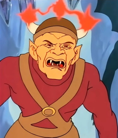
In the third and final season of the D&D cartoon, there's an episode entitled "The Dungeon at the Heart of Dawn" that features a character who looks very much like Dave Trampier's original Monster Manual illustration of a goblin, though he's not explicitly called a goblin. He even has – yet again – a horned helmet, although, in this story, the horns serve to focus a magical blast that he shoots from his helmet. 
Second Edition's Monstrous Monstrous Compendium (1989) gives us a different Jim Holloway take on goblins. You can definitely see in this piece an evolution of Trampier's original, right down to his pose. He still wears a small helmet, albeit one without horns. This goblin is a bit more wizened in appearance than his 1e counterpart, which, strangely, calls to mind Greg Bell's dwarf-like OD&D version.
Finally, there's this goblin image from the 2e Monstrous Manual (1993) by an artist I can't quite identify. He's vaguely reminiscent of Holloway's goblins from Horror on the Hill, but also seems vaguely "fairy tale-ish" in his attire, particularly the oversized shoes. 

As the title of this post implies, this is an incomplete examination of the evolution of goblins in TSR era Dungeons & Dragons. I am sure there are other illustrations depicting this classic evil humanoid to be found during the period between 1974 and 2000, but I've presented here only those with which I am most familiar. If there are other examples from this period you think are particularly relevant to this discussion, please feel free to post them in the comments. This is especially true if the depiction differs radically from what we see above. My own take on goblins from the Dwimmermount and Urheim setting of Telluria owe a lot, I think, to the illustrations I saw in the TSR products of my youth, which just goes to show how important evocative artwork is in bringing a game and/or setting to life.

Monday, June 10, 2024

The Adventure is Yours

Throughout 1982 and into 1983, I regularly saw this full-page advertisement for the Moldvay/Cook/Marsh Dungeons & Dragons boxed sets in the pages of Dragon.


The ad is interesting to me for a couple of reasons. First, the image at the bottom left, showing five people sitting at a table playing D&D (with the cover of Keep on the Borderlands clearly standing up in front of the DM) seems to depict the same group of people who appear in a TV commercial from around the same time. That suggests that this print ad was part of a larger, multi-prong effort to introduce "the world's most talked about role-playing adventure" to a wider potential audience. 

Second, the ad features artwork in a style quite distinct from that of any artist I associate with D&D of that era. Since there's no obvious artist's signature, identifying its origin is difficult. It's possible that this question has already been resolved. If so, I'd love to know the identity of the artist. Beyond that, it's also noteworthy, I think, that the illustration depicts three characters (who appear to be a thief, a magic-user, and perhaps an elf) walking/riding at night through the streets of a fantasy setting rather than something more obvious, like a party fighting a dragon or some other monster. Perhaps the marketing people felt this was redundant in light of the inset pictures of the two boxed sets, one of which shows that very scene.

I have no idea how effective this advertisement was in its intended purpose, but I've always liked it.

A (Very) Partial Pictorial History of Kobolds

One of the things I've long appreciated about early Dungeons & Dragons is the way that it took vaguely defined folkloric, mythological, and literary monsters and made them distinctive to the game. The pig-faced orcs of the Monster Manual are a good example of what I'm talking about, though there are many others, like kobolds. In folklore, kobolds don't have a clear and universally accepted description. From what I recall, they're short and vaguely dwarfish. That's probably why Holmes, in his Basic Set, calls them "evil dwarf-like beings" (and why I opted for something similar in my Dwimmermount and Urheim setting).

Within the history of D&D, however, the image immediately below is (I think) the very first time we're shown a kobold. It's from the AD&D Monster Manual (1977) and is drawn by Dave Sutherland, based on an exceptionally vague description that speaks only of their coloration, small horns, lack of hair, and red eyes. 

The MM also includes a second Sutherland kobold illustration, this one a full-page piece.
I like this second illustration a lot, because it gives a sense of how, despite having only 1–4 hit points each, kobolds could nevertheless be dangerous foes, because of their numbers. The illustration is also useful in showing the little monsters from several different angles. I suspect, more than any other, this piece is responsible for my early conception of kobolds and their physical characteristics – short, scaly dog-men with horns. Precisely why Sutherland settled on this appearance, I have no idea, since there's nothing in either folklore or the Monster Manual's own description to suggest it.

That same year (1977), Minifigs in the UK picked up the license to produce official Dungeons & Dragons miniatures. Though the company didn't produce as many figures as did Grenadier later (more on that below), it produced enough that they're often worth examining for insight into the beginnings of D&D as a product line. Take, for example, this figure of a kobold, which looks rather similar to the creatures depicted in Sutherland's illustrations, particularly the second, full-page one, right down to the harness he's wearing.
1980's Rogues Gallery features a very memorable depiction of kobolds by Jeff Dee. As you can see, Dee's kobolds look very similar to Sutherland's – almost identical, in fact. In this rendering, they're still short, scaly dog-men.

Deities & Demigods was published the same year as the Rogues Gallery, but offers up a somewhat different depiction of kobolds. The entry for Kurtulmak, the supreme deity of the kobolds, is accompanied by an illustration drawn by Erol Otus. He's described as looking like a "giant kobold (5½' tall) with scales of steel and a tail with a poisonous stinger). This suggests that what we see below is, more or less, what a kobold looks like. Though there's a very broad similarity with the Sutherland/Dee illustrations, we can see that his face has been flattened into more humanoid proportions, thereby lessening its canine associations.
Just below the Otus illustration in the DDG is another one featuring Kurtulmak, this time by Dave LaForce. As you can see, the four kobolds depicted in it look like smaller versions of their god, albeit without horns or scales. To me, LaForce's kobolds look almost simian in apperance. 
Interestingly, 1980 is also the year that Grenadier Models first started producing official Advanced Dungeons & Dragons miniatures under license from TSR. If you look carefully at this photo, what you see are three kobold miniatures whose appearance is not too dissimilar to what we see in the art of Otus and LaForce above. Pay close attention to their flat, humanoid faces and lack of horns.
The next year (1981), Otus provides a different illustration for a kobold, this time appearing in Tom Moldvay's D&D Basic Set. This illustration accompanies an entry that describes kobolds as "small, evil dog-like men ... [that] have scaly rust-brown skin and no hair."
This version has neither horns nor a tail, but its canine head is unmistakable. I find it notable that the module Keep on the Borderlands, included with the '81 Basic Set, has a rumor table that makes mention not just of "hordes of tiny dog-men" (i.e. kobolds), but also "big dog-men" or gnolls, suggesting a connection between these two monsters that I don't believe I've ever seen developed in the entire history of D&D. 
Above, we can see Jim Roslof's illustration of a kobold from 1982's AD&D Monster Cards. This illustration looks to me to be a further development of the Otus/LaForce version of kobolds – flat faces, no horns, no visible tail. In fact, they look rather like the goblins depicted in that same product, which makes for an interesting call-back to OD&D (and Chainmail before it), which seems to treat kobolds as if they were simply a species of goblin, or at least a closely related type of monster.

The first appearance of kobolds in AD&D Second Edition is in the Monstrous Compendium (1989), with this illustration by Jim Holloway:
Holloway's kobold is a kind of two-steps-forward-one-step-back version – broadly consonant with Otus/LaForce/Roslof one but regaining the horns of Sutherland/Dee. Though there's no visible tail, the description in the Monstrous Compendium suggests that they do indeed possess "non-prehensile rat-like tails." It also notes that they "sound like small dogs yapping" and smell like "a cross between damp dogs and stagnant water." This perhaps suggests that the writer (David Cook, Steve Winter, or Jon Pickens) was attempting to restore a bit of the canine connection of early 1e while retaining the overall look established by its later artists.
Lastly, there's this illustration from the 2e Monstrous Manual (1993), provided by Tony DiTerlizzi, who's probably best known for his distinctive contributions to the Planescape setting. This version restores the elongated, muzzle-like face of early AD&D, though, to my eyes, it looks more rat-like than canine. The accompanying description is the same as in the earlier Monstrous Compendium, so it's not as if any of DiTerlizzi's alterations were required by a revised text.

Despite my recent musings about Third Edition, the post-TSR editions of Dungeons & Dragons are beyond the scope of this blog, so I won't be discussing the subsequent development of kobolds. That's probably just as well, since I'm not a fan of their metamorphosis into small lizard/dragon-men. Nevertheless, looking over the pictorial history of this low-level monster has opened my eyes to just how ill-defined the kobold actually is. My own preferred version is heavily indebted to that of the first version I ever saw and I suspect that's probably true of most other D&D players. 

Do you have a default vision of kobolds? If so, what does it look like?